There is a reason every spa you have ever been to is blue, or beige pretending to be blue. Of all the colours, blue is the one most reliably associated with calm — lower heart rates, slower breathing, the whole physiological package. But “paint it blue” is not a design strategy, and most blue rooms fail in one of two ways: too cold and flat, or too dark and heavy.
The tranquil blue room — the one that actually delivers the calm it promises — is built on layering: multiple blues in the same temperature family, warmed by natural materials and warm light, with texture doing the quiet work of keeping it interesting. Sixteen ideas follow, each one a different door into the same calm.
Wash Walls in Soft Sky Blue
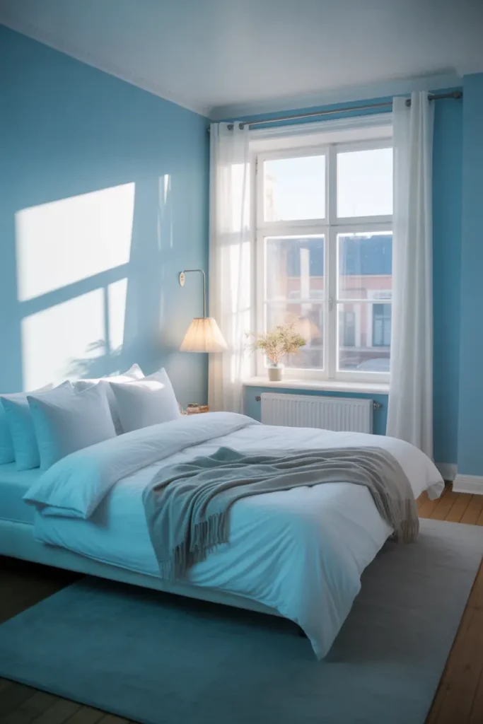
Sky blue on walls is the fastest route to a calm room, and it works for a physical reason: pale blue recedes visually, making walls feel further away. In a bedroom, that recession reads as openness; the room breathes. Choose a blue with a whisper of grey in it — pure sky blue can feel childish, but greyed sky blue feels like early morning.
Pair it with white or pale wood trim rather than stark white. The softer the boundary between wall and trim, the calmer the room. And test it at night under your actual lamps — sky blue that glows at noon can go oddly green under the wrong bulb.
Layer Blues in the Same Temperature
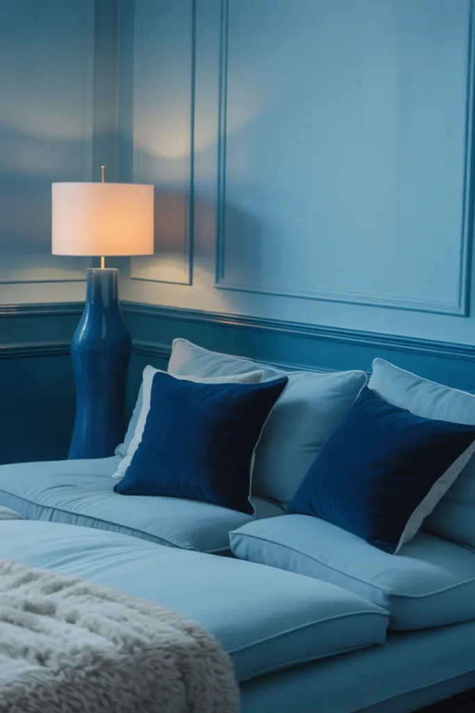
One blue is a colour; three blues is a scheme. Layer pale blue walls with mid-blue upholstery and deep navy accents — cushions, a throw, a lampshade — and the room gains a depth that single-colour rooms never achieve. The layering mimics how blue appears in nature: sky, sea, and depth, all at once.
The non-negotiable rule: keep all the blues in the same temperature. Cool, grey-based blues together; or warm, teal-leaning blues together. One warm blue among cool ones will look like a mistake every time you glance at it. Hold swatches together in daylight before committing.
Ground Blue with Soft Neutrals
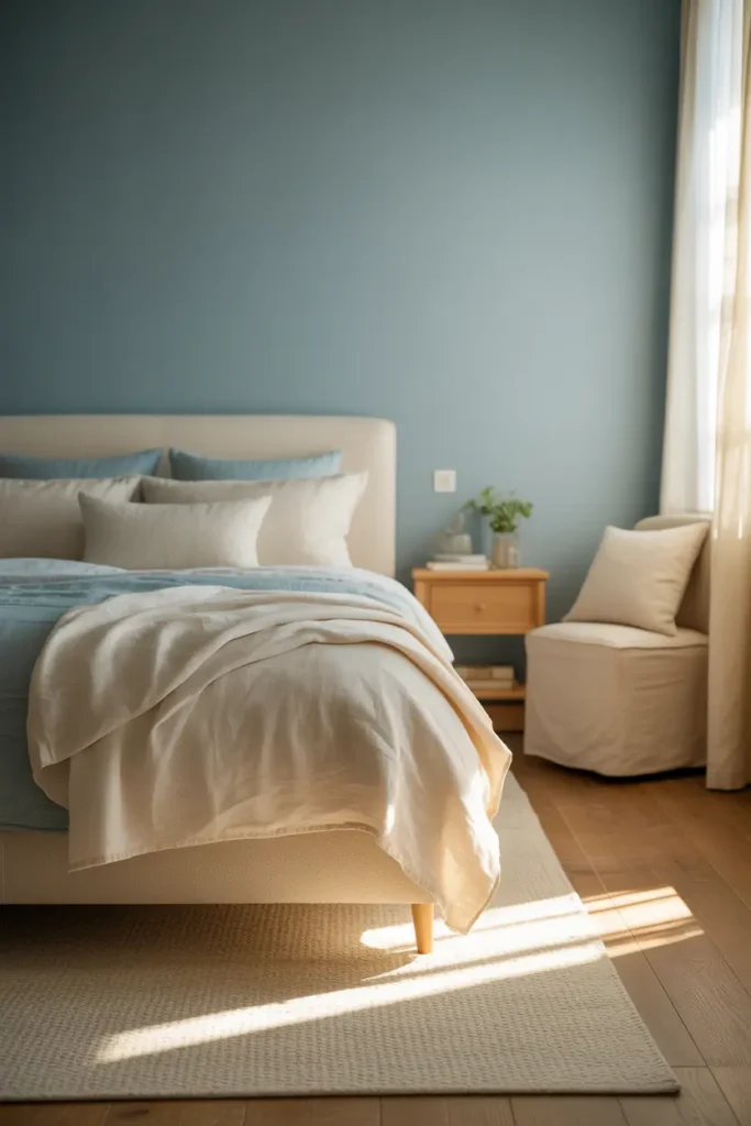
Blue needs an anchor or it floats away. Warm beige, oatmeal, soft white, pale wood — neutrals give blue something to rest against and stop the room feeling like an aquarium. The classic ratio: blue leads, neutrals support at roughly equal visual weight, neither dominating.
Linen is blue’s best neutral textile. Its natural slubs and matte finish absorb light softly, which calms blue’s coolness in a way that smooth cotton cannot. Linen curtains, a linen duvet cover, a linen-upholstered chair — each one makes the blues beside it feel warmer.
Filter Light Through Blue Curtains
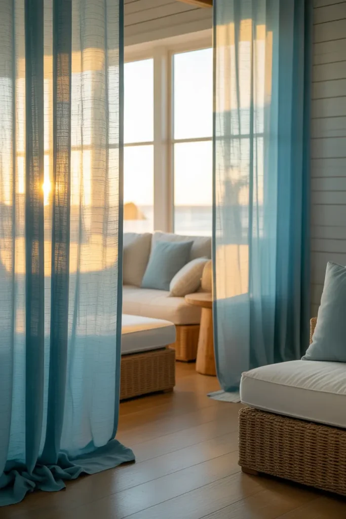
Sheer or semi-sheer blue curtains do something no other window treatment can: they tint the daylight itself. Sunlight passing through soft blue fabric fills the room with a gentle blue glow that makes the whole space feel like late afternoon, all day. It is the closest thing to a lighting trick that paint cannot achieve.
Hang them high and wide — at the ceiling and 15 to 20 cm beyond the window frame on each side — so the window reads larger and the blue has maximum presence. And choose washable fabric; curtains near windows collect dust and sun, and dingy blue is the opposite of tranquil.
Make Blue Upholstery the Focal Point
A blue sofa or armchair gives the room its anchor and its personality in one piece. Dusty blue, denim, muted teal — these mid-tone blues are colourful enough to lead the room but grey enough to live with for years. They also hide wear far better than pale upholstery.
Performance fabrics are worth the premium here: a blue sofa is a long-term commitment, and stain-resistant weaves mean it survives real life. Test the fabric in your light before ordering — blue upholstery shifts more than almost any colour between showroom and home.
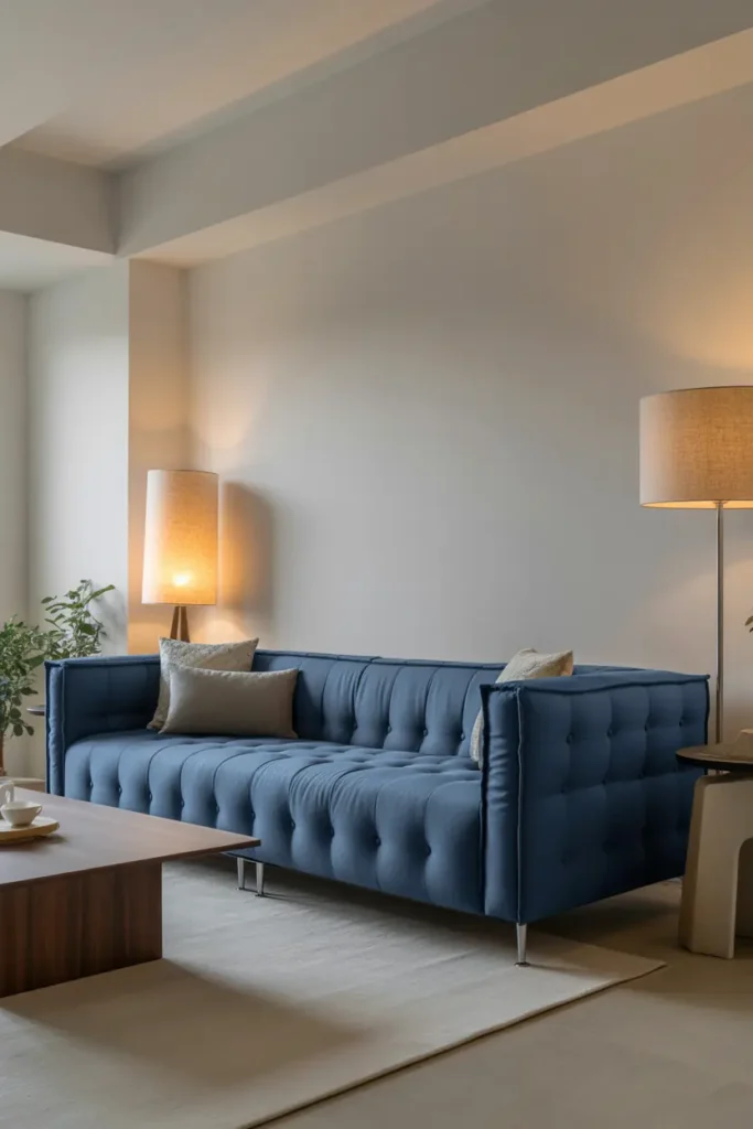
Warm Blue with Natural Materials
Blue’s great weakness is coldness, and natural materials are the fix. Oak, walnut, rattan, jute, wool — every warm, tactile material you add pulls blue back toward the human. A blue room without wood or fibre feels like a swimming pool; with them, it feels like a coastal house.
You do not need much: a wooden coffee table, a jute rug, a rattan basket. Three natural pieces is the minimum effective dose. They work by contrast — the organic irregularity of wood grain against blue’s cool flatness is what the eye finds restful.
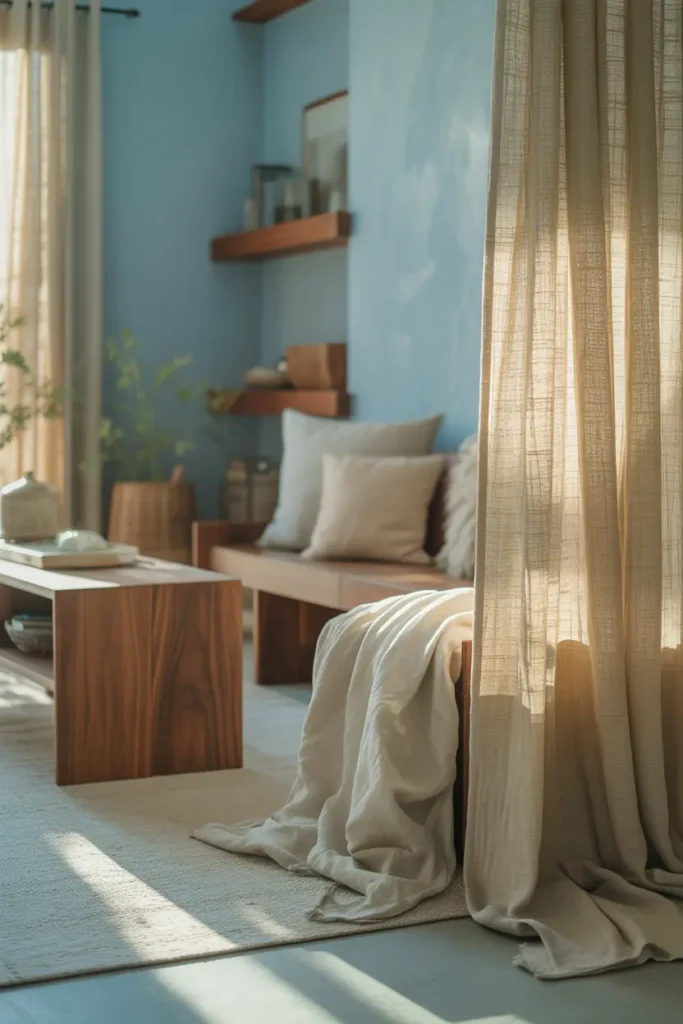
Use Blue in Small, Deliberate Doses
Not every room needs blue walls. Sometimes the calmest approach is restraint: blue cushions on a neutral sofa, blue art on a white wall, a blue throw on a beige bed. Small doses of blue read as intention, and intention is inherently calming — the room feels considered rather than decorated.
This is also the renter’s path to a blue room: nothing painted, nothing permanent, all of it reversible in an afternoon. Some of the most tranquil blue rooms are just neutral rooms with excellent blue accessories.
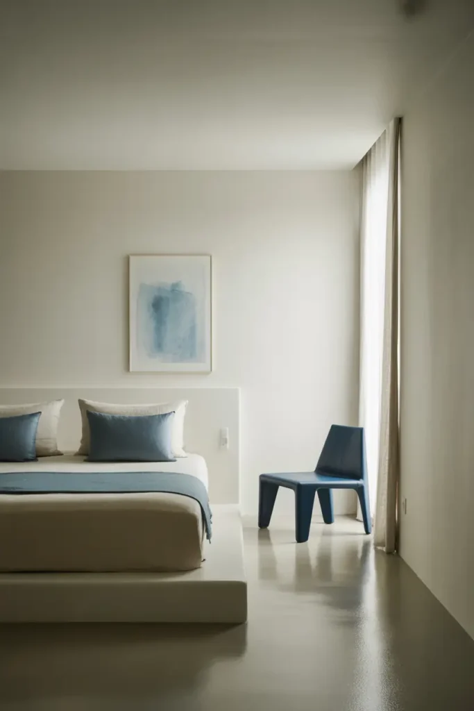
Go Deep with Navy for Intimacy
Navy walls are the opposite strategy from sky blue: instead of opening the room, they embrace it. In a bedroom, study, or reading corner, deep navy creates a cocoon — intimate, quiet, and oddly restful. Dark colours recede too, so navy walls can actually make a small room feel larger, like evening sky.
Navy demands warm light — 2700K, multiple sources — or it goes flat and cold. It also demands contrast: crisp white bedding, warm wood, brass accents. Navy without contrast is just dark; navy with contrast is drama in the best sense.
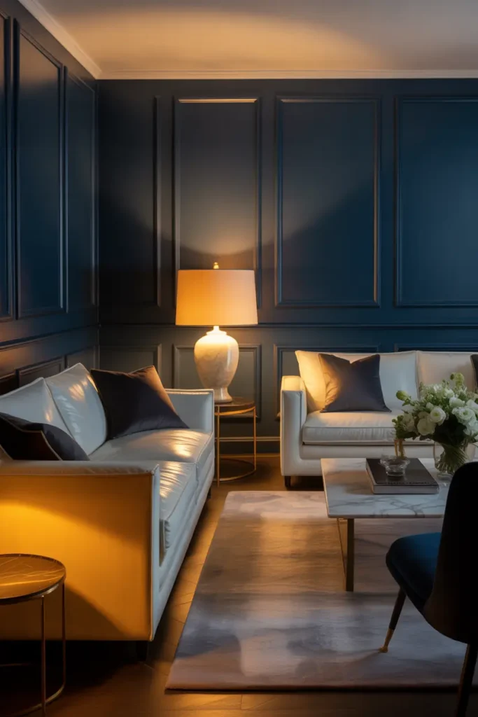
Anchor with a Blue Rug
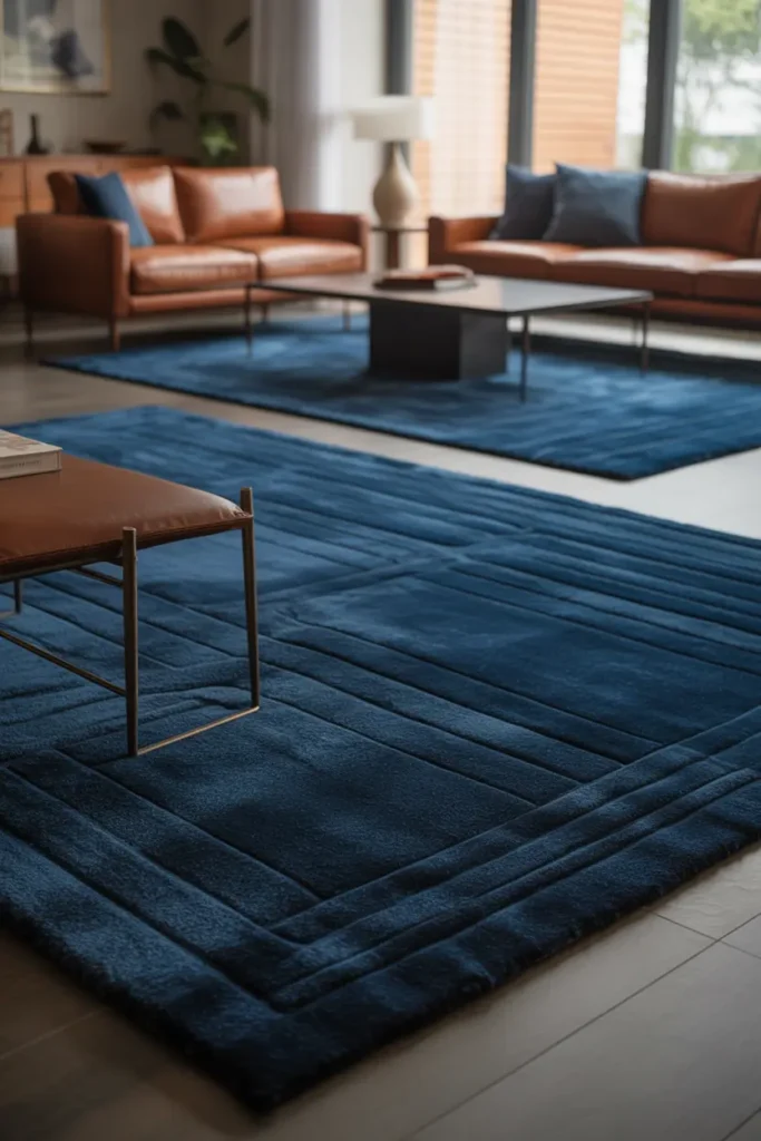
A rug is the foundation garment of the room, and a blue one sets the palette from the floor up. It defines the seating zone, adds softness underfoot, and gives every other blue in the room something to relate to. Choose the rug first and let it dictate the wall and upholstery blues — it is easier to match paint to a rug than the reverse.
Size generously: all front legs of seating on the rug, with at least 20 cm of rug beyond the furniture on the main sides. A too-small rug under a blue scheme looks hesitant; a generous one looks confident. Pattern is fine if it stays in the blue family.
Hang Blue Artwork for Calm Interest
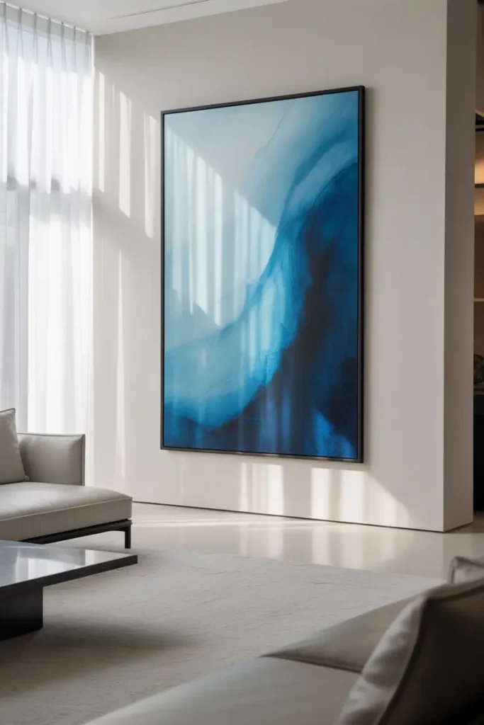
Art with blue tones — seascapes, abstracts, indigo textiles framed simply — adds the colour at eye level with zero commitment. It is also the easiest blue to change seasonally: swap the art and the room’s mood shifts without touching a wall.
Scale it to the wall: above a sofa, aim for two-thirds the sofa’s width; on an empty wall, go as large as the budget allows. Small art in a calm room creates visual restlessness — the eye keeps searching. One generous piece gives it somewhere to land.
Pair Blue with Crisp White
Blue and white is the oldest calm palette in design — coastal, classic, and nearly impossible to get wrong. The white keeps blue fresh and prevents it from going moody; the blue keeps white from feeling stark. Together they read as clean air.
The ratio matters: roughly equal visual weight works best. All-white with a blue cushion feels like a white room; all-blue with white trim feels like a blue room. Decide which room you want and weight accordingly — most tranquil rooms lean slightly white.
Light Blue Warmly
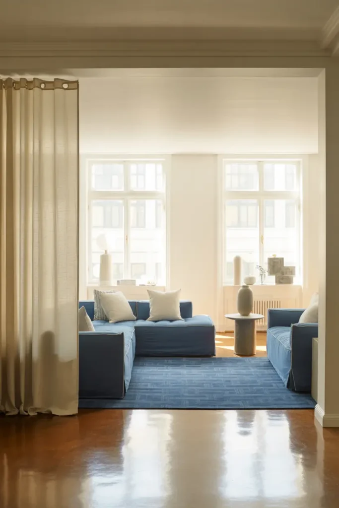
Blue under cool light goes icy; under warm light it glows. This is the most misunderstood aspect of blue rooms: people choose blue for calm, light it with daylight bulbs, and wonder why it feels cold. Warm 2700K light is what makes blue feel like evening rather than winter.
Layer it like any calm room: a soft overhead on a dimmer, warm table or floor lamps, and one low accent. And check the wall colour under the actual evening light before finalising — the test that saves more blue rooms than any other single step.
Transform with Blue Bedding
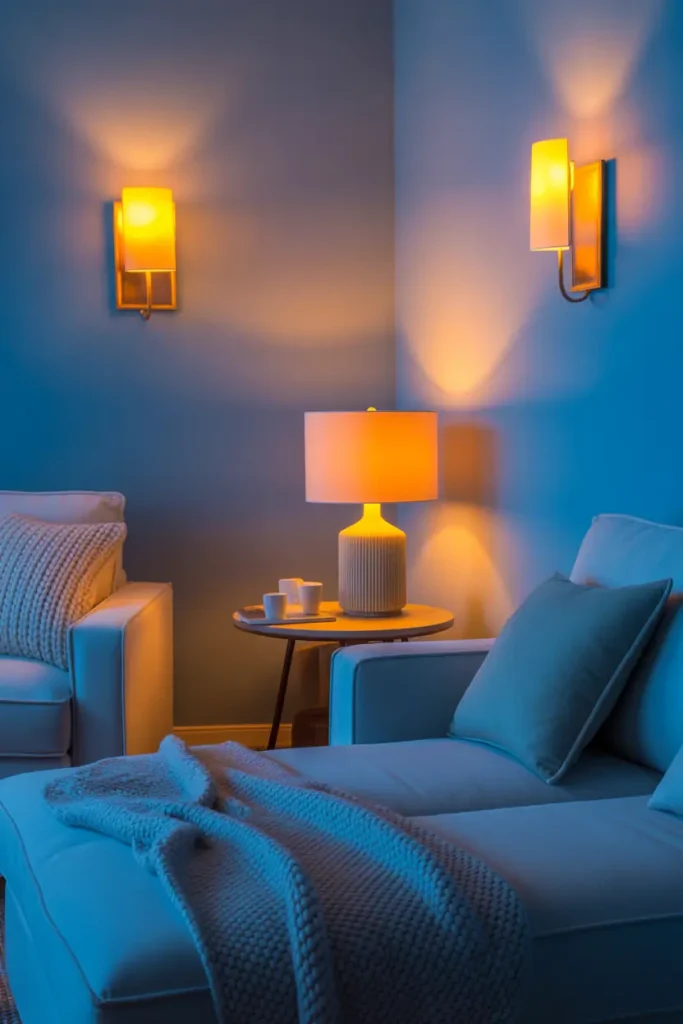
The fastest blue-room transformation in existence: change the bedding. A duvet cover in dusty blue or indigo, layered with white sheets and a textured throw, remakes a bedroom in ten minutes. Bedding is the largest textile surface in the room, so it has outsized influence.
Layer at least three blues or blue-adjacent tones on the bed — duvet, throw, cushions — to get the depth that makes it look designed rather than just blue. And wash new bedding before judging the colour; indigo dyes in particular shift after the first wash.
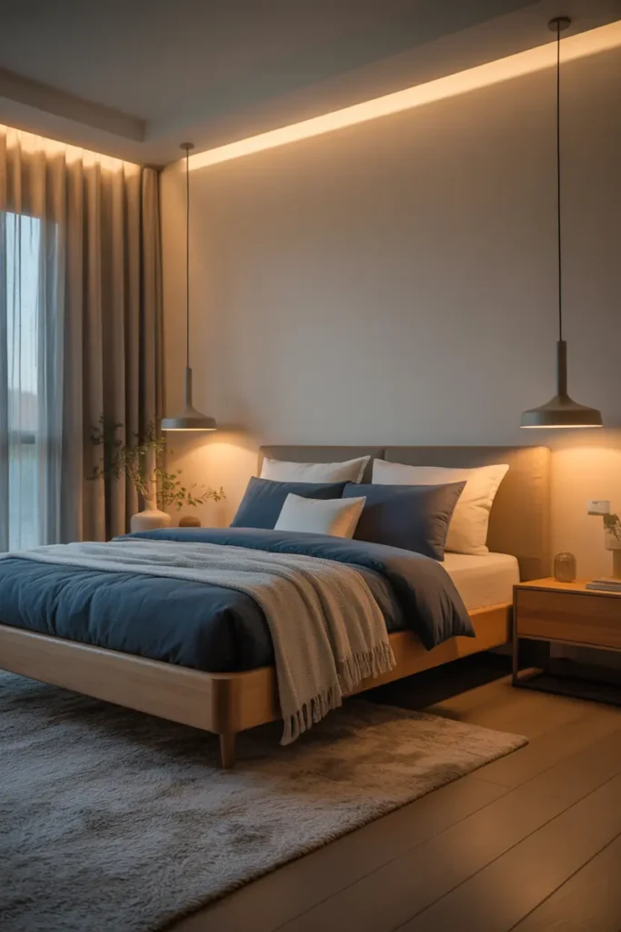
Keep the Layout Open
Calm is spatial as well as chromatic. Leave clear walkways, do not push every piece of furniture against the walls, and resist filling corners. An open layout lets the blue breathe — colour needs air around it to feel calm rather than insistent.
The test: can you walk the room’s main path without turning sideways, and can you see at least one stretch of clear floor from the doorway? If yes, the layout is supporting the calm. If no, no colour choice will compensate.
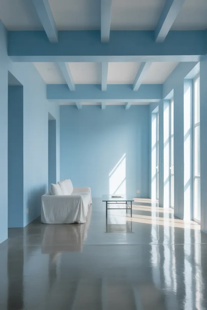
Blend Textures for Depth
A blue room in all-smooth finishes feels flat no matter how good the palette. Blend: nubby wool against smooth linen, matte paint against polished wood, a shaggy rug under a tailored sofa. Each texture gives the eye a different experience of the same colour, which is what “depth” actually means visually.
Aim for at least four distinct textures in the room. Count them: wall finish, largest textile, rug, wood or metal. If you are at two, the room will photograph well and feel flat in person. Texture is the difference between looking calm and feeling calm.
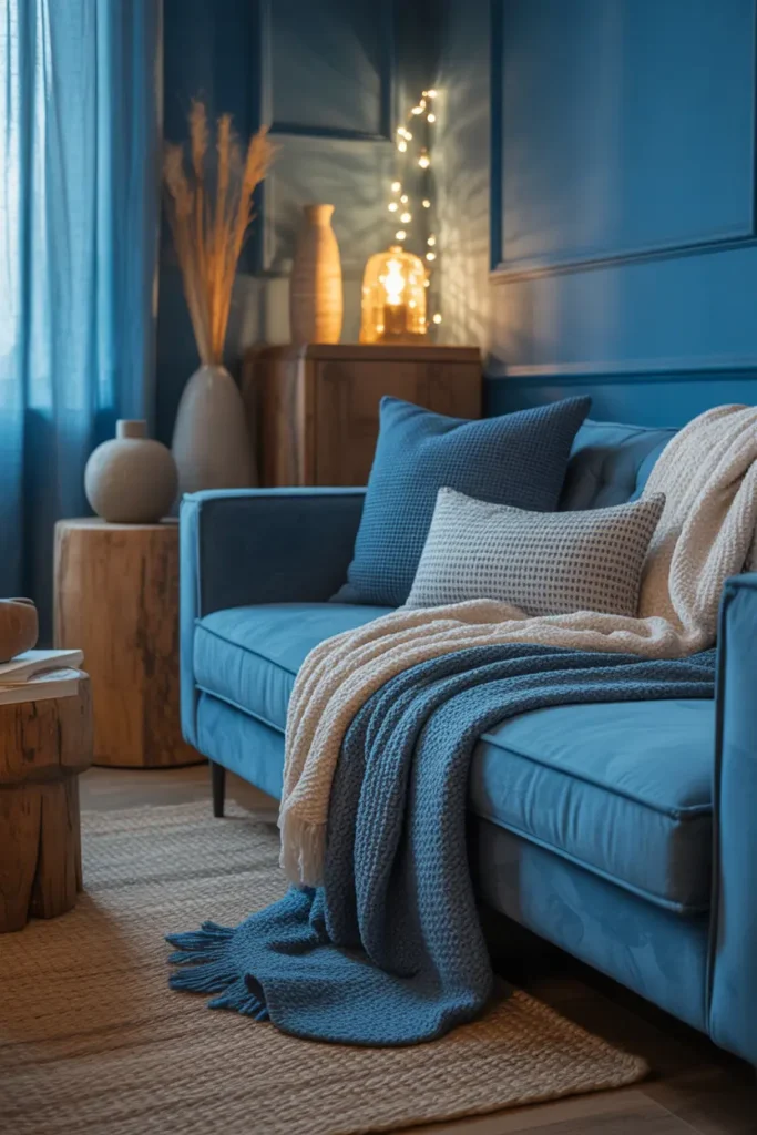
Finish with Personal, Lived-In Details
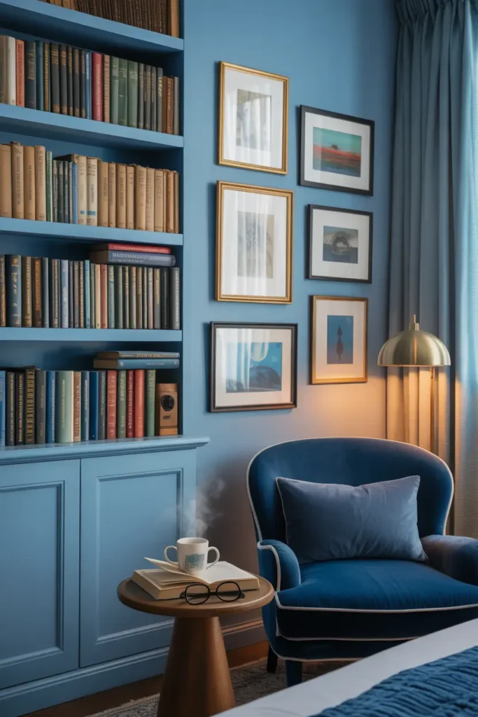
The final layer of a tranquil room is evidence of a life: the books you are actually reading, a photo that matters, a ceramic made by a friend, the chair that is visibly your chair. Tranquillity is not sterility — the calmest rooms feel calm partly because they feel safe, and safe means personal.
Add these last, after the design is done, and let them be imperfect. A tranquil room with one slightly messy bookshelf is more restful than a perfect room that feels like nobody lives there. Calm is a feeling, not a photograph.
Related Decor Ideas
If you loved these tranquil blue room ideas, you might also explore:
- Cozy bedroom decor ideas for better relaxation
- Neutral home decor ideas with soft accents
- Minimalist room design trends for 2026
- Small space decor ideas that feel open and airy
Conclusion
Tranquil blue rooms are not painted; they are built — layer by layer, temperature-matched, warmed with wood and warm light, textured until they have depth, and finished with the personal details that make calm feel like home. Blue does half the work. The layering does the rest.
Pro Tips
- Match blue temperatures: All cool greys together or all warm teals together — never mixed. Temperature mismatch is the most common blue-room failure.
- Warm light is mandatory: 2700K throughout. Cool bulbs turn tranquil blue into cold blue, every time.
- Four textures minimum: Wall finish, main textile, rug, wood or metal. Fewer than four and the room looks calm but feels flat.
- Test at night: Check wall colour under your actual evening lamps before committing. Blue transforms after dark more than any colour.
FAQs
What is the most calming shade of blue?
Muted, greyed mid-blues — dusty blue, denim, soft teal. They have enough colour to feel intentional but enough grey to stay restful. Very pale blues can feel washed out; very saturated blues energise rather than calm.
Does blue make a room feel cold?
Only when it is lit cool and paired with cool materials. Warm 2700K lighting, natural wood, wool and linen textures, and warm-leaning blue temperatures keep a blue room cosy. Cold blue rooms are a lighting failure, not a colour failure.
Can I do a blue room in a north-facing space?
Yes, but lean warm: choose teal-leaning or green-leaning blues rather than grey-blue, maximise warm lighting (three sources minimum), and add generous warm wood. North light is cool and will push blue colder, so compensate deliberately.
How do I keep a navy room from feeling too dark?
Contrast and light: crisp white bedding or upholstery, warm wood tones, brass accents, and at least three warm light sources. Navy with strong contrast feels dramatic and cosy; navy without it just feels dark.

HowDecor is a home decor blog sharing simple, practical decorating ideas for everyday spaces. We believe a beautiful home should feel comfortable, personal, and full of warmth — and that great style does not require a huge budget. Our goal is to inspire readers to create spaces that feel peaceful, welcoming, and truly their own — one room at a time.