Blue and brown shouldn’t work. One is the color of water and sky, the other of earth and bark — and yet put them together and something clicks, the way it clicks in nature every single day. The ocean meets the shore. The sky meets the forest floor. This palette isn’t invented; it’s observed. That’s why it feels restful instead of decorated.
But “blue and brown” is a trap for the careless, because the wrong blue with the wrong brown makes mud — literally, the visual kind. The whole game here is temperature matching: cool blues want cool browns (grey-brown, driftwood), warm blues want warm browns (walnut, honey oak). Get that right and the twelve ideas below practically arrange themselves.
Table of Contents
- ✨ Idea 1: Blue Walls with Warm Brown Wood
- ✨ Idea 2: Blue Tiles with Brown Marble
- ✨ Idea 3: Navy Blue with Chocolate Brown
- ✨ Idea 4: Sky Blue and Light Brown Combo
- ✨ Idea 5: Blue Vanity with Brown Countertop
- ✨ Idea 6: Blue Walls and Brown Floor Tiles
- ✨ Idea 7: Blue Shower with Brown Stone
- ✨ Idea 8: Blue Wallpaper with Brown Decor
- ✨ Idea 9: Blue Sink with Brown Vanity
- ✨ Idea 10: Blue and Brown Coastal Style
- ✨ Idea 11: Blue Ceiling with Brown Walls
- ✨ Idea 12: Blue and Brown Minimal Balance
Idea 1: Blue Walls with Warm Brown Wood
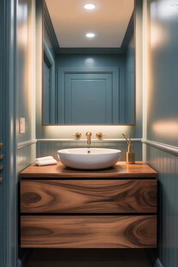
The foundational pairing: blue paint, wood vanity. It works because wood is doing emotional labor — every cool surface in the room (tile, porcelain, chrome) gets balanced by one warm, organic material. A walnut or white-oak vanity against dusty blue walls is the single most reliable blue-brown move in existence. If you only take one idea from this list, take this one.
Match the temperatures: warm blue-greys (with a hint of green or beige in the undertone) want warm woods — walnut, white oak, honey. Cool icy blues want cooler browns — grey-stained oak, driftwood tones. Hold the paint chip against the wood sample in the room’s light; if they fight, one of them is the wrong temperature. The wood should also appear at least twice — vanity plus mirror frame, or vanity plus stool — or it looks like a leftover.
Idea 2: Blue Tiles with Brown Marble
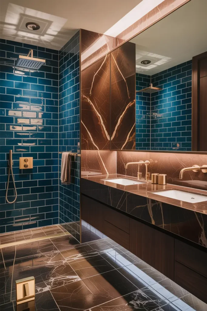
Two natural stones, two different jobs: blue tile (glazed ceramic or porcelain) for color and light-play, brown marble for weight and veining. The brown marble belongs where you’d touch it — the countertop, the tub deck — because marble’s cool solidity under the hand is half its luxury. The blue tile belongs where you’d look — the shower wall, the backsplash.
Keep the brown marble’s veining quiet. Busy brown marble (heavy gold veining, dramatic movement) plus blue tile is two patterns competing; a softly-veined brown or a nearly-solid travertine-look lets the blue be the pattern. And seal the marble — brown marbles stain just as readily as white ones, and a bathroom is a wet, cosmetic-filled environment. Penetrating sealer, twice a year, no exceptions.
Idea 3: Navy Blue with Chocolate Brown
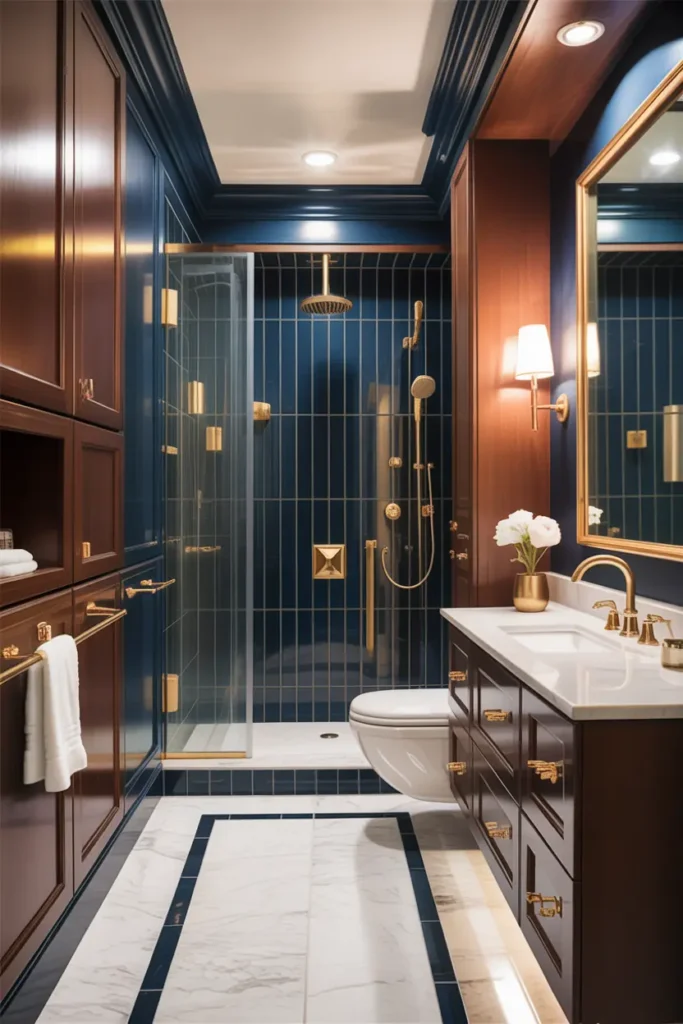
The moody end of the spectrum: deep navy walls or tile with rich chocolate-brown wood or leather-brown accents. This is a small-bathroom power move — dark colors in a small room feel enveloping rather than cramped when the lighting is right — and it’s spectacular in a powder room where drama is the whole point.
The lighting is non-negotiable here. Dark navy plus dark brown under a single dim ceiling light is a cave; the same palette with layered warm lighting (sconces at face height, 2700K, plus one accent light) is a jewel box. And give the darks something light to lean on: a white ceiling, a white vessel sink, pale towels. Dark-on-dark needs a light escape valve or it suffocates.
Idea 4: Sky Blue and Light Brown Combo
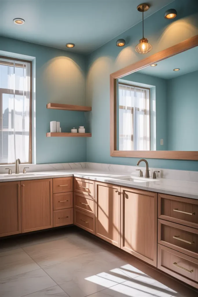
The airy end: pale sky blue with light, blonde woods — white oak, ash, light bamboo tones. This is the Scandinavian-inflected version of blue-and-brown, and it’s the best choice for small or dark bathrooms because both colors are light-reflective. Nothing here absorbs light; everything bounces it.
Keep the wood pale and consistent — one light tone throughout. Mixing blonde oak with dark walnut in the same small room breaks the airy spell instantly. White fixtures, pale blue walls or tile, light wood vanity and mirror frame, done. It’s a four-element room, and it feels like morning.
Idea 5: Blue Vanity with Brown Countertop
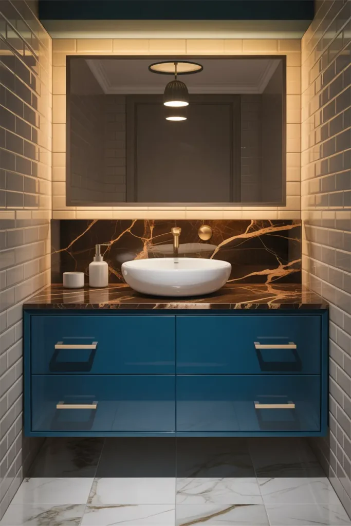
Flip the usual script: the color goes on the vanity, the brown goes on top. A navy or slate-blue vanity under a warm brown countertop — wood, butcher block sealed for bathroom use, or a brown quartz — reads as custom furniture rather than “bathroom cabinet.” The countertop’s warmth keeps the blue vanity from feeling cold, which is the risk with blue cabinetry.
If you use real wood for the counter, it must be sealed for wet use — marine-grade finish or a proper bathroom-rated sealer, reapplied yearly — or go with quartz in a warm brown tone for zero maintenance. Either way, keep the walls quiet (warm white or pale greige) so the vanity-counter combination is the room’s one strong statement.
Idea 6: Blue Walls and Brown Floor Tiles
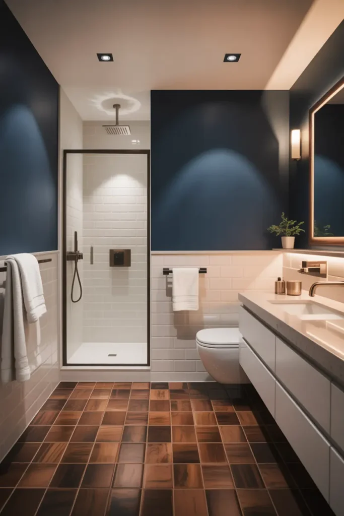
Color logic: cool recedes, warm advances — so blue walls (receding, airy) with a warm brown floor (grounding, stable) gives you a room that feels both open and anchored. Wood-look porcelain in a warm brown tone is the practical pick: the warmth of wood, the waterproofing of tile, $3–$6/sq ft, zero maintenance anxiety.
Lay the floor tile in a plank format (6×36 inches reads most wood-like) and run it in the room’s longest direction to stretch the space. Keep the blue walls in the mid-tone range — pale blue walls with a brown floor can feel disconnected, like two different rooms stacked. A dusty or slate blue has enough presence to hold its own against the floor.
Idea 7: Blue Shower with Brown Stone
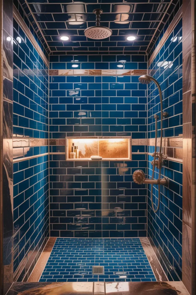
The shower gets blue tile; the brown arrives as stone — a travertine or brown marble threshold, a stone bench, a pebble-look floor. The contrast of glossy blue walls against matte brown stone is a texture story as much as a color story, and texture is what makes a shower feel spa-like rather than merely tiled.
Put the brown stone where it’s driest: the bench top, the curb, the niche surround — not the shower floor, where brown stone shows soap film fastest. And use epoxy grout throughout the shower; with two porous-adjacent materials meeting in a wet zone, cement grout is a maintenance liability you don’t need.
Idea 8: Blue Wallpaper with Brown Decor
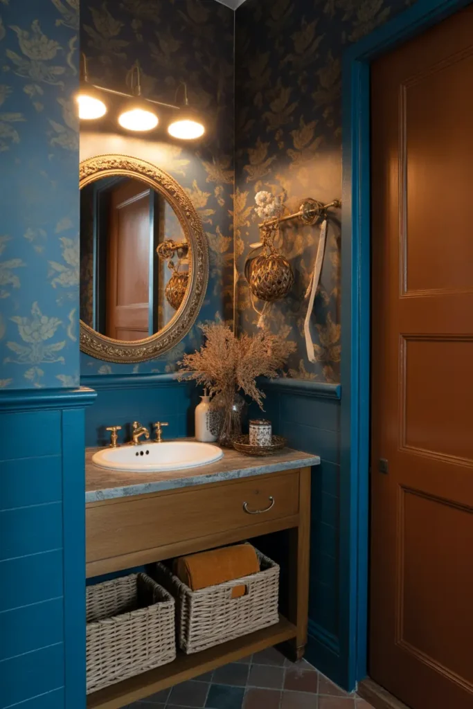
Wallpaper lets blue carry pattern — a navy botanical, a dusty-blue stripe, a chinoiserie-inspired print — while brown arrives in the decor: a wooden mirror frame, woven baskets, leather pulls on the vanity. The pattern does the blue work; the brown keeps it grounded and human.
One patterned wall only, and keep the brown decor simple-lined — the wallpaper is already providing visual complexity, so the wood pieces should be quiet shapes. In bathrooms, vinyl-coated wallpaper is the safe choice, and keep it off direct-splash walls. The brown elements are what make a bold wallpaper feel like a room rather than a statement.
Idea 9: Blue Sink with Brown Vanity
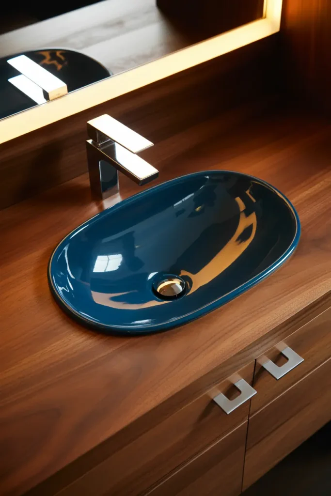
The jewel-box version: a blue vessel basin on a warm brown wood vanity. Both elements are small, both are strong, and together they’re the entire design — which is exactly right for a powder room, where you have about 20 square feet to make an impression. Guests remember this combination; it’s the bathroom equivalent of a good first impression.
The vanity wood should be rich enough to stand up to the blue — walnut, stained oak, a deep brown — not a pale wood that the blue overpowers. Vessel height math applies: basin adds 5–6 inches, so the faucet must be vessel-height or wall-mounted. One small plant or a single framed print completes it; this vignette needs nothing else.
Idea 10: Blue and Brown Coastal Style
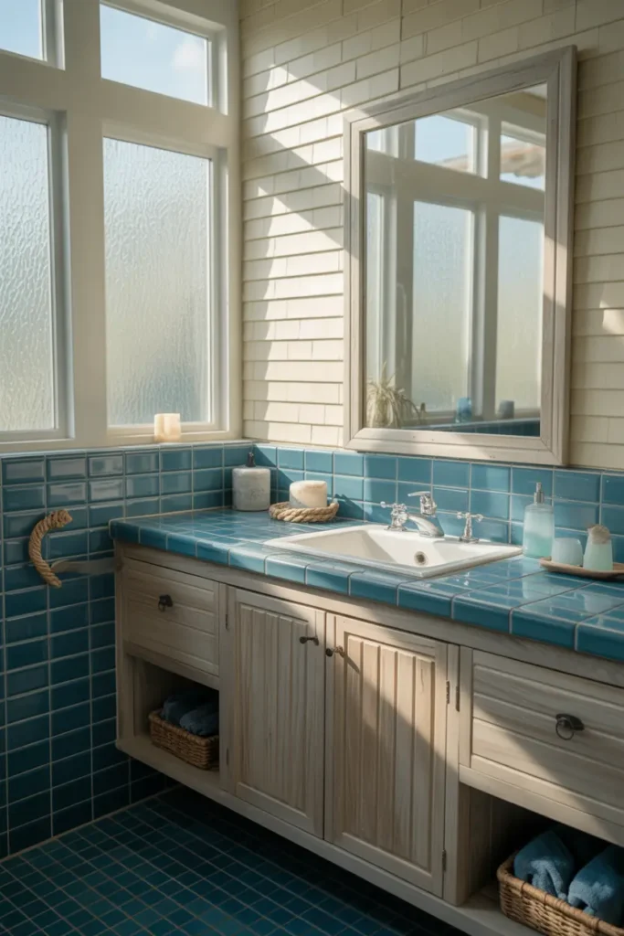
Coastal is blue-and-brown’s native habitat — ocean blue, driftwood brown, sand white. The authentic version uses weathered, greyed browns (driftwood, reclaimed wood tones) rather than rich chocolate; grey-brown is what salt water and sun actually do to wood. A driftwood-finish vanity or mirror frame with sea-glass blue tile is coastal without a single anchor motif.
Texture carries this style: woven baskets, a jute rug, linen curtains, maybe a rope detail on the mirror. Keep it to three textures maximum or it tips into beach-shop. And resist themed accessories — the palette already says coastal; a starfish says gift shop. Let the colors do the talking.
Idea 11: Blue Ceiling with Brown Walls
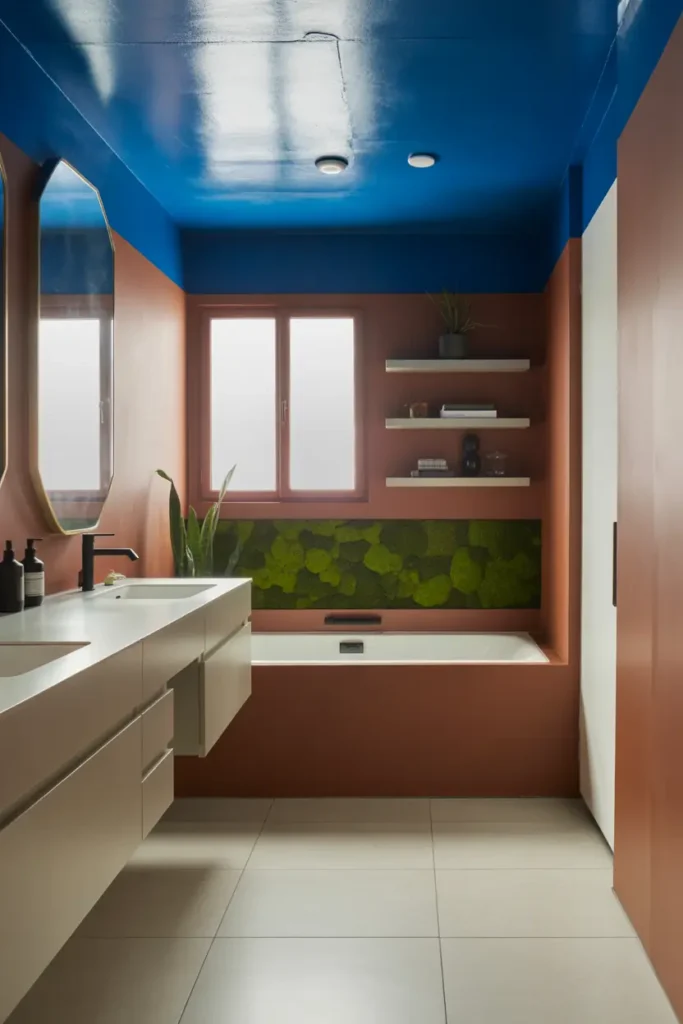
The bold inversion: warm brown walls (a soft taupe-brown or warm greige-brown, not dark chocolate — keep it livable) with a pale blue ceiling. The brown wraps the room in warmth; the blue ceiling lifts it like sky. It’s unexpected, it’s confident, and it works because the eye reads the ceiling as light even when the walls are warm.
This needs good lighting to succeed — brown walls absorb light, so layer warm 2700–3000K sources: sconces, a well-placed ceiling light, maybe a backlit mirror. Keep the ceiling blue pale; a dark blue ceiling over brown walls closes the room like a lid. Done right, it’s the most memorable bathroom on the street.
Idea 12: Blue and Brown Minimal Balance
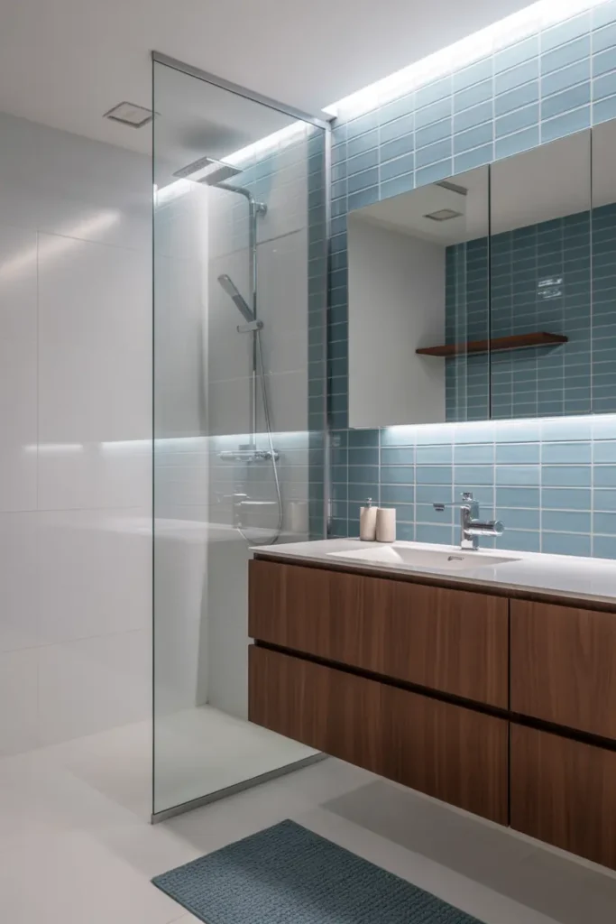
Minimalism with two strong colors is an exercise in discipline: one blue element, one brown element, everything else white or neutral. A blue vanity and a wooden stool. Blue tile on one wall and a teak bath mat. That’s the whole palette, and the restraint is what makes it feel expensive.
The 60-30-10 rule keeps it honest: 60% neutral (white/greige), 30% one of your colors, 10% the other. Which color gets the 30 depends on the room’s light — more natural light can handle more blue; less light wants the warmth of brown in the larger share. Minimal doesn’t mean empty; it means every object earned its place.
Pro Tips
- Match color temperatures, not just colors. Hold paint chips against wood samples in the room’s actual light. Warm blue + warm brown = harmony. Warm blue + cool brown = mud. This one check prevents 90% of blue-brown failures.
- Repeat each material twice. One wood vanity alone looks accidental; vanity plus mirror frame (or stool, or shelf) looks intentional. The same goes for blue — one blue wall plus blue towels, not one blue wall alone.
- Let white do the mediating. When blue and brown feel like they’re fighting, white fixtures, white trim, or a white ceiling between them resolves the tension. White is the diplomat of this palette.
- Seal every natural material. Wood countertops, marble, travertine — all of it needs sealing in a bathroom, and resealing on schedule. The palette only stays beautiful if the materials stay protected.
FAQs
Do blue and brown actually go together in a bathroom?
Yes — it’s one of the most natural pairings there is (ocean and shore, sky and earth). The key is temperature matching: warm blues with warm browns, cool blues with cool browns. Mismatched temperatures are what make the combination look muddy.
What brown goes best with navy blue?
Rich, warm browns — walnut, chocolate, cognac leather tones. Navy is deep and cool, so it needs a brown with real warmth to balance it. Avoid greyed or ashy browns with navy; they drain the combination of energy.
Can I use real wood in a bathroom with this color scheme?
Yes, with the right species and sealing: teak, white oak, and walnut handle humidity well when sealed with a bathroom-rated finish. Keep wood away from direct constant water (inside showers), ventilate well, and reseal yearly.
How do I keep a blue and brown bathroom from looking dark?
Anchor the palette with white — white fixtures, white ceiling, or white tile — and layer warm lighting (2700–3000K). Keep at least 50–60% of the room’s surfaces light, and reserve the deep blues and browns for accents and furniture rather than all four walls.

HowDecor is a home decor blog sharing simple, practical decorating ideas for everyday spaces. We believe a beautiful home should feel comfortable, personal, and full of warmth — and that great style does not require a huge budget. Our goal is to inspire readers to create spaces that feel peaceful, welcoming, and truly their own — one room at a time.