Purple is the colour most people are afraid to try in a bedroom — and the one they end up loving the most. The fear makes sense: we have all seen those heavy, almost gloomy purple rooms from a decade ago. But the purple bedroom of right now has nothing to do with that. It is built on dusty lavender, muted mauve, and deep plum used like seasoning rather than a main course.
What makes purple genuinely special for sleeping spaces is how it behaves at night. Under warm lamplight, cool purples soften into something cocoon-like — the visual equivalent of sinking into a warm bath. This guide walks through exactly how to get that effect: which shades to commit to, how to layer them without making a mess, and the small mistakes that turn a dreamy room into a dark one.
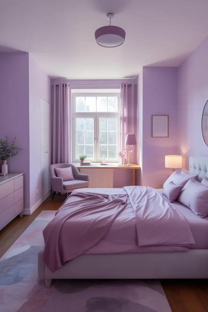
Start with Soft Lavender or Dusty Purple Walls for a Calm Foundation
Wall colour sets the emotional temperature of a bedroom, and lavender or dusty lilac sits right in the sweet spot: colourful enough to feel personal, grey enough to stay restful. Paint it on all four walls in a small room, or — if your room gets weak natural light — use it on the headboard wall only and keep the rest a warm white so the space does not cave in.
The most common mistake is picking a shade that reads too blue or too pink once it dries. Purple shifts more than almost any colour between the paint chip and the wall. Buy two sample pots — one at the value you think you want and one a touch greyer — and paint metre-wide patches on different walls. Check them at noon and again under your bedroom lamp before committing.
Layer Different Shades of Purple to Create Depth Without Clutter
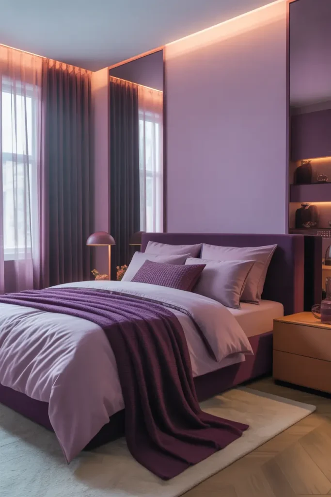
One flat shade of purple is what makes a room look like a rented student flat. The fix is layering three values of the same family: a pale lavender on walls or bedding, a mid-tone mauve in cushions or a throw, and one deep plum accent — a single velvet cushion or the shade of a bedside lamp. Three values is the magic number; two feels unfinished, four starts to look chaotic.
Keep every shade within the same temperature. Cool lavenders pair with cool mauves and cool plums; warm violets pair with warm ones. Mixing a blue-based lavender with a red-based plum is the quickest way to make the room feel “off” without being able to say why. Hold your fabric samples against the wall in daylight to check the undertone match before buying.
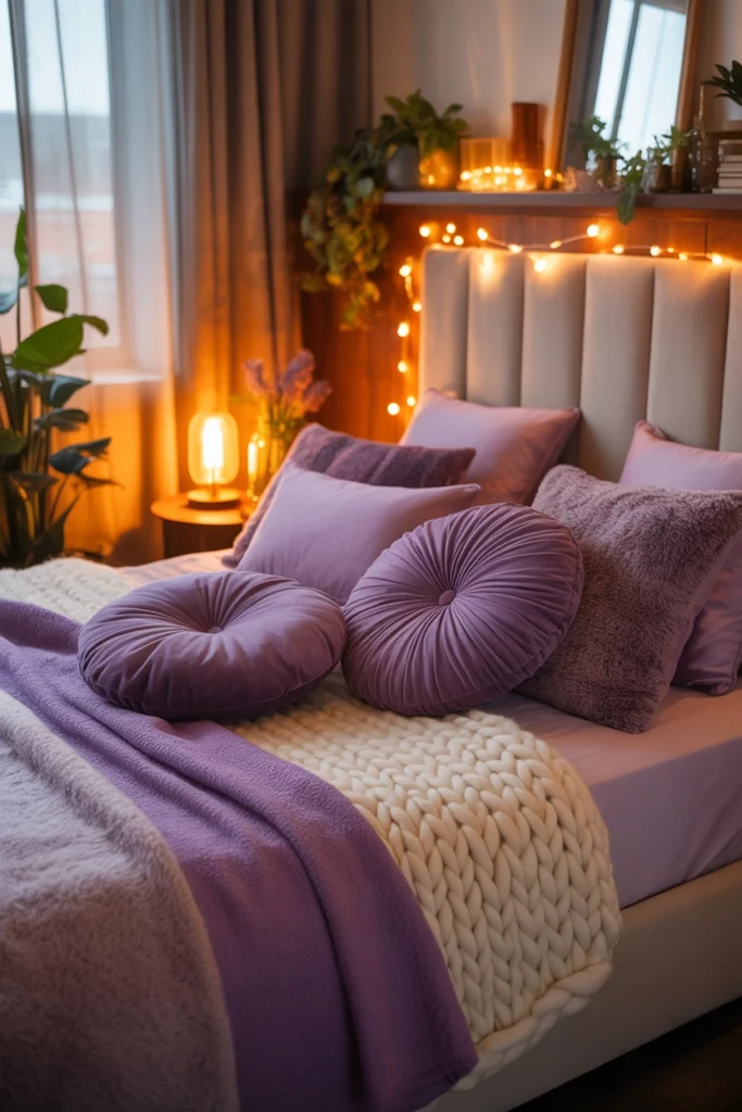
Use Soft Textiles to Make Purple Feel Warm and Inviting
Purple can read cool, so textiles do the heavy lifting of making it feel cosy. The rule of thumb: pair every smooth purple surface with something touchable. A lavender duvet wants a chunky knit throw across its foot. Mauve cushions want a velvet or bouclé companion. Silk-look pillowcases, beautiful as they are, will make a purple bedroom feel colder — save them for neutral rooms.
A rug does more than any other textile here. A soft-pile rug in a muted plum or even a neutral warm grey under the bed anchors the colour scheme and stops the palette floating. Size it so at least 45 cm of rug extends on each side of the bed; anything smaller reads as a postage stamp and cheapens the whole look.
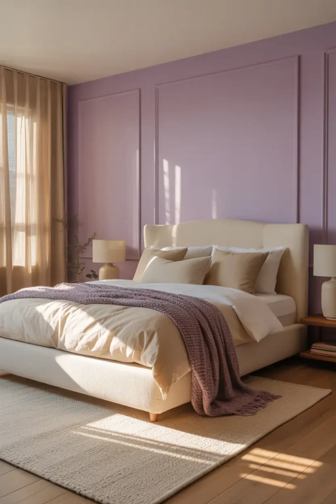
Pair Purple with Warm Neutrals for a Balanced and Relaxing Look
Purple needs a partner that calms it down, and warm neutrals — ivory, warm beige, oat, soft white — do it best. Aim for roughly a 70/30 split: seventy percent neutrals across walls, bedding base, and large furniture, thirty percent purples in layers and accents. That ratio keeps the room serene while letting the colour be the thing you notice and love.
Avoid pairing purple with stark, blue-white bedding or chrome-heavy furniture; the cold contrast makes lavender look grey and tired. Warm wood tones — oak, ash, walnut — are the ideal bridge material. Even a simple oak bedside table between purple bedding and a plum lamp shade makes the whole composition sit together.
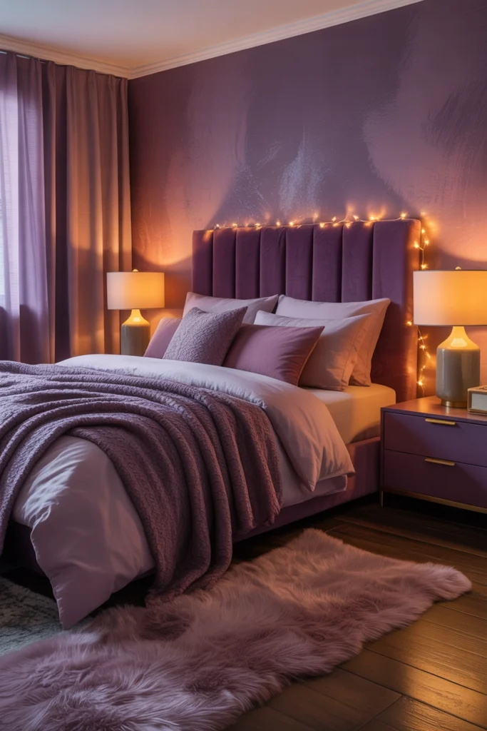
Use Soft, Warm Lighting to Bring Out Purple’s Cozy Side
Lighting decides whether your purple bedroom feels like a sanctuary or a cave. Purple absorbs light aggressively, so a single overhead fitting will make the walls look muddy by evening. Instead, layer: a warm-white bedside lamp on each side of the bed (2700K bulbs), plus one low ambient source — a small table lamp on a dresser or an LED strip behind the headboard.
Keep bulb colour temperature at 2700K or warmer. Anything at 4000K or above — typical “daylight” bulbs — flattens lavender into a flat grey and kills the cosy effect entirely. If your bedroom has only an overhead light, a dimmer switch is the single cheapest upgrade you can make; a quality dimmer costs less than a takeaway and changes the room more than new cushions would.
Bring In Wooden and Natural Elements to Ground the Colour
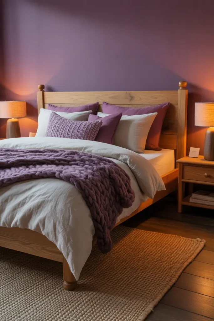
Purple is an unapologetically artificial colour — it barely exists in nature — which is exactly why natural materials balance it so well. A wooden bed frame, a woven seagrass basket for extra throws, or linen curtains with visible texture all pull the room back toward the real world. Without them, a purple bedroom can feel like a showroom set.
You do not need much. Two or three natural pieces is plenty: think oak nightstands, a rattan laundry basket, and one trailing plant like a pothos on a shelf. The plant is doing double duty here — green is purple’s complement on the colour wheel, so even a small one makes the purples look richer by contrast.
Keep Decor Minimal So the Colour Feels Intentional
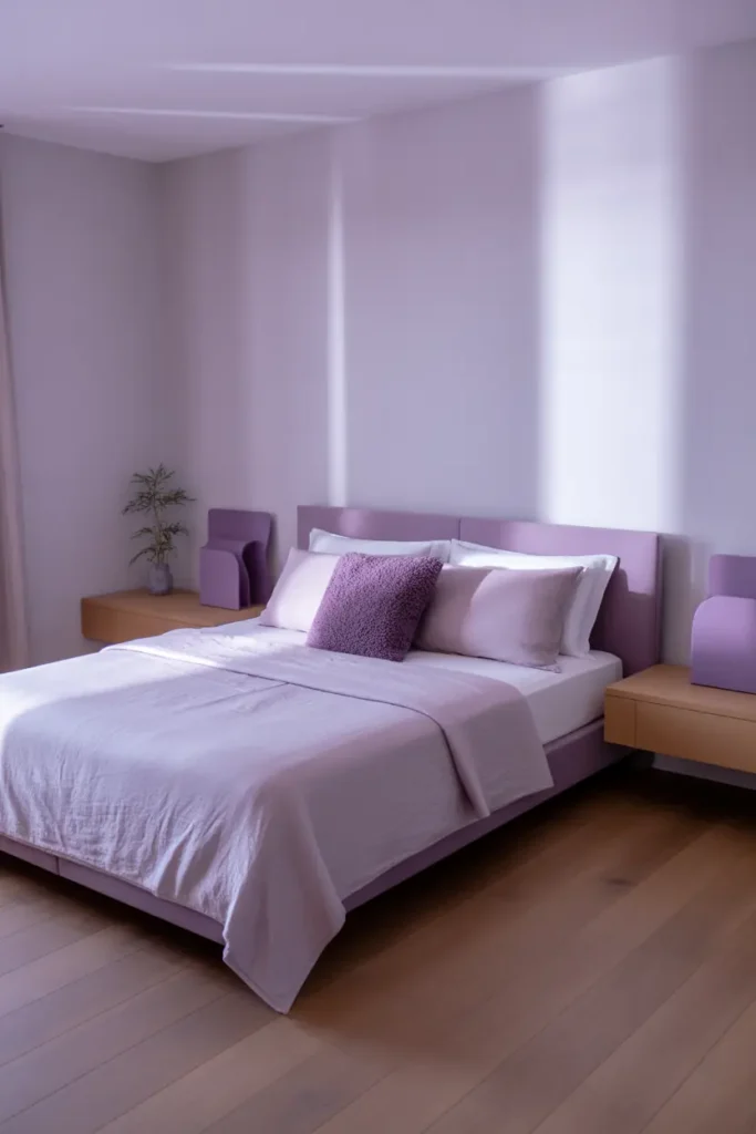
A strong colour choice is an argument for restraint everywhere else. When purple is doing the talking, every extra object competes for attention. Edit your surfaces down to one or two meaningful pieces per surface: a stack of books and a candle on the nightstand, a single framed print above the dresser. Gallery walls, in a purple bedroom, almost always look busy.
The test is simple: stand in the doorway and notice the first three things your eyes land on. If all three are purple-adjacent and calm, you are done. If a bright phone charger, a pile of laundry, and a half-read magazine are in the mix, the colour scheme is not the problem — the clutter is. Closed storage is worth more than any cushion.
Add Personal Touches That Make It Yours
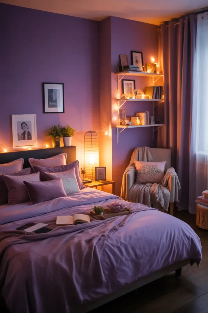
The difference between a styled bedroom and a loved one is evidence of a person. That does not mean clutter — it means one or two things that could not belong to anyone else: the blanket your grandmother knitted, a framed photo from a trip, a well-worn paperback on the nightstand. Purple is a romantic colour; it pairs beautifully with sentiment.
Resist the urge to buy a “purple bedroom decor set.” Coordinated sets look finished in the worst way — flat and impersonal. A room that evolved over time, with one inherited piece or one thing you made yourself, will always feel warmer than a room that arrived in three delivery boxes.
Related Decor Ideas
- Cozy Bedroom Decor Ideas That Feel Warm and Relaxing
https://howdecor.com/minimalist-bedroom-ideas
Conclusion
A purple bedroom works when the colour is treated as atmosphere rather than decoration: dusty walls, three layered values, warm textiles, and neutrals doing the quiet supporting work. Get the undertone matching right and the lighting warm, and purple stops being a risk — it becomes the reason the room is your favourite place in the house.
Pro Tips
- Sample on the wall, not the chip: Purple shifts dramatically between paint chip and painted wall. Always test two sample pots in both daylight and lamplight before buying a full tin.
- The 70/30 rule: Keep roughly seventy percent of the room in warm neutrals and thirty percent in purples. This ratio keeps the colour feeling intentional instead of overwhelming.
- Warm bulbs only: Use 2700K bulbs throughout a purple bedroom. Cool daylight bulbs drain the warmth out of lavender and plum.
- One deep plum accent is enough: A single deep-plum velvet cushion or lamp shade gives the room its anchor. Two or three and the scheme tips from cosy to heavy.
FAQs
Does purple work in a small bedroom?
Yes — as long as you keep the values light. Pale lavender or dusty lilac on the walls actually recedes, making walls feel further away. Save deep plum for accents only; large areas of dark purple in a small room will close it in.
What colours go best with a purple bedroom?
Warm neutrals are the safest partners: ivory, warm beige, oat, and soft white. For materials, warm woods like oak and walnut bridge the gap beautifully. Avoid stark white and chrome, which make purple look grey and cold.
Is purple too feminine for a shared bedroom?
Not when you lean into the dustier, greyer end of the spectrum. Smoky mauve and deep plum read as moody and sophisticated rather than feminine — especially paired with walnut, black metal, and linen instead of blush and velvet.
How do I stop purple walls looking flat?
Layer three values of purple across the room (light walls, mid-tone soft furnishings, one deep accent) and add texture at every level — knit, velvet, linen, wood. Flatness comes from one shade plus smooth surfaces, so texture is the fix.

HowDecor is a home decor blog sharing simple, practical decorating ideas for everyday spaces. We believe a beautiful home should feel comfortable, personal, and full of warmth — and that great style does not require a huge budget. Our goal is to inspire readers to create spaces that feel peaceful, welcoming, and truly their own — one room at a time.