Blush pink and black should not work together. One is the colour of nurseries and wedding invitations; the other is the colour of leather jackets. And yet, in a living room, they are one of the most reliable pairings in modern design — because each fixes the other’s worst habit. Blush keeps black from going gloomy. Black keeps blush from going saccharine.
The whole game is proportion and temperature. Too much black and the room feels like a nightclub; too much blush and it feels like a boutique hotel lobby. Done right — roughly eighty percent soft blush and neutrals, twenty percent black in sharp, deliberate hits — the result is calm, confident, and quietly expensive-looking. Here is how to land it.
Start with Blush Pink as a Soft, Neutral Foundation
Treat blush as a neutral, not a colour. That mental shift changes everything: instead of “a pink sofa,” think “a warm-toned neutral sofa.” A blush sofa, armchair, or even just blush walls at a barely-there saturation gives the room a warmth that beige never quite manages, while staying pale enough to live with long-term.
If you are nervous about commitment, do not start with the sofa. Start with the rug or the curtains — large but replaceable. Live with blush at that scale for a month. If you still love it, then consider the bigger pieces. A full blush sofa is a five-to-ten-year decision; a blush rug is a weekend one.
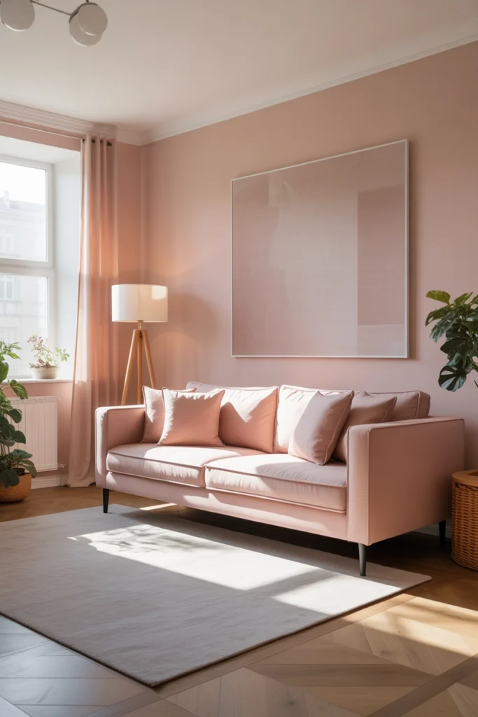
Introduce Black Through Small, Deliberate Accents
Black earns its place in small doses: a matte-black floor lamp, slim black picture frames, the legs of a coffee table, a black tray on the ottoman. These hits of darkness give the eye somewhere to land and stop the blush from dissolving into one big soft blur. Think of black as punctuation, not prose.
The rule that never fails: distribute, do not cluster. One black lamp on the left and one black frame on the right balances the room; five black objects on one shelf looks like a mistake. Spread your black accents across at least three different zones of the room and the palette will feel intentional.
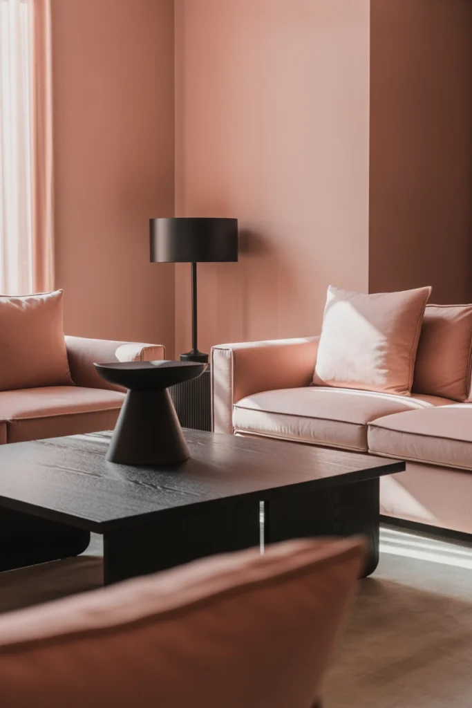
Layer Textures So Softness and Contrast Blend Naturally
Blush and black is a high-contrast pairing, and contrast without texture feels stark. Soften the meeting points: a blush velvet sofa wants a black knit throw, not a black leather one. A black metal floor lamp wants a fabric shade, not a bare bulb. Every hard black edge should be near something soft.
Mix at least three textures across the room — for example, velvet (sofa), bouclé or wool (cushions), and natural fibre (jute rug or linen curtains). This layering is what separates a designer-looking room from a flat catalogue photo. It also makes the space physically more comfortable to sit in, which is the whole point of a living room.
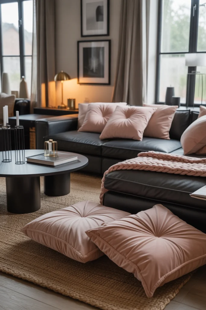
Keep the Walls Light to Stay Airy
With two strong personalities in the furniture, the walls should referee, not compete. Warm white, ivory, or the palest blush — barely a whisper of colour — keeps the room bright and lets the furniture pairing do the talking. This matters doubly in north-facing rooms, where grey-white walls plus black accents can turn the whole space cold.
One exception: a single feature wall in a deep, muted tone — charcoal or warm greige — can look spectacular behind a blush sofa, making the pink glow by contrast. But commit to only one wall. Two dark walls with black furniture accents will shrink the room fast.
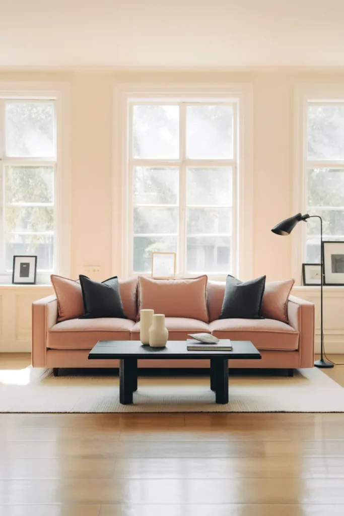
Use Warm Lighting to Soften the Contrast
This palette lives or dies by lighting. Cool white bulbs make blush look washed out and black look harsh; warm 2700K light makes blush glow and black recede into elegant shadow. If your living room currently runs on one overhead fitting, adding two warm table or floor lamps will transform the pairing more than any new furniture would.
Position at least one warm light source near your main black accent. Light grazing across a black lamp base or black-framed art softens its edges and makes it feel integrated rather than pasted on. Dimmers are worth every penny here — blush pink at half-light in the evening is genuinely beautiful.
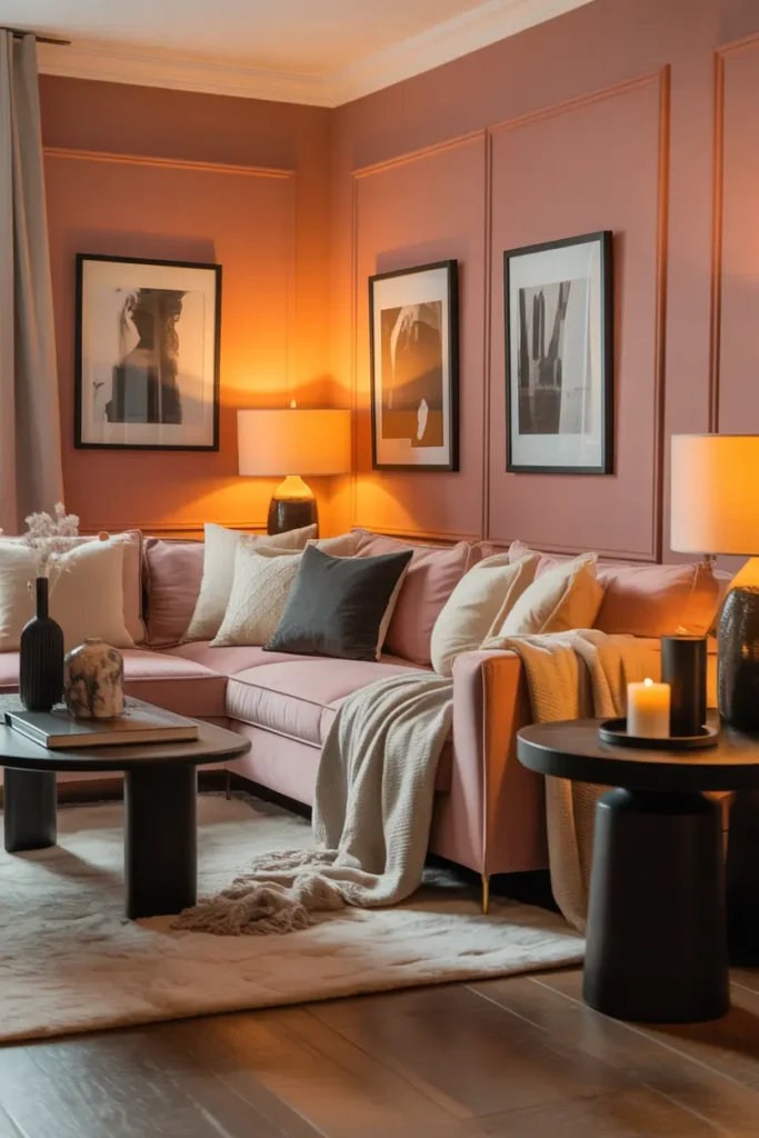
Add Slim Black Lines for a Clean, Modern Edge
Thin black lines — a slim-framed mirror, black curtain rod, the edge of a shelving unit — add structure without weight. They read as drawing lines around the room, giving the soft blush shapes definition. This is the trick behind most “expensive-looking” pink-and-black rooms you see online: the black is doing architectural work, not furniture work.
Keep these lines consistent in finish. Mixing matte black, glossy black, and blackened bronze in one room looks accidental. Pick one — matte black is the safest and most modern — and repeat it at least three times so it reads as a deliberate choice.
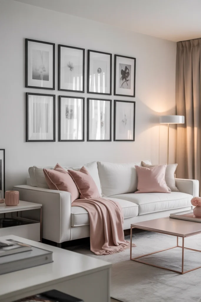
Balance Colour Placement Across the Room
The most common failure mode: all the blush on the sofa, all the black on one side of the room. The result feels lopsided, like the room is leaning. Instead, think in triangles. Blush sofa on one side, blush cushions or throw on the opposite chair, blush tones in the rug underfoot — the colour should appear at three heights and three positions.
Do the squint test: squint at the room from the doorway until details blur. You should see blush and black distributed fairly evenly across your field of vision. If one corner is all dark and another all pale, shuffle pieces until the balance evens out. It takes ten minutes and fixes more rooms than any purchase.
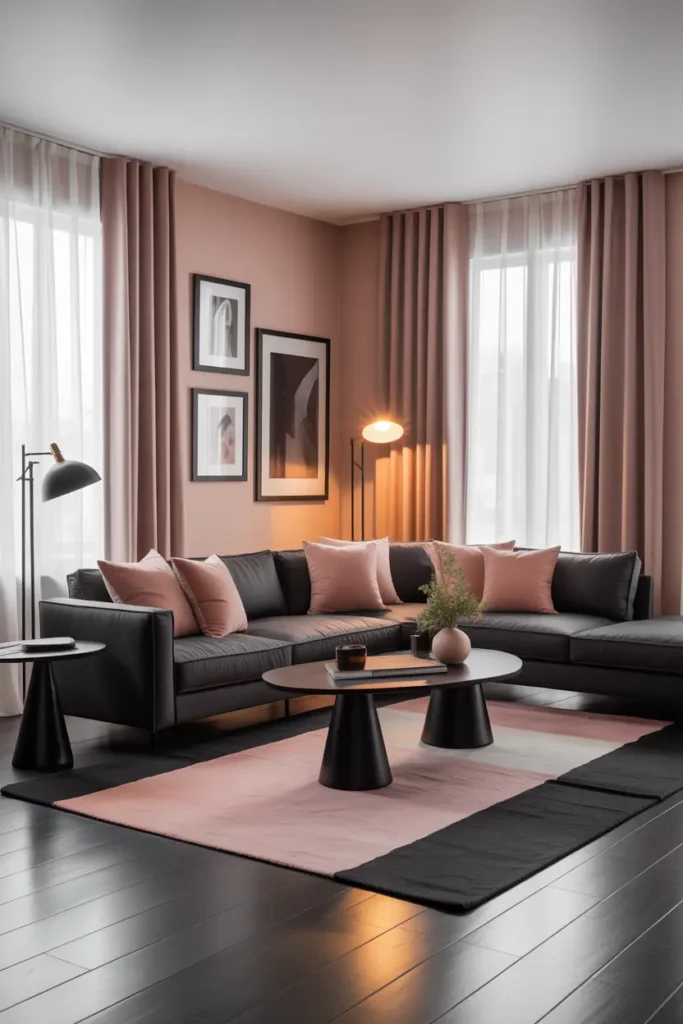
Keep Decor Minimal and Let the Pairing Speak
When the colour pairing is this strong, extra decoration is noise. Edit surfaces down hard: one beautiful object per surface, not five pretty ones. A blush-and-black room with a clear coffee table looks confident; the same room with the table covered in trays, books, candles, and a plant looks like it is apologising for the palette.
This restraint also makes the room easier to live in. Fewer objects means less dusting, less visual noise in the evening, and a space that still looks composed when real life — laptops, mugs, blankets — inevitably moves in.
Related Decor Ideas
- Modern Living Room Decor Ideas That Feel Stylish and Comfortable
https://howdecor.com/modern-living-room-decor-ideas - Small Living Room Ideas That Make Your Space Look Bigger
https://howdecor.com/small-living-room-ideas
Conclusion
Blush pink and black work because they are opposites that behave: softness held in check by structure, darkness warmed by glow. Keep the blush dominant, the black distributed and deliberate, the lighting warm — and the pairing that should not work becomes the room everyone comments on.
Pro Tips
- The 80/20 split: Aim for roughly eighty percent blush and light neutrals, twenty percent black. This keeps black as punctuation rather than a second dominant colour.
- Matte black, consistently: Use one black finish — matte — repeated at least three times. Mixed finishes look accidental.
- Do the squint test: Blur your vision from the doorway; blush and black should be evenly spread. Lopsided colour is the most common mistake.
- Warm bulbs are non-negotiable: 2700K lighting makes this palette glow. Cool bulbs make it look flat and cheap.
FAQs
Will blush pink make my living room look childish?
Only if it is paired with white and pastels, which pushes it toward nursery territory. Black is the antidote: even a few black accents — frames, a lamp, table legs — immediately make blush read as sophisticated rather than sweet.
How much black is too much in a blush room?
When black starts forming large continuous areas — a black sofa, black rug, and black curtains together — it has taken over. Keep black to accents and lines: frames, lamp bases, trays, legs. If you can cover every black item with your hands from across the room and the room still reads blush, the balance is right.
What wall colour works with blush pink and black?
Warm white or ivory is the safest choice and keeps the room bright. For drama, one feature wall in charcoal or warm greige behind the sofa makes blush glow. Avoid grey-white in north-facing rooms — it turns the palette cold.
Can this palette work in a small living room?
Yes, and it is actually well suited to small rooms: pale blush keeps walls feeling open while black accents add depth that stops the room feeling washed out. Just keep the black pieces slim and few — bulky black furniture will dominate a compact space.

HowDecor is a home decor blog sharing simple, practical decorating ideas for everyday spaces. We believe a beautiful home should feel comfortable, personal, and full of warmth — and that great style does not require a huge budget. Our goal is to inspire readers to create spaces that feel peaceful, welcoming, and truly their own — one room at a time.