Cream, gold, and burgundy is the palette of old European hotels — the kind with heavy curtains and a chandelier in the lobby. The challenge is capturing that richness without the heaviness, and the answer is discipline: cream does the volume, gold does the glint, and burgundy is rationed like a spice.
This combination fails when the ratios are wrong. Too much burgundy and the room feels like a wine cellar; too much gold and it feels like a showroom. The proportions that work — and that you will see in every successful version of this room — are roughly seventy percent cream and light neutrals, twenty percent burgundy, ten percent gold. Memorise that, and the rest is detail.
Build the Foundation in Cream
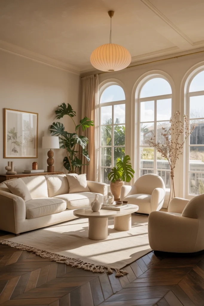
Start with the largest pieces in cream: the sofa, the armchairs, the rug base. Cream upholstery reflects light beautifully, which is why rooms in this palette glow even on grey days. Choose performance fabrics — stain-resistant weaves or treated linen — because cream shows everything, and a beautiful cream sofa you are afraid to sit on is a failed purchase.
Watch the undertone. Cream ranges from yellow-warm to pink-warm to almost grey, and your burgundy needs to harmonise with it. Hold burgundy fabric samples against the sofa in daylight: if the cream suddenly looks dirty or yellow next to the burgundy, the undertones are fighting. A warm, buttery cream is the most forgiving partner for burgundy.
Use Gold as a Highlight, Not a Theme
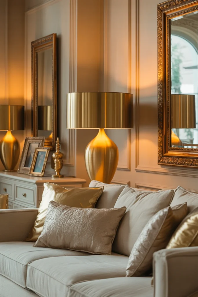
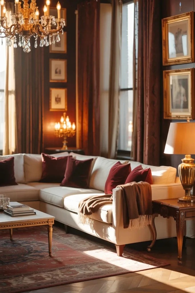
Gold should behave like candlelight in the room — present in glints, never in sheets. A brass floor lamp, a gold-framed mirror, the edge of a picture frame, a small tray. Four to six small gold moments across the room is plenty. A gold sofa, gold curtains, and gold wallpaper together is not luxury; it is a theme park.
Brushed brass and antique gold beat polished gold every time in a living room. Polished gold reflects hard and reads flashy; brushed finishes catch light softly and feel expensive. If you already own polished-gold pieces, place them where light hits indirectly — on a shaded side table rather than opposite a window.
Ration the Burgundy Like a Spice
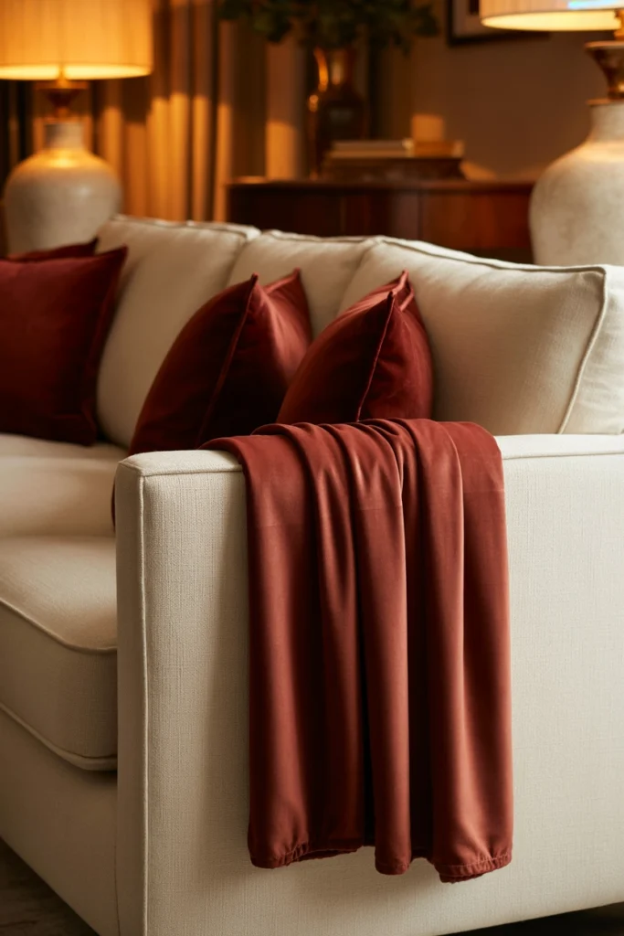
Burgundy is the colour people fall in love with and then overuse. It belongs in textiles you can move: cushions, a throw, an ottoman, the seat of an accent chair. Keep it off the walls and off the largest furniture. A burgundy sofa is a fifteen-year commitment to one mood; burgundy cushions are a seasonal whim.
Velvet is burgundy’s best fabric — the pile catches light and gives the colour its famous depth. In flat cotton or linen, burgundy can look dull and brownish. So if you are buying burgundy, buy it in velvet: two velvet cushions and a velvet throw will do more than a whole burgundy armchair in the wrong fabric.
Layer Textures to Keep It Comfortable, Not Stuffy
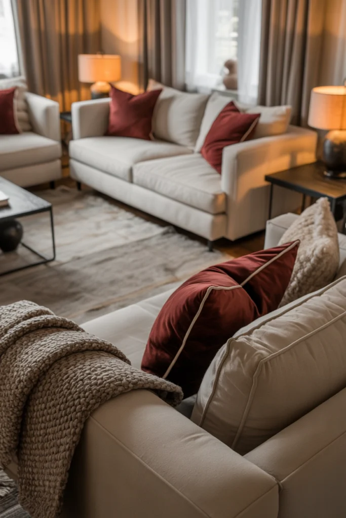
Rich palettes go stiff without texture contrast. If the sofa is smooth cream linen, add a nubby wool throw and a velvet cushion. If the rug is a flat weave, add a sheepskin draped over the armchair. The goal is that every seat invites touch — a room you want to sit in, not just look at.
This is also where you prevent the “hotel lobby” effect. Hotels keep everything matching and smooth; homes mix. A slightly worn leather ottoman, a handmade-looking ceramic vase, one imperfect vintage piece — these small irregularities are what make a rich palette feel lived-in instead of staged.
Keep Walls and Large Surfaces Light
With burgundy and gold in play, the walls must stay out of the way. Warm white, pale greige, or the very lightest warm beige. Dark walls plus burgundy furniture is technically possible but brutally unforgiving — it demands perfect lighting and generous square footage, and most living rooms have neither.
Ceilings matter too: keep them bright white, not the wall colour. In a rich palette, a white ceiling lifts the whole room and stops the burgundy from pressing down visually. It is a small detail that makes a disproportionate difference, and it costs nothing if you are painting anyway.
Arrange for Comfort, Not Just for Photos
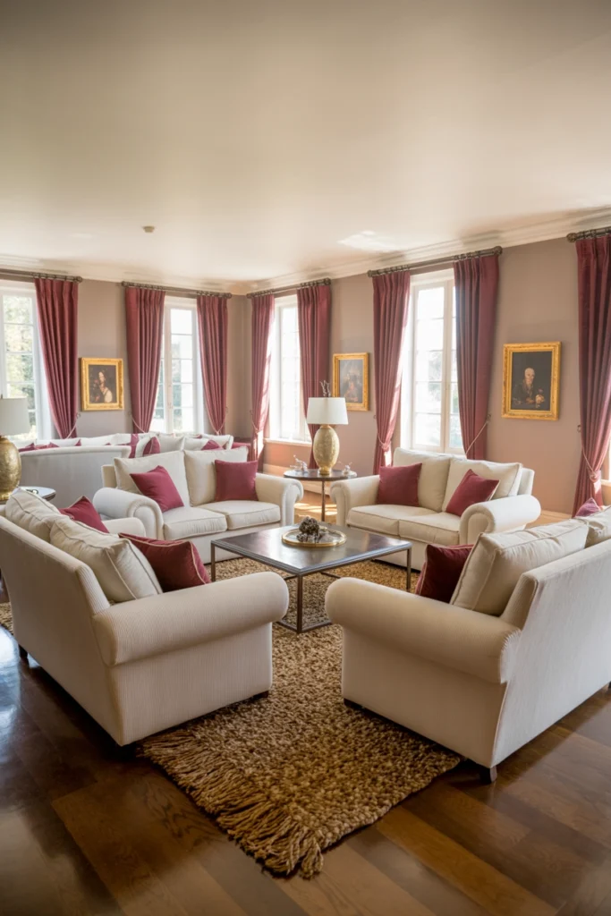
An elegant palette still has to survive Tuesday night. Arrange seating in a genuine conversation layout — chairs angled toward each other, not lined up like an audience — with a coffee table within easy reach of every seat (about 40 to 45 cm from the sofa edge is the comfortable standard). Leave clear walkways of at least 75 cm so nobody shuffles sideways.
And give the room one unstyled corner: a reading chair with a real lamp and a side table that is allowed to hold an actual book and an actual mug. Perfection everywhere is exhausting to live with. One honest corner makes the elegance feel like a choice rather than a performance.
Related Decor Ideas
- Small Living Room Ideas That Make Your Space Look Bigger
https://howdecor.com/small-living-room-ideas
Conclusion
Cream, gold, and burgundy rewards restraint: cream for volume, burgundy rationed in velvet, gold in glints, walls kept light, and furniture arranged for real evenings rather than photographs. Follow the 70/20/10 ratio and the palette does the elegant work on its own.
Pro Tips
- Memorise 70/20/10: Seventy percent cream and light neutrals, twenty percent burgundy, ten percent gold. Every successful version of this room follows roughly this split.
- Burgundy belongs in velvet: The colour needs pile to show its depth. In flat fabrics it reads dull; in velvet it glows.
- Buy performance fabric for cream: Cream shows every mark. Stain-resistant weaves let you actually use the sofa without anxiety.
- Check undertones in daylight: Hold burgundy samples against the cream sofa before buying. Clashing undertones make cream look dirty.
FAQs
Is burgundy too dark for a small living room?
Not if it stays in accents. A small room can absolutely carry burgundy cushions, a throw, and one ottoman — the cream foundation keeps it open. What a small room cannot carry is a burgundy sofa or burgundy walls; those will close the space in.
Gold or brass — which finish should I choose?
Brushed brass or antique gold. Polished gold reads flashy in daylight; brushed finishes catch light softly and look expensive. Keep one finish consistent across the room rather than mixing.
How do I keep cream furniture clean with kids or pets?
Choose performance fabrics with stain resistance built into the weave, keep washable throws on the most-used seats, and accept that cream will need a professional clean every couple of years. Darker cream — closer to oatmeal — hides far more than pale ivory.
Can I add burgundy to walls instead of furniture?
You can, but only on one wall and only in a room with strong natural light and generous proportions. In most living rooms, burgundy walls plus the rest of this palette is too much. Cushions and throws give you the colour with none of the risk.

HowDecor is a home decor blog sharing simple, practical decorating ideas for everyday spaces. We believe a beautiful home should feel comfortable, personal, and full of warmth — and that great style does not require a huge budget. Our goal is to inspire readers to create spaces that feel peaceful, welcoming, and truly their own — one room at a time.