Red is the colour everyone wants in their living room and nobody trusts themselves with. Fair enough — red has ruined more rooms than any colour except maybe purple. But here is the thing: the ruined rooms all made the same mistake. They used red as a theme instead of an accent, and they paired it with cold light and hard surfaces.
Used the way this guide describes — as warmth, in small doses, against calm neutrals and soft textures — red stops shouting and starts glowing. Think embers, not alarms. The difference is about restraint, temperature, and texture, and it is entirely learnable.
Build a Calm Neutral Base First
Red needs a quiet room to shine in. Warm white, soft beige, greige, or pale warm grey on walls and large furniture gives red something to contrast against without competing. Without this calm base, even small red accents look loud — it is the quiet around the colour that makes it feel rich rather than aggressive.
Keep the base warm, not stark. Cool greys and blue-whites make red look harsh and almost orange; warm neutrals make it look deep and expensive. If your room currently reads cool, warming the base — even just with a beige throw and warm bulbs — should come before any red arrives.
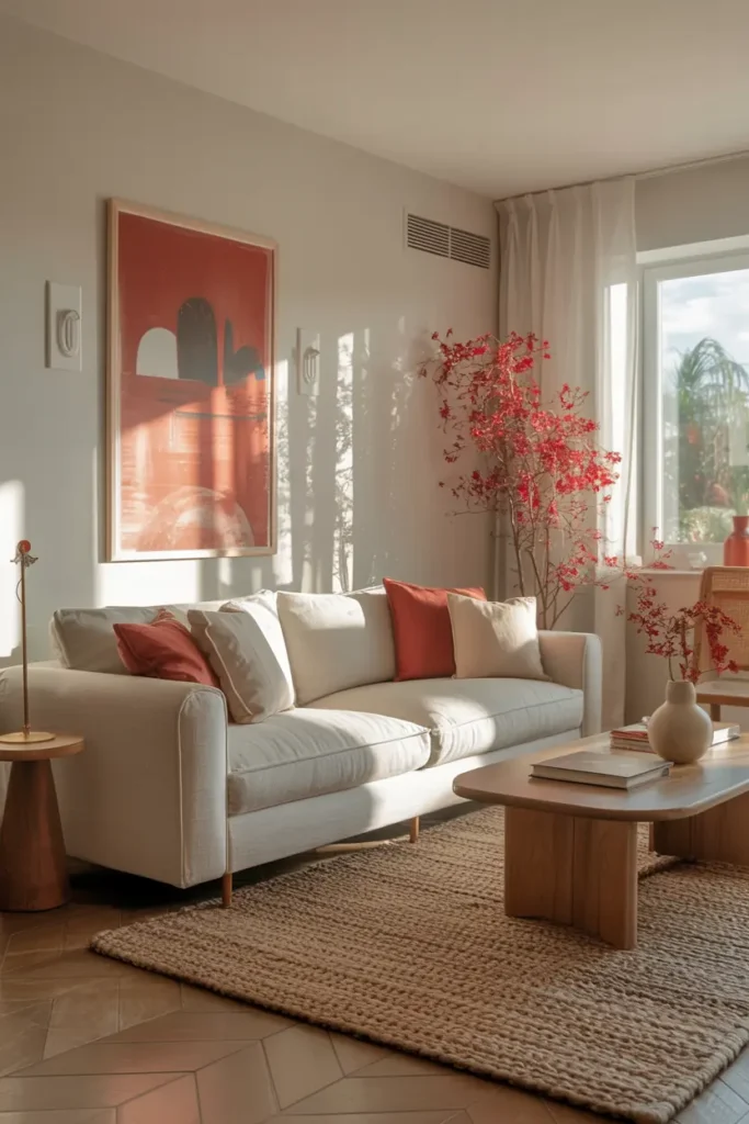
Add Red Cushions in Soft, Muted Tones
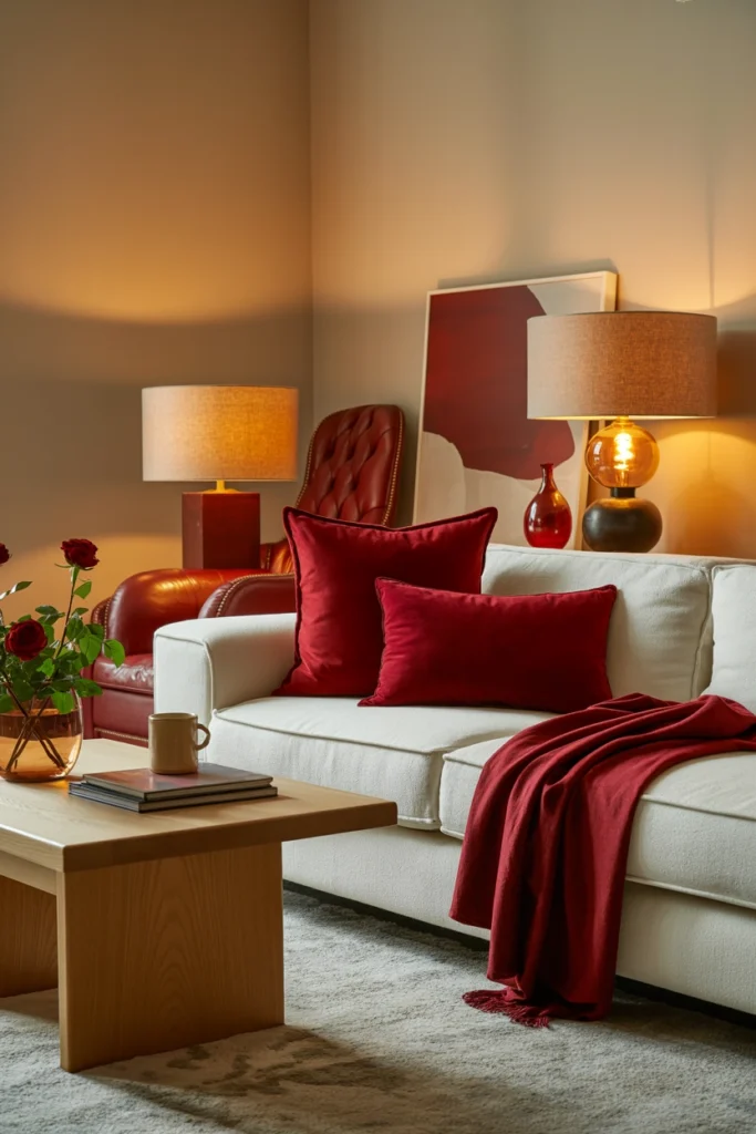
Cushions are the lowest-risk way to test red: cheap, movable, and easy to remove if you hate it. Skip primary red and go for the sophisticated end of the family — rust, terracotta, burgundy, muted brick. These shades carry all of red’s warmth with none of its aggression, and they age far better in daylight.
The formula that works: two cushions in your red tone, one in a neutral that matches the sofa, arranged asymmetrically. Symmetry (red-red-neutral-neutral) looks staged; a 2-1 grouping looks collected. And buy the inserts one size up from the covers — a 50 cm insert in a 45 cm cover gives that full, designer plumpness.
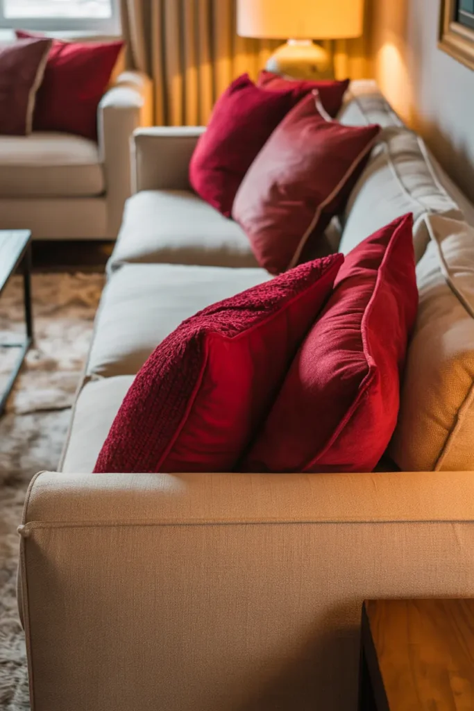
Drape a Red Throw for Instant Warmth
A throw is red at its most relaxed. Draped — not folded, not arranged — over the arm or back of a sofa, a rust or burgundy throw adds a lived-in warmth that no cushion can match. Wool or chunky knit is ideal; the texture breaks up the colour and keeps it from reading flat.
Placement matters more than people think. A throw folded into a perfect rectangle looks like a shop display. Toss it, let it fall where it falls, then adjust exactly once. That single adjustment is the difference between “effortless” and “messy” — everything after that is overthinking.
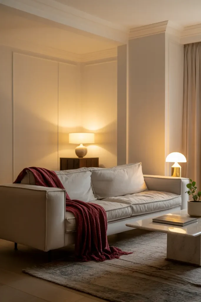
Let Artwork Carry the Red
If you want red’s energy without red’s commitment, let art do the work. A print or painting with red tones — even just 20 percent of the composition — introduces the colour at eye level, where it has maximum impact, while the frame and wall keep it contained and intentional.
Scale is the common mistake: art that is too small for the wall it hangs on. Above a sofa, art should span roughly two-thirds the sofa’s width. One generous piece with red in it will do more than three small red prints scattered around the room.
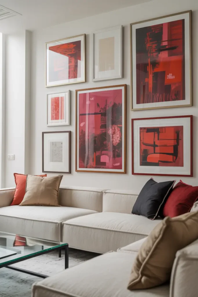
Warm Up the Lighting
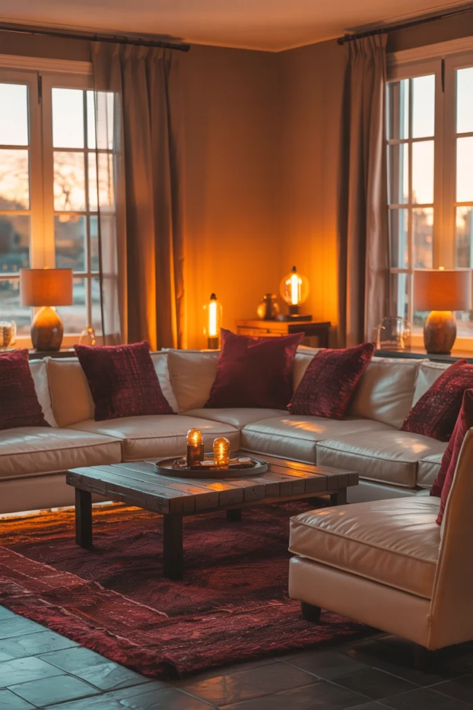
Red under cool light looks alarming; red under warm light looks like candlelight. This is not subtle — it is the single biggest factor in whether red accents feel cozy or aggressive. Swap any daylight bulbs (4000K+) for warm 2700K, and add at least one lamp with a fabric shade near your main red pieces.
Evening is when red earns its keep. Under warm lamplight, rust cushions and burgundy throws deepen into something almost edible — rich, enveloping, calm. If your red accents look wrong, check the bulbs before blaming the colour. Nine times out of ten, it is the light.
Ground Red with Natural Materials
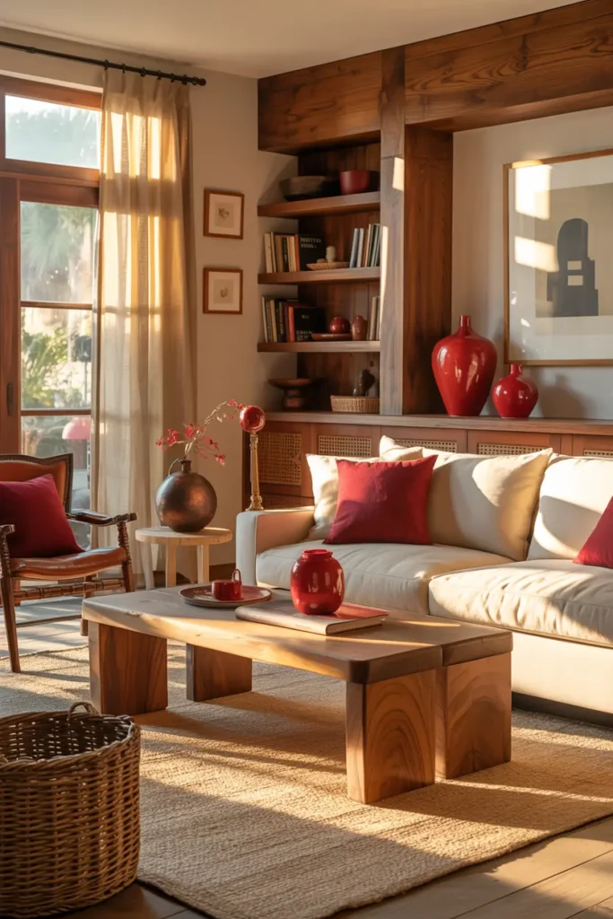
Red is an intense, artificial-feeling colour, and natural materials are its best friend. Oak, walnut, linen, jute, wool — these textures absorb some of red’s visual energy and return it as warmth. A rust cushion on a linen sofa next to an oak coffee table is a completely different experience from the same cushion on a grey synthetic sofa.
You do not need to redecorate to get this effect. A jute rug underfoot, a wooden tray on the coffee table, linen curtains instead of synthetic ones — three natural textures near your red accents will transform how the colour feels. Think of naturals as the soil red grows in.
Keep Red to a Few Controlled Pieces
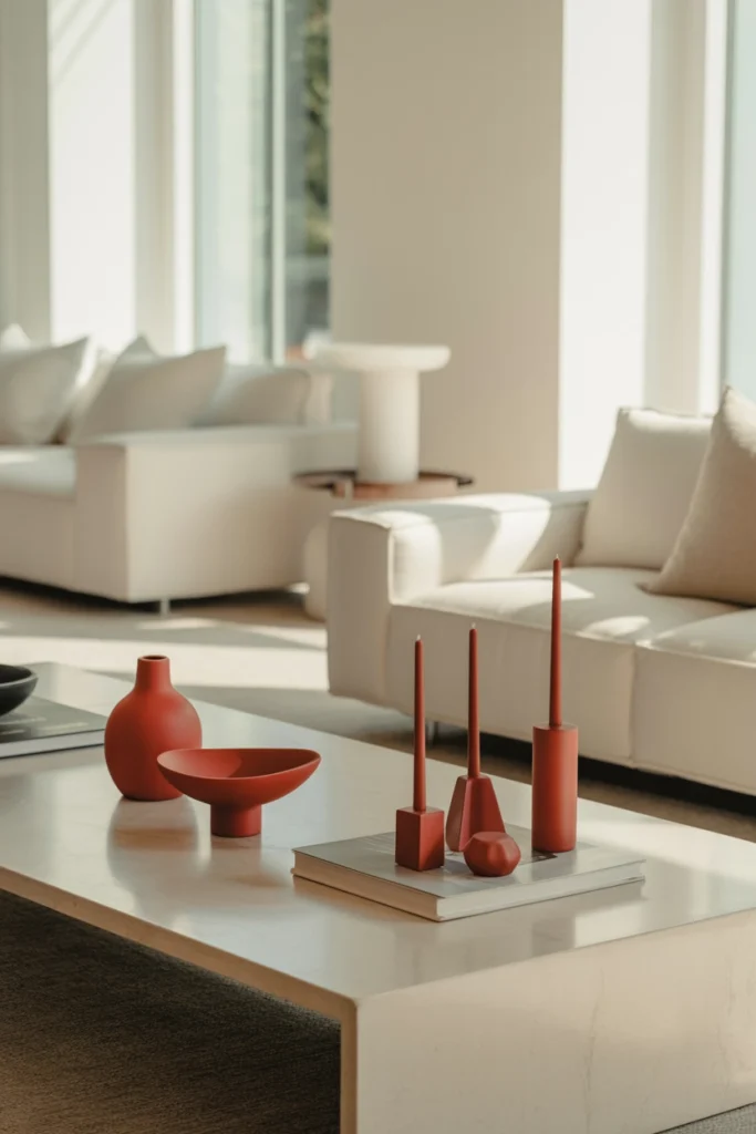
Beyond cushions, a throw, and art, add red in small, hardworking details: a ceramic vase, a stack of books with red spines, a tray, a candle. These are the punctuation marks — each one small, each one deliberate. Five small red objects spread across the room beat one large red object every time.
Give each red piece breathing room. A red vase crammed between five other objects disappears; the same vase with empty space around it becomes a focal point. Red needs negative space around it to be appreciated — crowd it and it just becomes noise.
Soften Everything with Texture
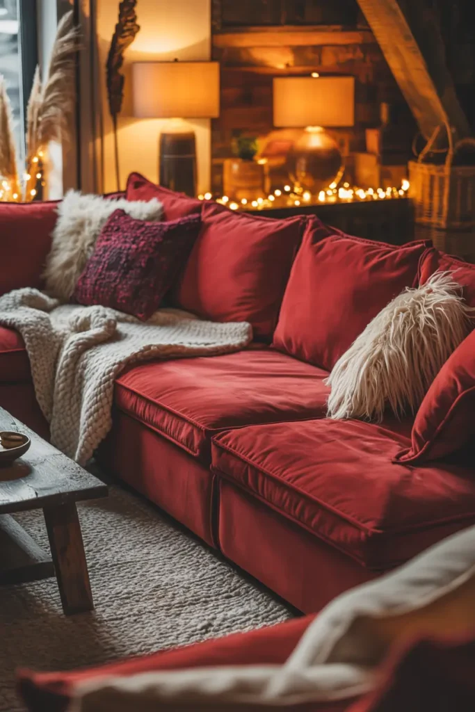
Texture is what turns red from “bold choice” into “warm room.” Velvet cushions, a wool throw, a nubby rug — soft surfaces absorb light and make red feel touchable rather than shouty. Hard, shiny red (lacquer, plastic, patent) is what gives the colour its aggressive reputation; soft red barely resembles it.
Aim for at least three different textures in your red story: for example, velvet cushions, a knit throw, and a woven rug. This variety keeps the eye moving across surfaces instead of stopping hard on the colour, which is exactly how “warm” happens visually.
Edit Ruthlessly Around the Colour
Strong colour plus lots of stuff equals chaos. When red is in the room, everything else should be quieter than usual: fewer objects on surfaces, simpler patterns, calmer art elsewhere. This is not minimalism for its own sake — it is giving red the stage it needs.
The one-in-one-out rule works well here. Every time a new object enters the living room, something else leaves. It sounds strict, but it is the only way to keep a room with a strong accent colour from slowly reverting to clutter.
Arrange Seating for Real Life
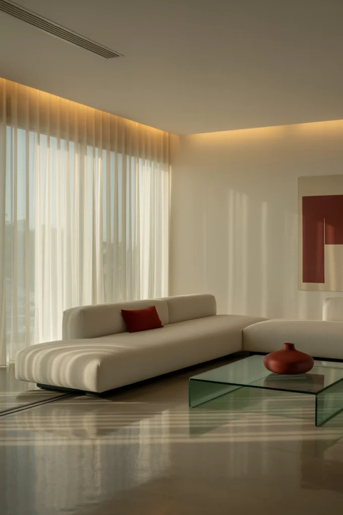
All the colour theory in the world fails if the layout is uncomfortable. Pull seating into a genuine conversation arrangement — nothing more than about 2.5 metres between the furthest seats — with the coffee table close enough to actually use (40 to 45 cm from the sofa). Red feels warmest when people are actually sitting in the warmth.
And leave one chair slightly angled, slightly imperfect. A room arranged with mathematical precision feels like a showroom no matter the colour. One chair at a human angle says people live here — and lived-in is the whole point of warm.
Related Decor Ideas
- Small Living Room Ideas That Make Your Space Look Bigger
https://howdecor.com/small-living-room-ideas
Conclusion
Red does not have to shout. Kept to muted tones, softened by texture, warmed by 2700K light, and grounded in natural materials, it becomes the most emotionally generous colour in the living room — warmth you can feel from the doorway.
Pro Tips
- Choose muted reds: Rust, terracotta, burgundy, and brick outperform primary red in every living room. They carry warmth without aggression.
- Check the bulbs first: If red looks wrong, it is almost always the lighting. Warm 2700K bulbs transform red; daylight bulbs ruin it.
- Buy inserts one size up: A 50 cm insert in a 45 cm cover gives cushions the full, plump look that makes any colour scheme look expensive.
- Five small beats one large: Spread red across several small pieces rather than one big one. Distributed colour feels intentional; concentrated colour feels like a theme.
FAQs
What is the safest red shade for a living room?
Rust or terracotta. They are warm, earthy, and forgiving in all lights, and they pair naturally with the beige, wood, and linen most living rooms already have. Burgundy is the next step up in drama; primary red should be reserved for tiny accents only.
How much red should I use?
Think in pieces, not percentages: two to three cushions, one throw, one piece of art, and two to three small objects. If you can count your red items on one hand with fingers to spare, you are in the safe zone.
Does red work with grey sofas?
Yes, but the grey must be warm. Warm greige plus rust is a classic combination. Cool blue-grey plus red can look harsh — if your sofa is cool grey, warm up the room first with beige textiles and warm lighting before adding red.
Can I use red in a small living room?
Absolutely — small rooms actually suit red well, because the colour adds depth that stops the room feeling washed out. Keep it to soft textiles and small objects, keep the base light, and let warm lighting do the heavy lifting in the evening.

HowDecor is a home decor blog sharing simple, practical decorating ideas for everyday spaces. We believe a beautiful home should feel comfortable, personal, and full of warmth — and that great style does not require a huge budget. Our goal is to inspire readers to create spaces that feel peaceful, welcoming, and truly their own — one room at a time.