Most colourful living rooms fail for the same reason most diets fail: too much, too fast, no plan. Someone buys a yellow sofa, a blue rug, and patterned curtains in one weekend, and the room ends up looking like a sweet shop exploded. The tragedy is that colour is the most joyful tool in design — it just needs a method.
The method is simpler than you think. One dominant colour, a calm base underneath it, secondary colours in small washable doses, and texture everywhere to take the edge off. Follow that order and you get a room that feels alive instead of chaotic — playful, warm, and completely liveable.
Build the Calm Base First
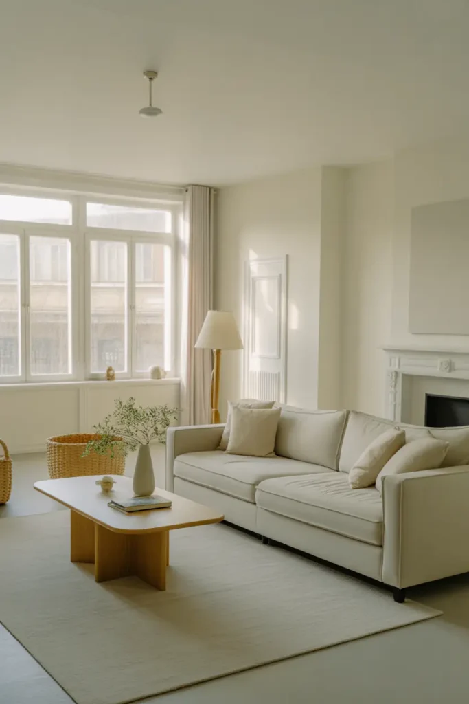
Every great colourful room is secretly a neutral room wearing jewellery. Walls in warm white or pale greige, a neutral sofa or neutral walls with one colourful anchor — the base is what lets the colours read as choices instead of accidents. Without it, colours fight each other and the loudest one wins.
This base is also your insurance policy. Tastes change, and a neutral base means next year’s palette is a cushion-and-throw project, not a reupholstery project. The most colourful rooms you admire online almost always have boring bones. Boring bones, brave accessories — that is the whole secret.
Choose One Dominant Colour and Commit
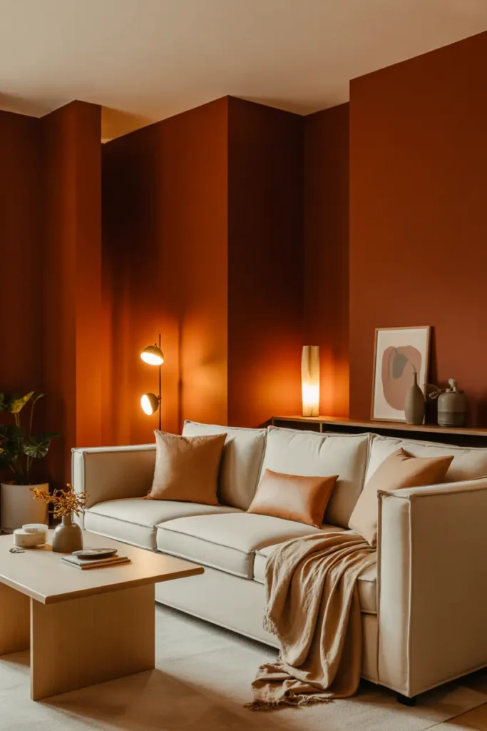
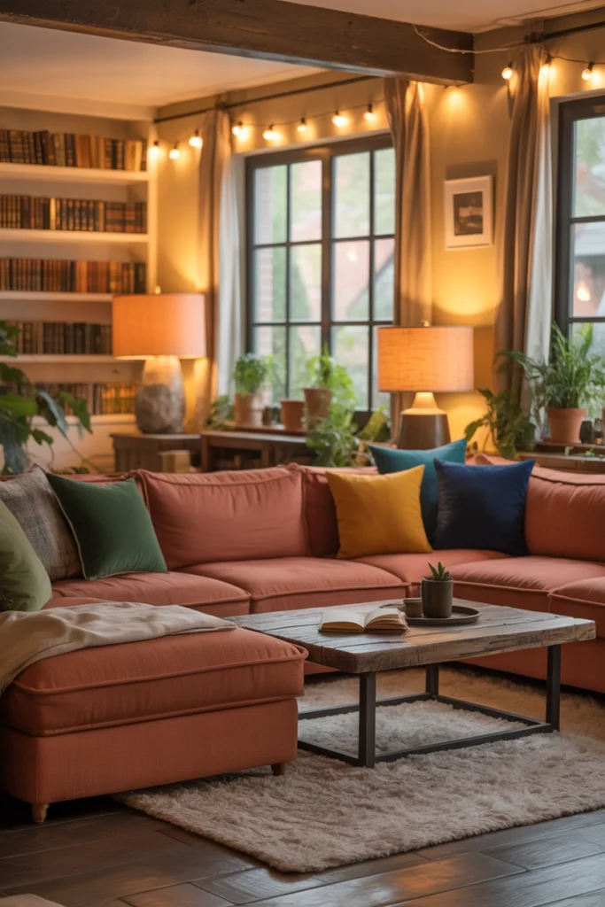
Pick the colour that will own roughly sixty percent of the colour in the room — not sixty percent of the room, just of the colour. Terracotta, deep teal, mustard, forest green: one clear leader. This dominant shade appears in the largest colourful items (sofa, rug, curtains) and sets the emotional temperature.
Test your dominant colour in the actual room light before committing. Colours shift violently between shop lighting and home lighting — that perfect teal can go muddy, that mustard can go neon. Live with a large fabric sample for a week, in daylight and lamplight, before the big purchase.
Layer Secondary Colours in Small Doses
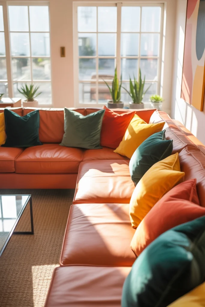
Once the leader is established, add two secondary colours in small, movable doses: cushions, throws, books, a plant pot, art. If your dominant is teal, secondaries might be mustard and blush; if terracotta, try sage and cream. Keep secondaries to items you could gather in one laundry basket — that scale keeps them playful, not dominant.
The two-secondary rule matters. One secondary feels like an accent; two feels like a palette; three starts to feel like a rainbow. Discipline here is what separates “designed” from “decorated by a toddler.” You can always add a third later, once the first two have settled.
Soften Bold Colour with Texture
Colour without texture is just paint — flat and loud. Texture is what makes bold colour feel like a home: velvet cushions that catch light differently across their surface, a chunky knit throw that breaks up a solid sofa, a jute rug under a patterned one. Every textured surface gives the eye somewhere to rest inside the colour.
This is especially critical with saturated colours. A flat, smooth mustard sofa shouts; the same mustard in a textured weave or velvet murmurs. If a colour feels too aggressive in your room, do not remove it — retexturise it. Swap the smooth version for a nubby, woven, or piled one and watch it calm down.

Give the Room One Star
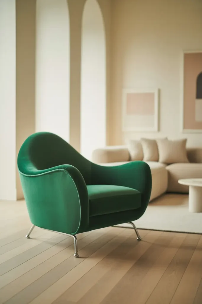
Every colourful room needs a protagonist: one piece that is unapologetically bold and gets the spotlight. A cobalt sofa, a massive abstract canvas, a hot-pink armchair. Everything else is the supporting cast. Rooms without a star feel scattered; rooms with two stars feel like they are arguing.
Place the star where the eye lands first — usually facing the doorway or at the end of the longest sightline. Then deliberately quiet everything around it: simpler shapes, calmer colours, less pattern within a metre or two. Stars need empty sky around them to shine.
Leave Calm Zones for the Eye to Rest
The secret ingredient of every successful colourful room is the part with no colour in it. A neutral reading corner, a plain wall, an unpatterned stretch of sofa — these calm zones are what make the colourful parts feel exciting rather than exhausting. Contrast needs quiet to be legible.
Plan at least one genuinely calm sightline: stand at the doorway and find one direction with minimal colour. If every direction is busy, edit until one is not. Your nervous system will thank you, and paradoxically, the colours will look bolder against the calm.
Light Colour Warmly and Carefully
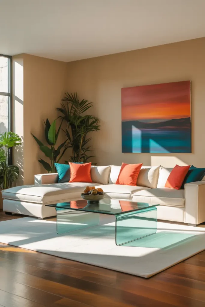
Lighting is colour’s editor. Warm 2700K light deepens and enriches most colours; cool light washes them out or turns them garish. But note the exception: very warm light can push yellows and oranges toward muddy, so if your palette is heavy on amber tones, test at 3000K as a compromise.
Use directional light to feature your star piece — a picture light over art, a floor lamp angled at the bold sofa. Lit colour glows; unlit colour just sits there. And always check your palette at night under the actual lamps before finalising; colours you love at noon can surprise you at 9pm.
Mix Patterns Like a Chef, Not a Gambler
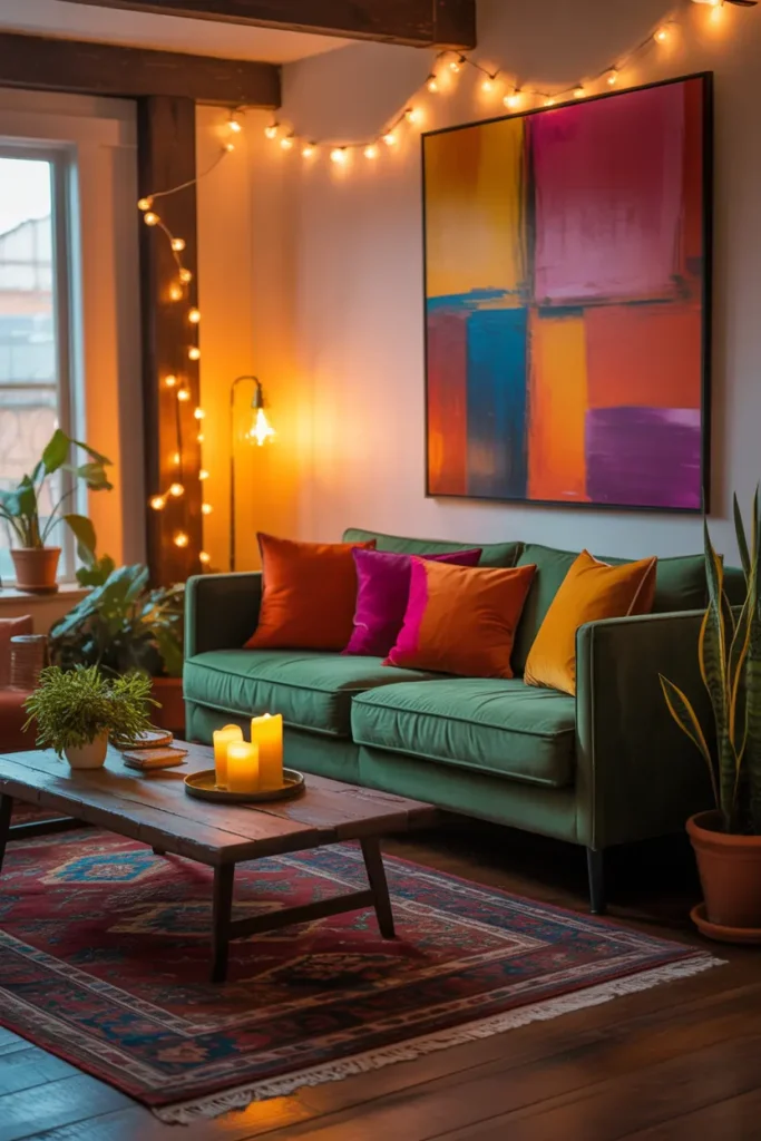
Pattern mixing has rules, and they are simple: vary the scale (one large print, one small, one in between), share at least one colour across all patterns, and keep one solid texture for every two patterns. Follow that and you can mix florals with stripes with geometrics and it will look intentional.
The beginner mistake is matching scales — three medium-scale patterns at the same size fight each other. The advanced mistake is too many patterns in one sightline. Spread them: patterned cushions on the sofa, patterned rug underfoot is fine, but then keep the curtains solid. Rhythm, not pile-up.
Ground It All with Nature
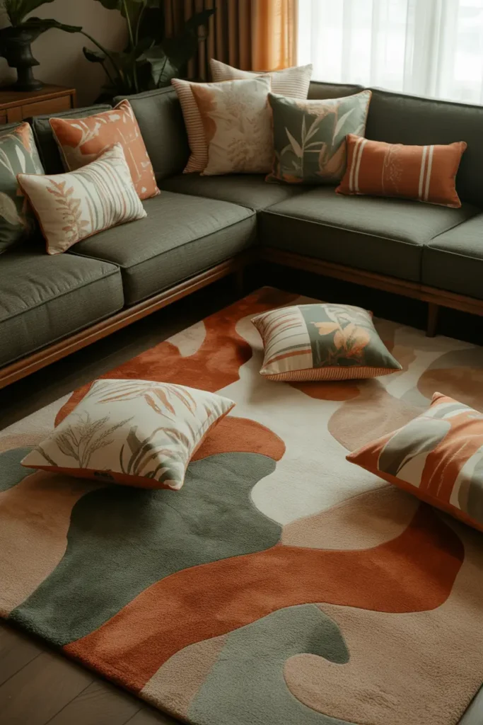
Plants are the cheat code of colourful rooms. Green sits opposite red on the colour wheel and alongside every other colour comfortably — it harmonises with literally any palette while adding life and movement. A large plant in a colourful corner does more balancing work than any amount of rearranging.
Wood counts too. An oak coffee table, a walnut frame, a woven basket — natural materials are visually quiet, which makes them perfect ballast for a colourful scheme. If the room feels like it is floating away on colour, add wood until it lands.
Keep the Layout Human
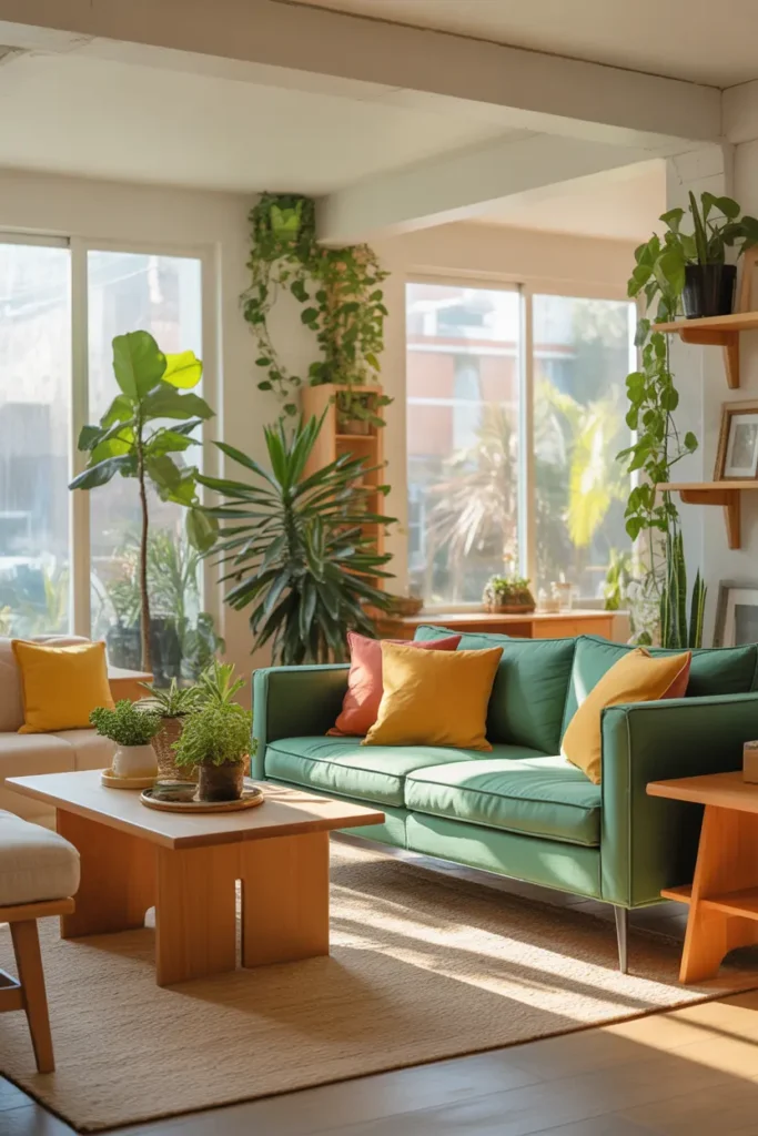
A colourful room styled like a showroom — everything facing forward, nothing touched — feels like a museum of colour rather than a home. Arrange for actual life: seating close enough for conversation, a table within reach, a throw that looks used. Colour feels joyful when the room feels used; it feels performative when the room feels staged.
And let the colour get a little messy. The mustard throw will slide off the sofa. The patterned cushions will get sat on. That is not the design failing — that is the design working. A colourful room that stays perfect is a room nobody is enjoying.
Related Decor Ideas
- Modern Living Room Decor Ideas That Feel Stylish and Comfortable
https://howdecor.com/modern-living-room-decor-ideas - Small Living Room Ideas That Make Your Space Look Bigger
https://howdecor.com/small-living-room-ideas
Conclusion
Colourful rooms are not about bravery; they are about method. Calm base, one dominant colour, two secondaries in small doses, texture everywhere, one star, calm zones, warm light — in that order. Follow the sequence and the room practically designs itself.
Pro Tips
- One dominant, two secondaries: Sixty percent of the colour in one leader, the rest split between two supporting shades in small, movable items.
- Texture tames colour: If a colour feels too loud, do not remove it — put it in velvet, weave, or knit. Texture quiets colour without losing it.
- Test at night: Always check your palette under the actual evening lamps before committing. Colours transform after dark.
- Plants fix everything: When a colourful room feels unbalanced, add greenery before rearranging. Green harmonises with any palette.
FAQs
How many colours is too many in a living room?
Three is the sweet spot: one dominant and two secondaries, all sitting on a neutral base. Four can work if the fourth is a tiny accent repeated twice. Five or more, and the eye stops seeing a palette and starts seeing noise.
What if I am afraid of committing to a bold sofa?
Do not start with the sofa. Build the palette in cushions, throws, art, and a rug first — all reversible. If you still love the dominant colour after three months at that scale, then commit to the big piece with confidence.
Do colourful rooms go out of style quickly?
The base does not, which is the point of keeping it neutral. Bold accessories can be swapped seasonally for very little money, so a colourful room is actually easier to keep current than a beige one — you just rotate the jewellery, not the bones.
How do I mix patterns without it looking chaotic?
Vary the scale (large, medium, small), share one colour across all patterns, and keep one solid for every two patterns. Then spread them across the room rather than clustering — rhythm beats pile-up.

HowDecor is a home decor blog sharing simple, practical decorating ideas for everyday spaces. We believe a beautiful home should feel comfortable, personal, and full of warmth — and that great style does not require a huge budget. Our goal is to inspire readers to create spaces that feel peaceful, welcoming, and truly their own — one room at a time.