Purple and gold has a reputation problem. It sounds like a football team, or a teenager’s idea of luxury. But strip away the clichés and you find one of the oldest colour pairings in design — Byzantine mosaics, Victorian libraries, Art Deco cinemas all ran on it. The reason it keeps coming back is simple: purple gives depth, gold gives light, and together they do something neither can do alone.
The modern version is quieter than the historical one. Dusty, muted purples instead of royal ones; brushed brass instead of polished gold; and both of them rationed, layered over neutrals, and lit warmly. Think less palace, more candlelit study. That restraint is the entire difference between rich and gaudy.
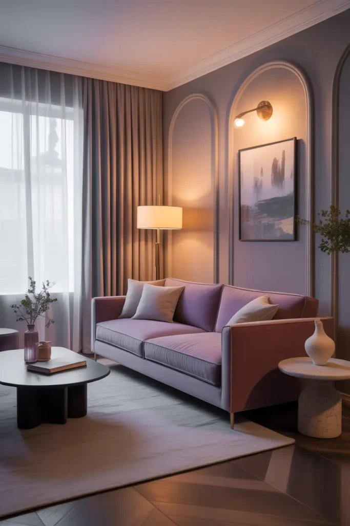
Anchor with a Muted Purple Sofa
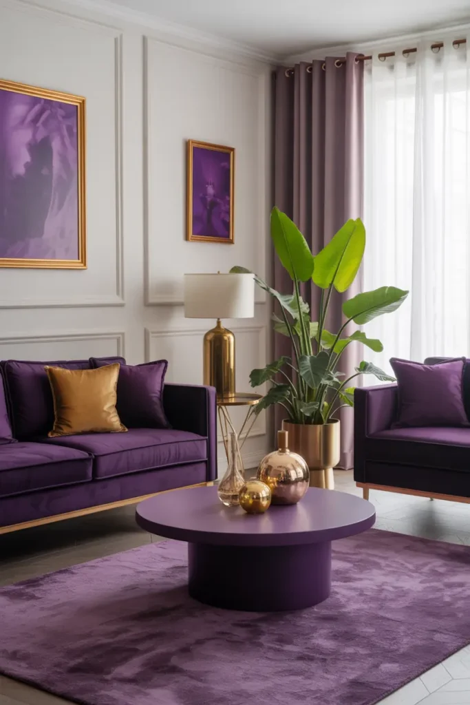
A purple sofa is a commitment, so choose the shade like you mean it: dusty, greyed, muted — aubergine, smoky mauve, deep heather. These shades read as sophisticated neutrals-with-personality rather than “a purple sofa.” Bright, saturated purple on a large piece is where the football-team jokes come from.
Velvet is the natural fabric here, and not just for looks. Velvet’s pile breaks up the colour so it shifts as you move around the room — it never sits flat. In flat cotton, the same purple can look dull and one-dimensional. If velvet feels too formal, a textured boucle or chenille in purple achieves a similar depth with a more relaxed feel.
Add Gold in Small, Warm Moments
Gold works the way jewellery works: a little elevates everything, a lot cheapens everything. A brass floor lamp with a fabric shade, a small gold tray on the coffee table, the frames of two prints, a gold-rimmed mirror. Five to seven small gold moments, distributed around the room, is the full dose.
Finish matters enormously. Polished, mirror-bright gold reads as bling; brushed brass, aged gold, or antique finishes read as warmth. Under warm lighting the difference is night and day — brushed finishes glow softly while polished ones throw hard reflections. When in doubt, go duller.
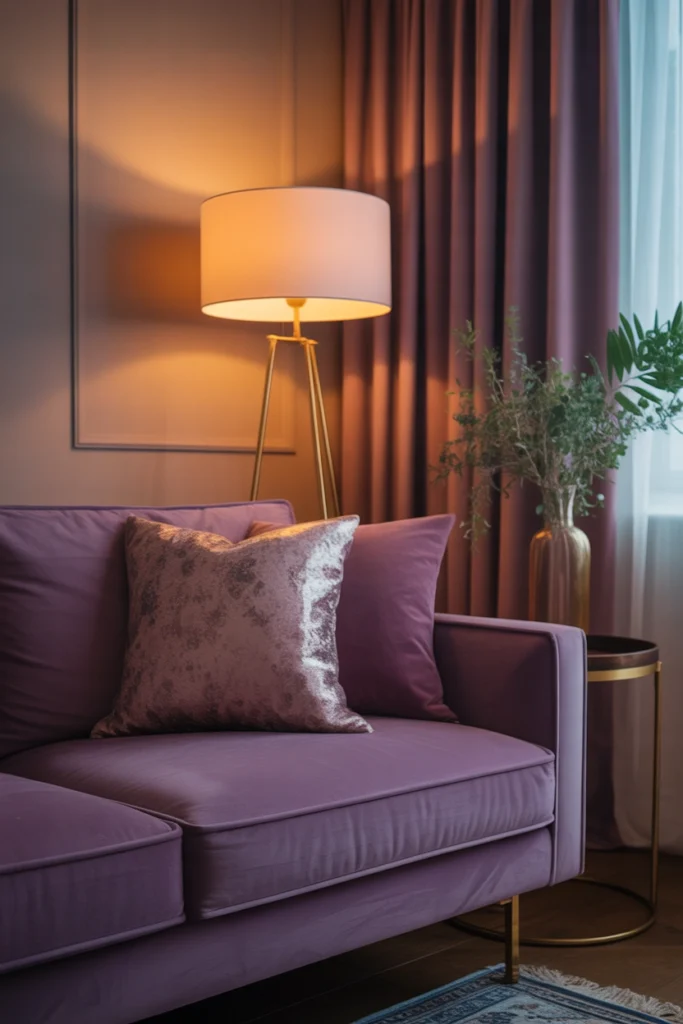
Layer Lighting to Keep Purple Luminous
Purple is a light-hungry colour — under a single overhead fitting it goes muddy and flat by 7pm. The fix is three layers: ambient (a dimmable ceiling light or floor lamp), task (reading lamp by the main seat), and accent (a small lamp or picture light that grazes a wall or art). Each layer at 2700K.
The accent layer is where gold earns its keep. A small warm light aimed near brass or gold objects makes them throw soft golden reflections around the room — the whole space starts to glow. This is the candlelit-study effect, and it is almost entirely a lighting trick rather than a furniture one.
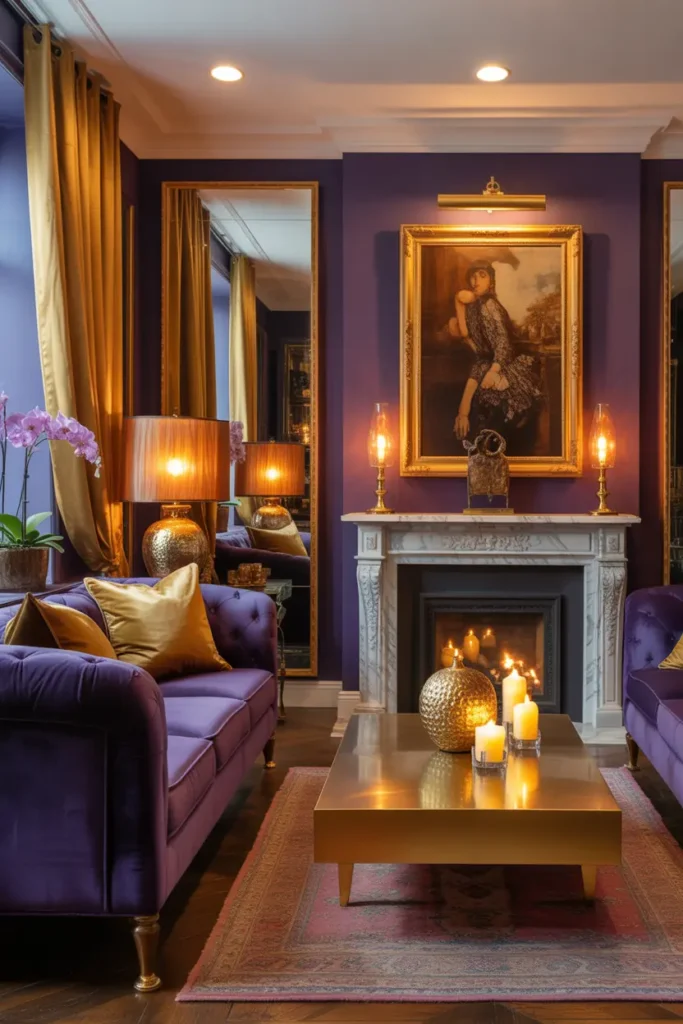
Keep Walls Neutral and Let the Colours Work
With two strong personalities in the furniture, walls should be the calm third party: warm white, ivory, pale greige. Dark walls plus purple furniture is possible but demands perfect lighting and large proportions — in an average living room it just reads as a cave with expensive furniture in it.
If plain walls feel too safe, add interest through texture instead of colour: limewash paint, grasscloth wallpaper in a neutral tone, or panel moulding painted the same colour as the wall. You get depth and shadow-play without introducing a third colour to manage.
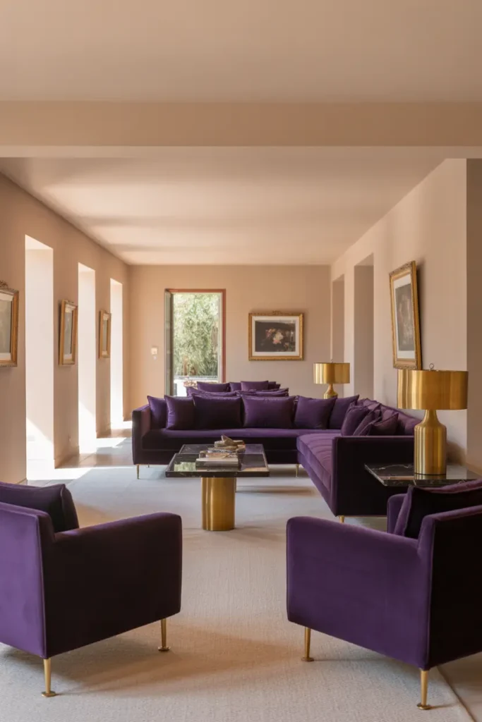
Use a Gold-Framed Mirror to Multiply Light
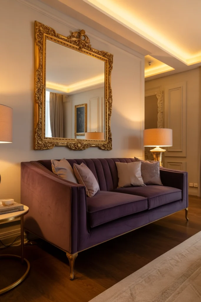
A mirror in a gold frame does triple duty in this palette: it bounces light around (critical for purple), it adds another controlled hit of gold, and it visually doubles the room’s depth. Hang it where it catches a window or a lamp — a mirror reflecting a blank wall is just an expensive blank wall.
Scale it generously. A small mirror in a fussy gold frame looks like an afterthought; one large mirror — at least 80 cm in one dimension — reads as architecture. Lean it on a console or mantel rather than hanging it dead-centre for a more relaxed, collected feel.
Soften with Textiles in Complementary Tones
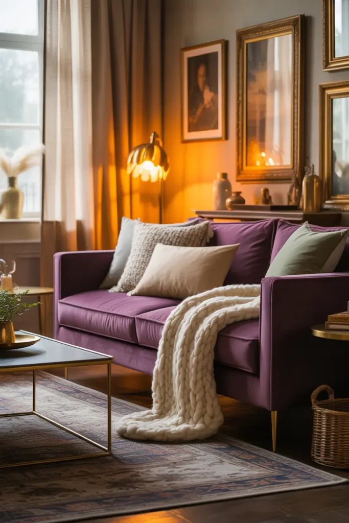
Purple and gold can feel formal, and textiles are what make the room sit-able. Layer cushions in cream, oat, and soft grey against the purple sofa; add a throw in a warm neutral; ground it all with a rug that has some pattern or texture. The textiles should feel like they belong to a comfortable home that happens to have purple and gold — not a purple-and-gold room that happens to have textiles.
Mix the formality levels deliberately: a velvet purple cushion next to a nubby wool one, a silk-look throw next to washed linen. This high-low mixing is what keeps a rich palette from feeling like a hotel. Hotels match; homes mix.
Put Gold in Patterns, Not Just Objects
Once the obvious gold objects are placed, add gold at the pattern level: thin gold lines in a rug border, gold threading in cushions, a print with gold leaf details. Pattern-level gold integrates the metal into the room’s fabric instead of leaving it as isolated shiny things.
Keep these patterns quiet — tone-on-tone or low-contrast. Loud gold patterns (bold damask, shiny geometric prints) tip the room toward ostentatious. The goal is gold you notice on second glance, not first.
Keep Furniture Shapes Simple
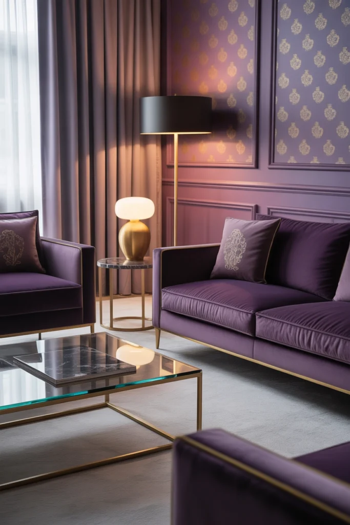
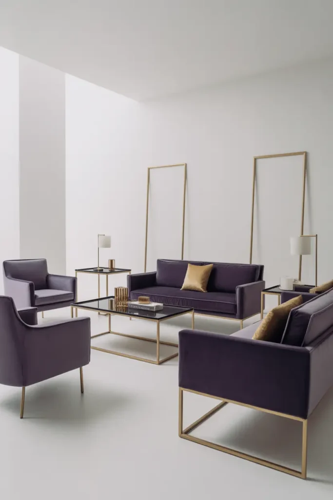
Strong colour plus fussy shapes equals visual noise. When purple and gold are doing the talking, furniture should be architecturally quiet: clean lines, simple silhouettes, minimal ornament. A plain, well-proportioned sofa in purple velvet is stunning; the same sofa with button tufting, nailhead trim, and carved legs is a costume.
This simplicity also future-proofs the room. Simple shapes recede when you eventually change the palette; ornate shapes fight every new direction. Buy the drama in the colour, not the carpentry.
Add Greenery to Keep It Alive
Green is purple’s complement, which makes plants disproportionately effective in this palette. A large fig, olive tree, or even a generous fern introduces the one colour that makes purple look richer by contrast while adding life and movement — the two things formal palettes always lack.
Choose the planter with the palette in mind: a simple brass or aged-gold pot ties the plant into the scheme; a bright ceramic one introduces a new colour to manage. Even the pot is a design decision in a considered room.
Arrange for Comfort, Not Ceremony
A purple-and-gold room that nobody sits in is a failed room. Arrange seating in a real conversation layout, keep the coffee table within reach (40 to 45 cm from the sofa), add a proper reading lamp, and leave space for feet on the ottoman. Luxury that cannot be lounged in is just a museum.
And allow one imperfect thing: a well-worn book on the table, a throw that is actually used. Perfection in a rich palette reads as untouchable; one honest, lived-in detail gives everyone else permission to relax. That permission is the difference between admiring a room and loving it.

Related Decor Ideas
- Modern Living Room Decor Ideas That Feel Stylish and Comfortable
https://howdecor.com/modern-living-room-decor-ideas - Small Living Room Ideas That Make Your Space Look Bigger
https://howdecor.com/small-living-room-ideas
Conclusion
Purple and gold rewards the disciplined: muted purple in velvet, gold in brushed finishes and small doses, neutral walls, layered warm light, and furniture simple enough to let the colours be the event. Do that, and the oldest luxury palette in design feels completely current.
Pro Tips
- Go dusty, not royal: Muted, greyed purples (aubergine, smoky mauve) read as sophisticated. Saturated purple on large pieces reads as a theme.
- Brushed beats polished: Brushed brass and antique gold glow; polished gold glares. Duller finishes photograph and live better.
- Light the gold: Aim a small warm light near brass objects and they will throw golden reflections around the room — free atmosphere.
- Simple shapes only: Strong colours need quiet furniture. Buy the drama in the colour, not the carpentry.
FAQs
Is purple and gold too much for a small living room?
Not if you scale the doses. A small room can carry a purple loveseat or armchair plus three to four small brass accents beautifully. What it cannot carry is a full purple sofa suite — keep the largest piece neutral and put the purple in the second-largest one.
What metal finish works best with purple?
Brushed brass or aged gold. Both have warm undertones that harmonise with purple’s red base. Chrome and polished nickel are too cool and will fight the palette; rose gold can work but risks pushing the room toward pink.
Can I use purple and gold in a modern minimalist room?
Yes — it is actually a natural fit. Keep the purple to one piece (a sofa or armchair), the gold to two or three objects, and everything else minimal and neutral. The restraint of minimalism is exactly what keeps this rich palette from tipping over.
How do I stop the combination looking dated?
Dated purple-and-gold comes from three things: shiny gold, ornate furniture shapes, and too much of both colours. Fix all three — brushed finishes, simple silhouettes, restrained doses — and the palette reads as timeless rather than retro.

HowDecor is a home decor blog sharing simple, practical decorating ideas for everyday spaces. We believe a beautiful home should feel comfortable, personal, and full of warmth — and that great style does not require a huge budget. Our goal is to inspire readers to create spaces that feel peaceful, welcoming, and truly their own — one room at a time.