Grey velvet and hot pink is a pairing with excellent instincts and terrible PR. It sounds like a nightclub or a teenager’s bedroom, but in practice it is one of the freshest combinations in contemporary design — precisely because the two colours do opposite jobs. Grey velvet is calm, soft, and recessive; hot pink is energy, optimism, and a little bit of mischief.
The entire success of the pairing rests on dosage. Grey is the room; pink is the exclamation mark. Somewhere around ninety percent grey and neutrals to ten percent pink is where the magic lives — enough pink to make the room unforgettable, little enough that it never shouts. Here is how to hold that line.
Anchor with Grey Velvet, Add Pink in Cushions
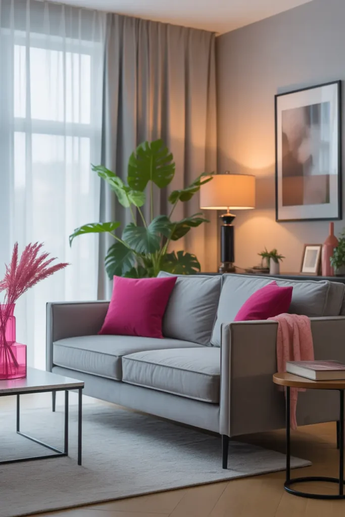
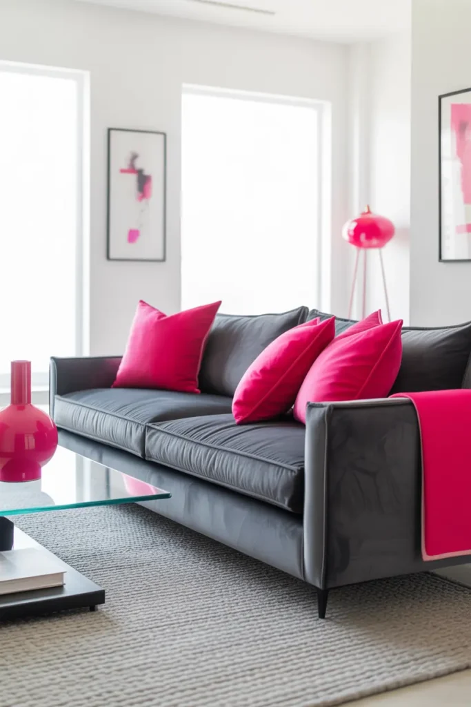
A grey velvet sofa is the ideal host for hot pink: its softness tames the pink’s edge, and its neutrality lets the pink be the undisputed star. Choose a mid-tone grey — too pale and the pink overwhelms it, too dark and the room goes moody (a different, also valid, design).
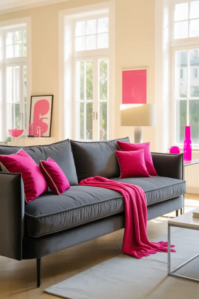
Introduce pink through two to three cushions in different pink-adjacent tones — hot pink, magenta, maybe a softer blush. Varying the pinks slightly looks collected and intentional; three identical hot-pink cushions in a row looks like a uniform. Mix in one grey or cream cushion to give the eye a rest.
Break the Calm with a Pink Throw
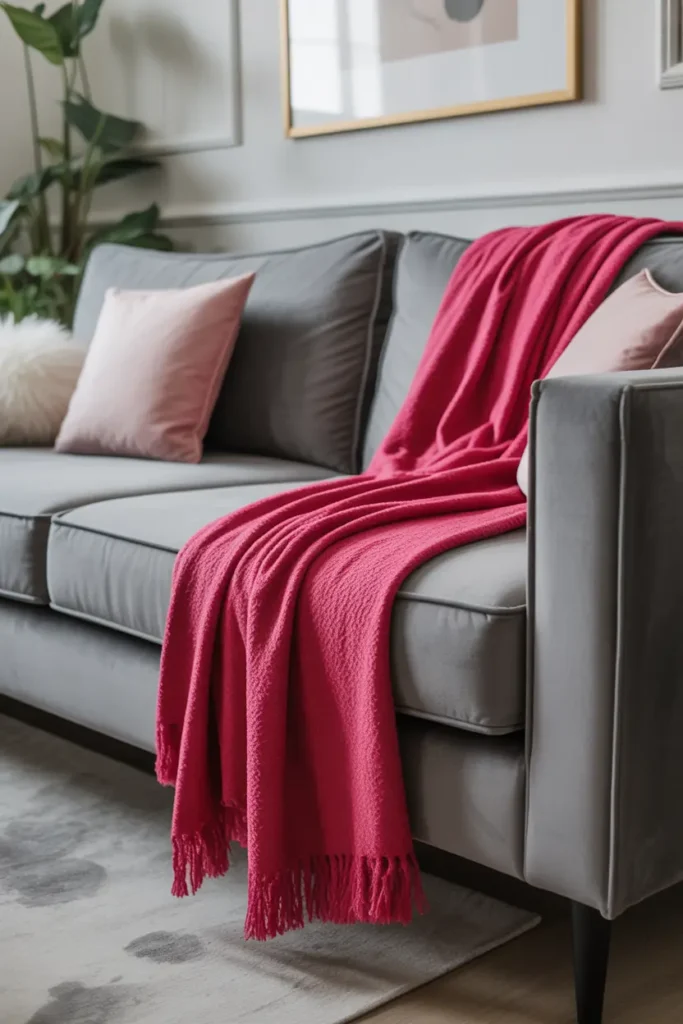
A throw is pink at its most casual — and casual is exactly what keeps hot pink from feeling aggressive. Draped over the arm of the grey sofa, a hot pink knit or woven throw adds a jolt of colour that reads as personality rather than statement. Texture matters: a nubby knit breaks up the colour; a flat shiny fabric would shout it.
Keep the throw to one. Two pink throws plus pink cushions starts to tip the ratio, and the ratio is everything here. One throw, allowed to look used and slightly rumpled, is the sweet spot between styled and alive.
Let Artwork Carry Pink at Scale
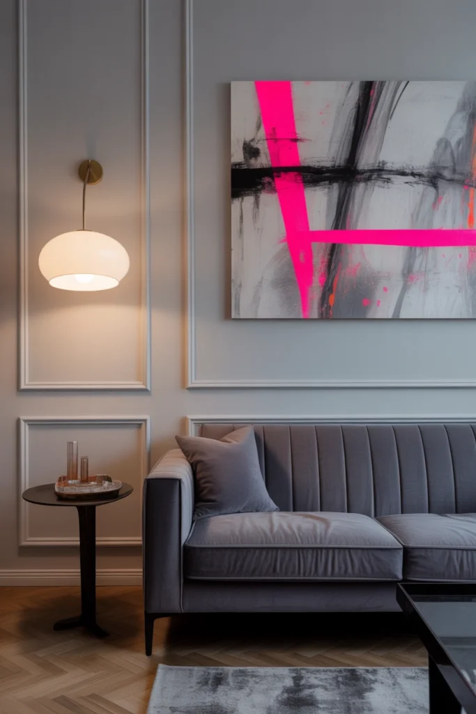
Art is how you get a large dose of pink without a large commitment. A canvas with hot pink tones — abstract is ideal, since it cannot be “wrong” — hung above the grey sofa gives the colour presence at eye level, where it has maximum impact per square centimetre.
Size it boldly: art above a sofa should span about two-thirds of the sofa’s width. Timid, small art in a bold colour looks indecisive; generous art in a bold colour looks confident. Frame it in slim black or natural wood — never ornate gold, which would drag the palette toward a different era entirely.
Light It Soft So Pink Glows
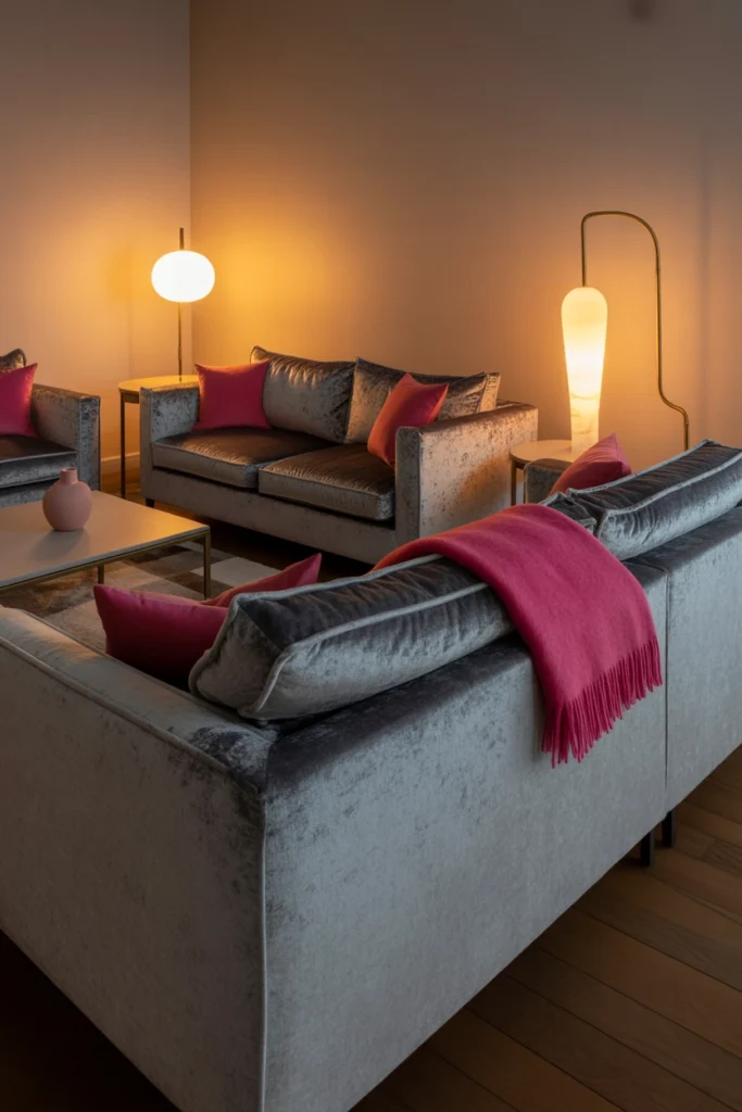
Hot pink under harsh light looks neon; under warm, soft light it looks like sunset. The lighting brief for this palette: warm 2700K sources, at least two, with one positioned to graze across the pink accents. Light raking across a pink cushion reveals its texture and deepens the colour beautifully.
Avoid placing pink pieces directly under cool downlights — the single fastest way to make hot pink look cheap. If your ceiling spots are fixed and cool, the practical fix is to keep pink pieces in the lamplight zones and let the grey velvet take the overhead light. Grey forgives; pink does not.
Concentrate Pink in a Few Objects
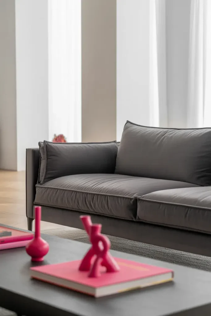
Beyond cushions, a throw, and art, pink belongs in small, deliberate hits: a ceramic vase, a stack of art books with pink spines, a candle, a small tray. Each one earns its place by being beautiful, not just pink. Five considered objects beat fifteen pink things.
Corral them slightly — a pink vase and pink books together on the coffee table read as a composed moment; the same items scattered across the room read as pink confetti. Concentration is control, and control is what keeps hot pink sophisticated.
Keep Walls Neutral and Quiet
With pink doing the talking, walls should listen: warm white, pale greige, soft warm grey. A coloured wall plus hot pink accents is a second conversation happening at once, and rooms can only hold one. The neutral wall is also what makes the pink look electric by contrast — put pink on pink and it just looks… pink.
If the walls feel too plain, add interest with texture rather than colour: a limewash effect, subtle panel moulding, or a grasscloth in a neutral tone. Depth without competition.
Consider One Pink Chair — Carefully
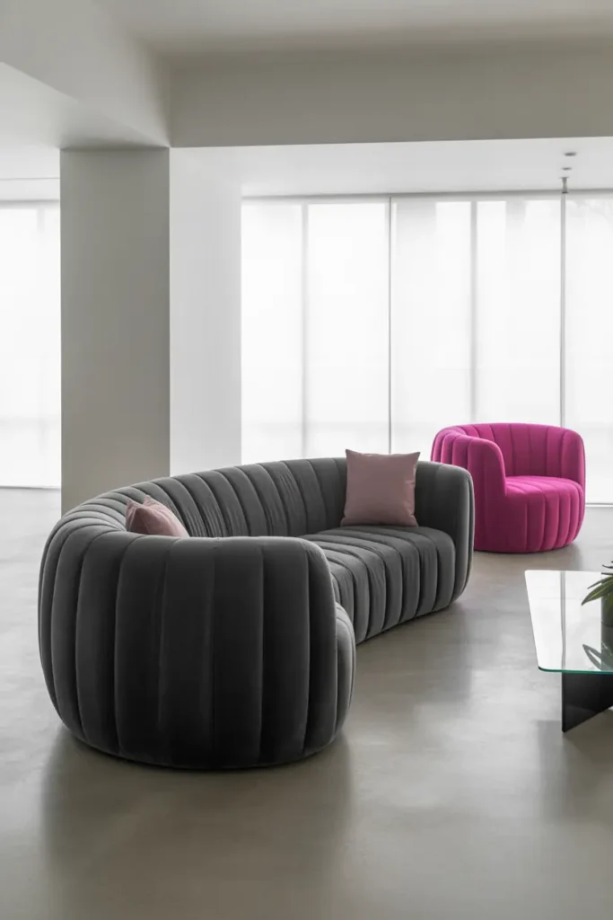
A hot pink accent chair is the boldest move in this palette, and it works when everything else stays quiet. One chair, simple shape, positioned as the room’s exclamation point — angled, not lined up with the sofa, so it reads as a deliberate accent rather than part of a set.
The risk is real: a pink chair plus pink cushions plus pink art is too much pink, and the chair becomes the thing you are tired of in eighteen months. If you take the chair, reduce pink elsewhere — cushions go neutral, art goes quieter. The total pink budget does not change; you are just spending it in one place.
Layer Textures to Enrich the Pairing
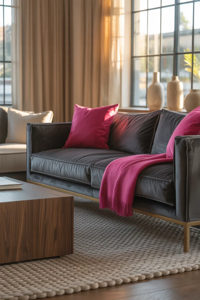
Grey velvet plus hot pink in flat fabrics would be a cartoon. Texture is what makes it design: the deep pile of the velvet against a nubby wool throw, a smooth ceramic vase against a woven basket, a glass coffee table reflecting it all. Each texture change gives the eye a new experience of the same two colours.
Pay special attention to the grey: velvet, bouclé, and linen greys all read differently, and mixing two grey textures (velvet sofa, wool rug) adds the depth that stops the neutral base feeling flat. The pink gets the attention, but the greys do the work.
Use a Grey Rug to Anchor Everything
The rug should be the quietest large surface in the room: mid-grey, subtly textured, large enough for the sofa’s front legs and the accent chairs to sit on it. It grounds the floating pink accents and ties the seating arrangement into one composed zone.
Pattern is optional but keep it tonal — a grey-on-grey pattern adds interest without adding colour. A multicoloured rug in this palette would be a third conversation, and as established, the room can only hold one.
Stay Minimal and Let Colour Lead
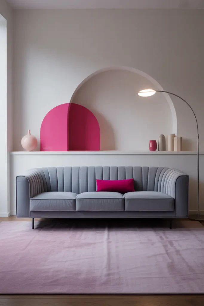
When two colours are this distinctive, everything else should be simple: clean-lined furniture, minimal ornament, clear surfaces. The palette is the decoration. Every extra object is auditioning against pink and grey, and most will lose.
This minimalism is also practical: fewer objects means the pink pieces stay visible and the room stays easy to live in. A grey-and-pink room buried under clutter just looks like a messy room; the same room edited looks like a design statement.
Related Decor Ideas
- Modern Living Room Decor Ideas That Feel Stylish and Comfortable
https://howdecor.com/modern-living-room-decor-ideas - Small Living Room Ideas That Make Your Space Look Bigger
https://howdecor.com/small-living-room-ideas - Minimalist Home Decor Ideas for a Clean and Elegant Look
https://howdecor.com/minimalist-home-decor-ideas
Conclusion
Grey velvet and hot pink is a 90/10 palette: ninety percent calm, considered grey and neutrals, ten percent joyful pink spent in cushions, a throw, art, and a few small objects. Hold that ratio, light it warm, and the most unlikely pairing becomes the most memorable room.
Pro Tips
- Hold the 90/10 ratio: Grey and neutrals own the room; pink gets about ten percent. Every pink addition should be weighed against this budget.
- Vary the pinks: Hot pink, magenta, and blush together look collected; three identical hot-pink items look like a uniform.
- Warm light only on pink: Keep pink pieces in 2700K lamplight zones. Cool downlights make hot pink look cheap.
- One chair means less pink elsewhere: A pink accent chair spends most of the pink budget — reduce cushions and art accordingly.
FAQs
Is hot pink too much for a living room?
Not at ten percent. The fear of pink comes from seeing it at forty percent — pink sofas, pink walls, pink rugs together. At accent scale, hot pink is just energy and optimism, and it is far easier to change than a neutral you are bored of.
What grey works best with hot pink?
Mid-tone warm greys. Very pale grey gets overwhelmed by the pink; very dark grey pushes the room moody (which works, but it is a different design). Warm greige is the most forgiving partner.
Can I use this palette in a traditional-style room?
Yes, with adjustments: swap velvet for a classic weave, choose magenta over neon pink, and let the pink appear in traditional forms — a chinoiserie vase, classic art prints. The palette is modern by default, but the colours themselves are timeless.
How do I stop pink fading in sunlight?
Hot pinks are fugitive colours — they fade faster than most. Keep pink textiles out of direct sun, use UV-filtering window film if the room is very bright, and choose solution-dyed fabrics for cushions that sit in sunny spots. Or embrace it: faded pink goes pastel, which is also beautiful.

HowDecor is a home decor blog sharing simple, practical decorating ideas for everyday spaces. We believe a beautiful home should feel comfortable, personal, and full of warmth — and that great style does not require a huge budget. Our goal is to inspire readers to create spaces that feel peaceful, welcoming, and truly their own — one room at a time.