Grey, red, and black in velvet is not a safe palette. Let us be honest about that up front — it is dramatic, moody, and one wrong move from looking like a vampire’s sitting room. But it is also one of the most rewarding palettes in design when it works: rich without being heavy, bold without being loud, and deeply, deeply comfortable to actually sit in.
The trick is that velvet changes the rules. In flat fabrics, this palette would be harsh. In velvet, every colour gets softened at the edges — black becomes smoky, red becomes ember-like, grey becomes cloud-like. The fabric is doing half the design work. The other half is balance: grey leads, red warms, black deepens, and none of them is allowed to take over.
Start with a Grey Velvet Sofa
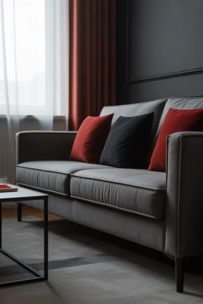
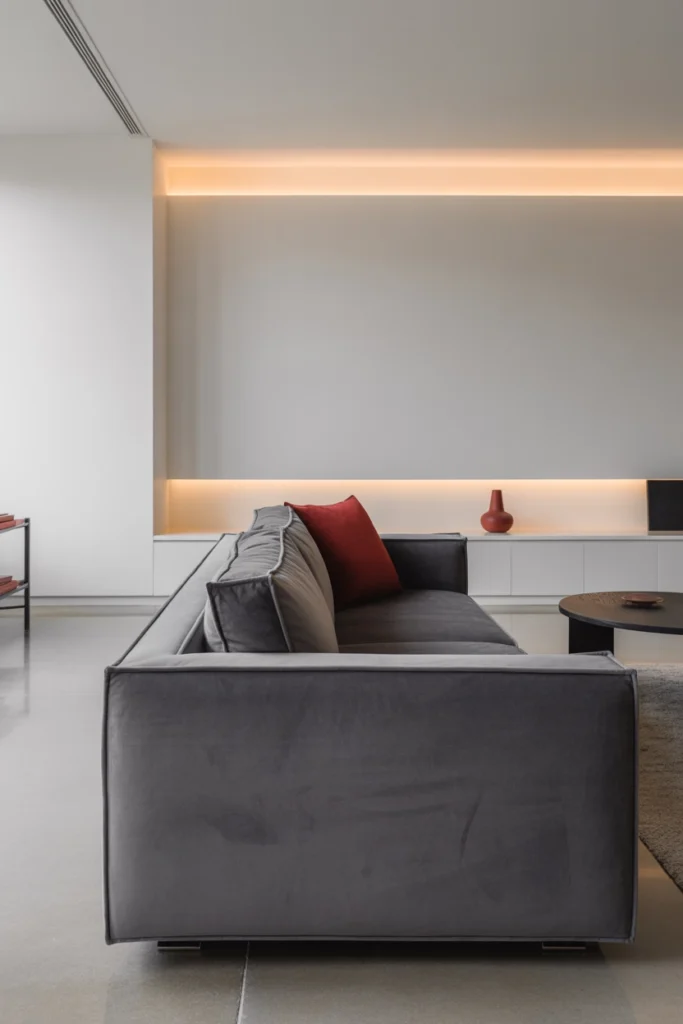
Grey is the diplomat of this palette — it keeps red and black from fighting. A grey velvet sofa in a mid-tone (not charcoal, not silver) gives you a large, calm, touchable base that makes both accent colours look intentional. Mid-grey velvet also hides wear better than any other sofa choice in this scheme.
Size it honestly for the room. In this palette, an oversized sofa in a medium room will make the whole scheme feel heavy; the sofa should leave at least 60 to 75 cm of circulation space on its main approach side. Velvet shows pressure marks, so rotate cushions monthly — it takes thirty seconds and keeps the pile even.
Add Deep Red Velvet Cushions
Red enters through cushions — deep, wine-dark reds: oxblood, burgundy, garnet. These shades have enough blue in them to sit calmly next to grey, unlike orange-reds which would clash. Two to four cushions is the dose; arrange them asymmetrically for a collected look rather than a showroom one.
Mix the red cushions with one or two in grey or black velvet so the red is part of a family, not an isolated statement. And again: buy inserts one size up from the covers. Plump cushions are the difference between “expensive velvet room” and “flat sad sofa.”
Bring In Black Velvet in Small Doses
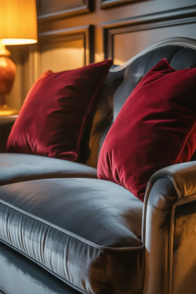
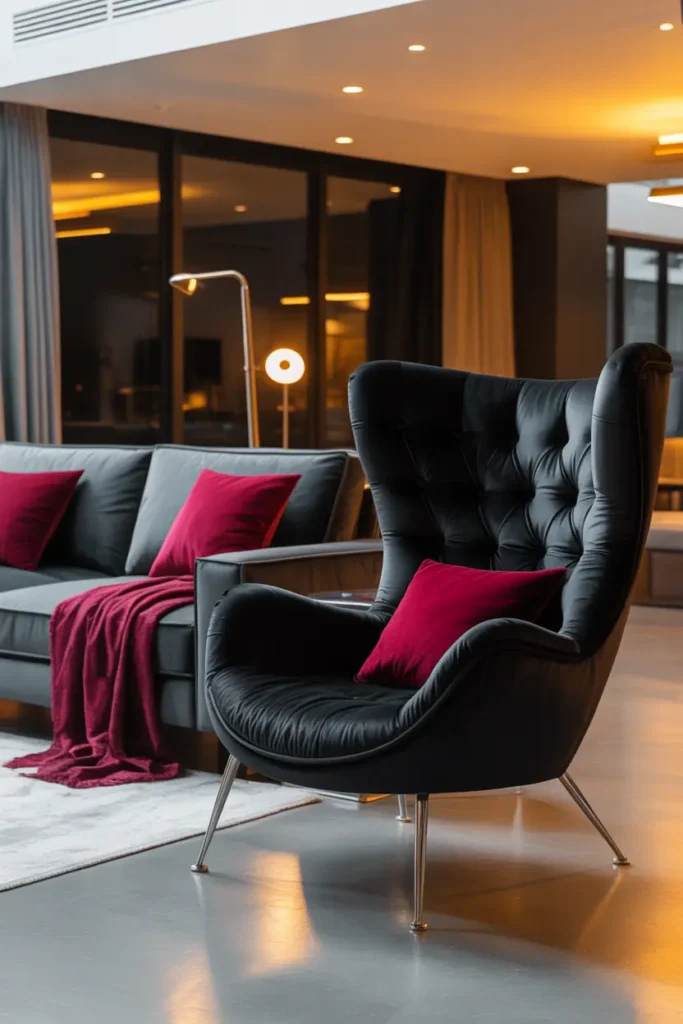
Black velvet is the most dramatic element here, so ration it: an ottoman, a pair of small cushions, a throw folded over one arm, or a single accent chair. Black velvet absorbs light completely, which gives the room its depth — but too much of it creates visual black holes that swallow the space.
Keep black velvet away from the darkest corner of the room. In shadow, black velvet disappears entirely and just reads as a void; in lamplight, it glows with subtle sheen. Place black pieces where your warm lighting actually lands and they will look luxurious instead of lost.
Balance with Light Walls
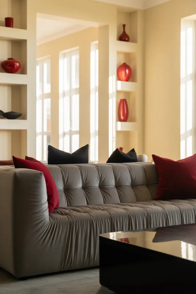
This palette demands light walls — non-negotiable. Warm white, pale greige, or the lightest warm grey. Dark walls plus dark velvet furniture is a combination for very large rooms with excellent lighting; in a normal living room it will feel like evening at noon.
Consider the ceiling too: bright white, always. And if the room has coving or picture rails, painting them the same colour as the walls (rather than contrasting white) keeps the eye moving smoothly and makes the walls feel taller — a useful trick when the furniture is visually heavy.
Layer Warm Lighting Generously
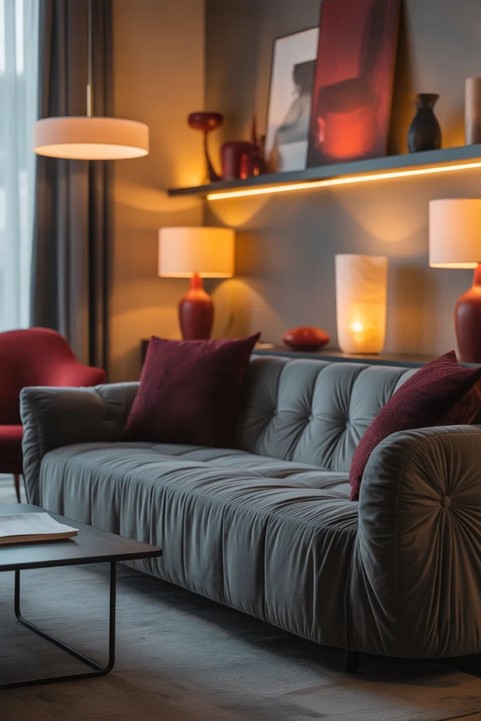
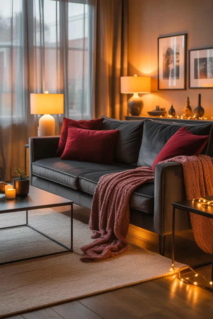
Dark palettes need more light, not less — a fact that surprises people. Plan for three to four warm light sources: an overhead on a dimmer for general fill, a floor lamp, a table lamp, and ideally an accent light washing one wall. All at 2700K. Velvet under warm light is the whole point of this palette; under cool light it looks dusty and flat.
Watch the shadows. Dark furniture plus a single light source creates harsh pools of dark and light. Multiple sources from different directions fill the shadows in and let the velvet’s sheen show evenly. If the room has one overhead light currently, adding two lamps will transform it more than any new cushion.
Ground It with a Neutral Rug
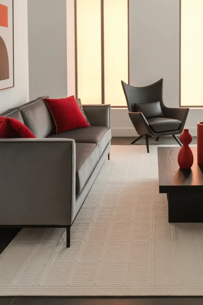
The rug should be the calmest thing in the room: warm beige, soft grey, or ivory, in a texture with some life — wool, jute, or a low-pile weave. It sits under the dark furniture and gives the eye a place to rest. A patterned or dark rug here would be one pattern too many.
Size it properly: front legs of the sofa and all accent chairs should sit on the rug. A too-small rug under heavy velvet furniture looks like a postage stamp and makes the whole arrangement feel tentative. When in doubt, go one size up — large rugs make rooms feel larger, not smaller.
Introduce Red Through Artwork
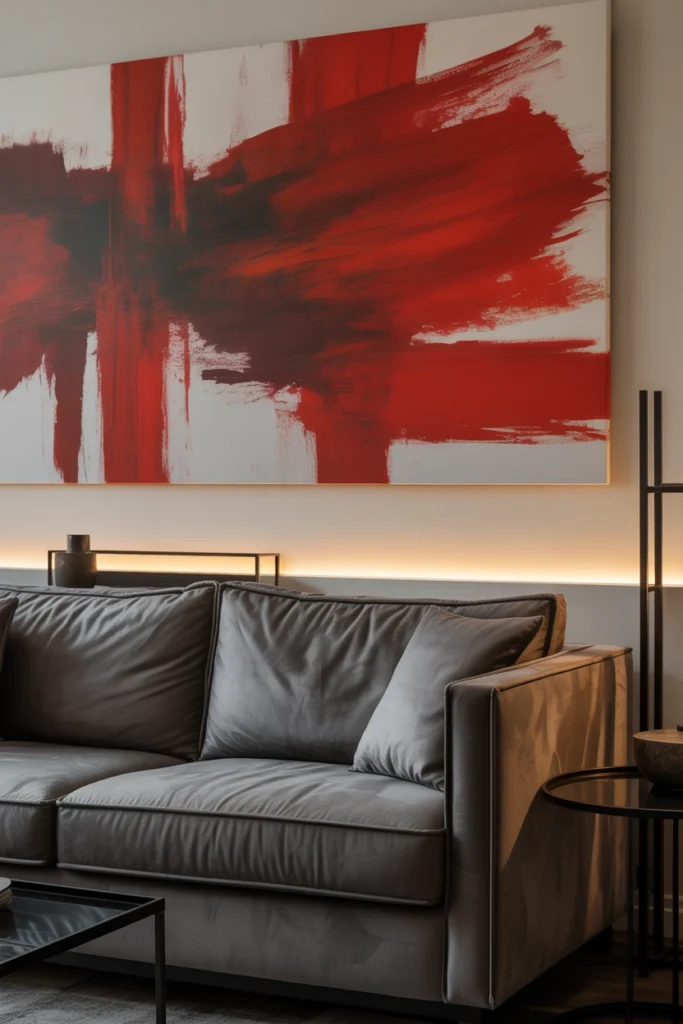
Art is red’s most sophisticated delivery system. A large abstract with red tones, hung where it catches the eye — above the sofa or on the main sightline from the doorway — adds the colour at scale without adding another upholstered object to maintain. It also gives the room a focal point beyond the furniture.
Frame it simply: thin black or natural wood. An ornate gold frame plus red art plus velvet furniture is three dramas competing; a quiet frame lets the art and the palette do the work. Size it to roughly two-thirds the width of the furniture below it.
Mix Textures to Keep It Lived-In
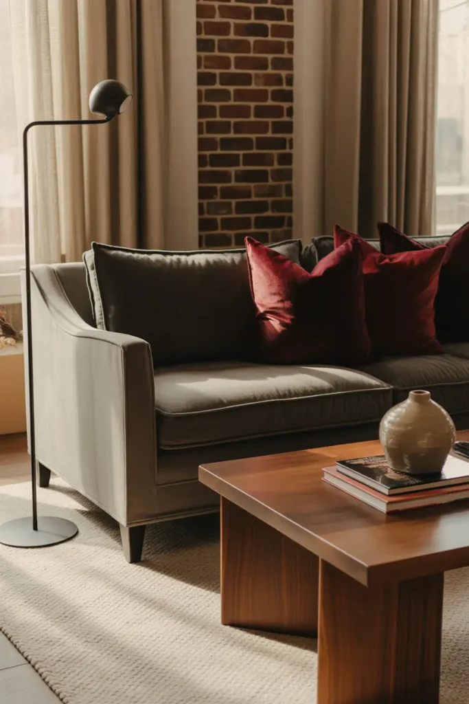
An all-velvet room risks feeling like a stage set. Break it up: a wool throw over the velvet sofa, a wooden coffee table with visible grain, a ceramic vase, linen curtains. These matte, natural textures stop the sheen from taking over and make the room feel like people actually live in it.
The wood choice matters: warm oak or walnut harmonises with red’s warmth; pale ash or grey-washed wood can make the palette feel cold. When the palette is already cool-leaning (blue-greys), warm wood is almost mandatory to keep the room inviting.
Edit Hard — Let the Colours Speak
A bold palette is an argument for fewer objects. Every extra decorative item competes with colours that are already doing a lot of visual work. Clear the surfaces to one meaningful piece each, keep patterns out (the velvet is pattern enough), and let the three colours be the decoration.
This discipline extends to the rest of the house’s clutter migrating in: the mail pile, the chargers, the “temporary” stack of magazines. Dark palettes show clutter more, not less — every light-coloured object screams against the dark. Closed storage near every seat is the practical answer.
Arrange for Conversation and Comfort
Drama means nothing if the room is uncomfortable. Pull seating into a real arrangement — seats no more than 2.5 metres apart — with the coffee table reachable from every seat and a side table with a lamp within arm’s reach of the main reading spot. Velvet invites lounging; the layout should permit it.
Leave the walkways generous. Dark furniture in a tight layout feels oppressive; the same furniture with clear, wide paths feels grand. If the room feels heavy after arranging, the usual culprit is not the colour — it is a blocked walkway or seating pushed too close together.
Related Decor Ideas
- Modern Living Room Decor Ideas That Feel Stylish and Comfortable
https://howdecor.com/modern-living-room-decor-ideas - Small Living Room Ideas That Make Your Space Look Bigger
https://howdecor.com/small-living-room-ideas
Conclusion
Grey, red, and black velvet is a high-wire palette, but the safety net is simple: grey leads, red and black accent in velvet, walls stay light, lighting stays warm and layered, and everything else gets out of the way. Walk the wire with those rules and the room is pure drama in the best sense.
Pro Tips
- Velvet does half the work: This palette only works in soft, light-absorbing fabrics. In flat or shiny materials the same colours would be harsh.
- Light walls are mandatory: Dark furniture plus dark walls needs a ballroom. In normal rooms, keep walls warm white or pale greige.
- More light, not less: Dark palettes need extra warm light sources to show the velvet’s sheen. Plan for three to four at 2700K.
- Rotate velvet cushions monthly: Velvet shows pressure marks. Thirty seconds of rotation keeps the pile even and the room looking new.
FAQs
Will a dark palette make my living room feel smaller?
Only if the walls go dark too. Dark furniture against light walls actually adds depth — the contrast makes walls feel further away. What shrinks rooms is dark walls, blocked walkways, and poor lighting, not dark furniture.
How do I clean velvet upholstery?
Vacuum weekly with an upholstery attachment, brush the pile with a soft clothes brush to lift marks, and treat spills immediately by blotting — never rubbing. For deep cleans, hire a professional; DIY steam cleaning can crush velvet pile permanently.
Can I add a fourth colour to this palette?
Carefully. Warm metallics (brass, aged gold) work beautifully as tiny accents. Green plants work as living accents. But a fourth strong colour — blue, pink, yellow — will break the palette’s tension. Three colours is the drama; four is a crowd.
Is black furniture too much for a north-facing room?
It can work if you compensate: warmer wall colour (not grey-white), extra warm lighting (four sources minimum), and a large mirror to bounce what light there is. Without those compensations, black velvet in a dim north room will just look dark.

HowDecor is a home decor blog sharing simple, practical decorating ideas for everyday spaces. We believe a beautiful home should feel comfortable, personal, and full of warmth — and that great style does not require a huge budget. Our goal is to inspire readers to create spaces that feel peaceful, welcoming, and truly their own — one room at a time.