Black and beige is the color combination of quiet money. It doesn’t shout — there’s no neon, no trend-chasing, no “look at me” accent wall in teal. Instead, there’s depth against warmth, structure against softness, and a balance so natural it looks effortless. It’s the palette of boutique hotels and tailored suits, and it works in bedrooms better than almost anywhere else.
What makes this pairing special is the tension: black brings the drama and definition, beige brings the comfort and calm. Get the ratio right and the room feels expensive at any budget. Get it wrong and it feels either gloomy or bland. Here’s how to get it right, move by move.
1. Anchor the Room With a Black Accent Wall
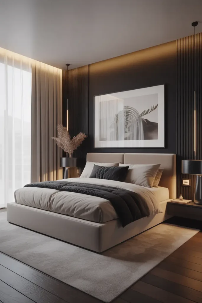
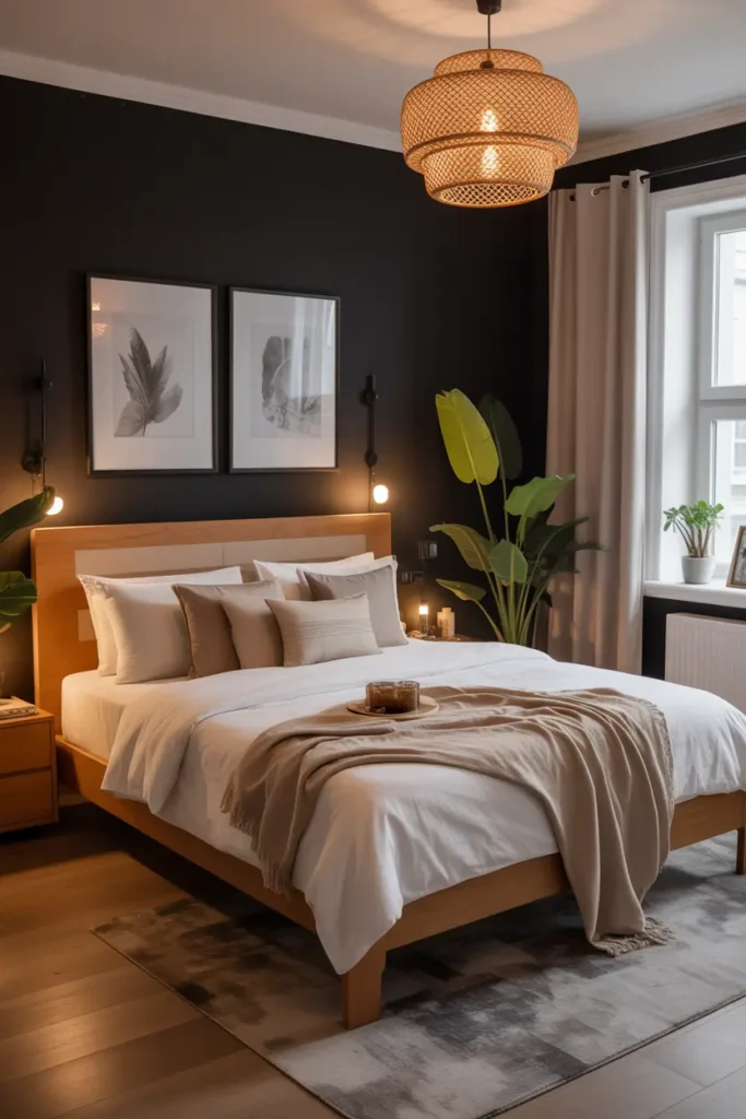
A black wall behind the bed is the boldest — and most effective — move in this palette. It creates instant depth, makes the bed the undeniable focal point, and gives the whole room a tailored, architectural quality. In a bedroom, the wall behind the headboard is the one you see least when sleeping and most when entering, so it’s the perfect place for drama.
Use a soft black (not pure jet — something with warmth, like a charcoal with brown undertones) in eggshell or satin, and keep the other three walls warm beige or cream. The contrast does the decorating for you. One caution: black walls need good lighting to avoid feeling flat — make sure the bed wall gets either natural light or a dedicated picture light or sconces.
2. Dress the Bed in Beige, Sharpen It With Black
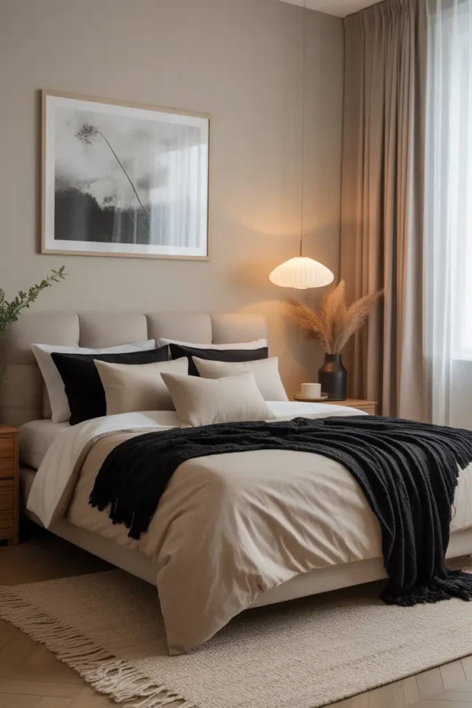
The bed is where the palette plays out in textiles: layers of beige — linen duvet, wool throw, cream shams — with black as the punctuation. A black lumbar pillow, a charcoal throw folded at the foot, black piping on cream shams. The beige does the comforting; the black does the defining.
The layering formula: start with cream sheets, add a beige duvet or coverlet, layer a textured throw (knit, waffle, or faux fur) in a deeper beige or black, then pillows in descending sizes mixing both tones. The mix of textures within the neutral palette is what makes it look rich rather than flat — linen, velvet, knit, and cotton all in beige read as luxury through variety.
3. Ground the Room With Black Furniture
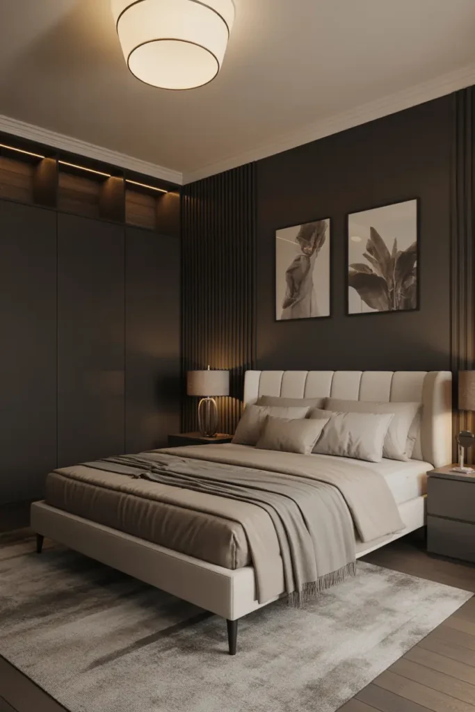
Black furniture — bed frame, nightstands, dresser — gives the bedroom its skeleton. Dark furniture anchors a room the way a dark rug anchors a seating area; without it, beige-on-beige can float away into blandness. The black pieces are the structure everything soft hangs on.
You don’t need a full black bedroom set (that would be too much). One or two black anchor pieces is enough: a black upholstered headboard with beige bedding, or black nightstands flanking a beige bed. Keep the furniture shapes clean and simple — the color is doing the talking, so the silhouettes should stay quiet.
4. Soften Everything With Beige Texture
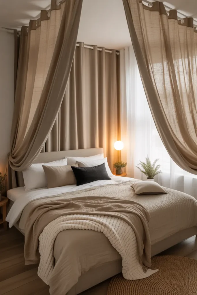
Texture is what keeps beige from being boring. Linen curtains, a nubby wool rug, velvet cushions, a chunky knit throw — when the color palette is restrained, texture becomes the visual interest. Run your hand across the room mentally: every surface should offer a different tactile experience.
The rule: at least three distinct textures in beige tones per sightline. Smooth (satin pillow), rough (jute rug or raw linen), and soft (velvet or wool throw). This variety is what makes neutral rooms feel expensive — it’s the same principle luxury hotels use, and it’s why their beige rooms never look cheap.
5. Choose Black Lighting Fixtures
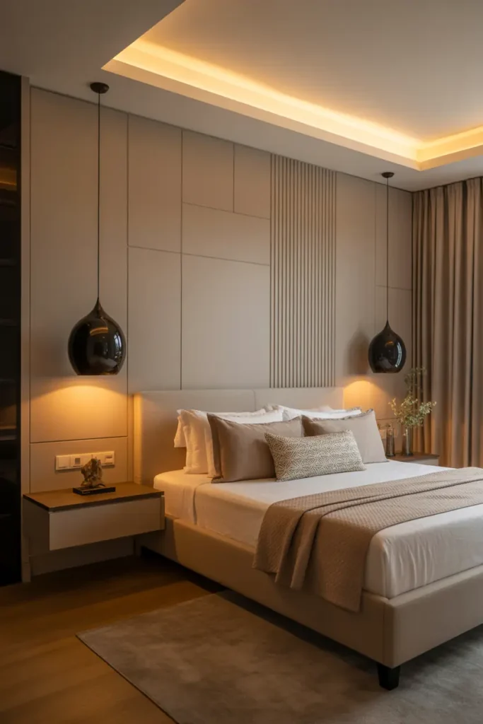
Lighting fixtures are jewelry, and in this palette they should be black: matte black pendant lights, black sconces flanking the bed, a black floor lamp in the corner. Against beige walls and bedding, black fixtures read as crisp punctuation — modern, graphic, intentional.
Keep the fixture shapes simple — the black is the statement, not the shape. And always pair with warm bulbs (2700K): black fixtures with cool white light feel industrial, but black fixtures with warm light feel luxurious. If you’re replacing existing fixtures, spray-painting them matte black ($10 for a can of quality spray paint) is a legitimate designer trick.
6. Edit Until It’s Calm
This palette demands restraint — it’s at its best when there’s room to breathe. Every object in a black-and-beige bedroom should earn its place; the contrast is strong enough that clutter reads as chaos rather than coziness. Clear surfaces, hidden storage, and a “one in, one out” rule for decor.
The test: photograph the room in black and white. If the composition still looks balanced and intentional without color, your editing is right. If it looks busy in monochrome, remove things until it doesn’t. Minimalism isn’t the goal — calm is, and in this high-contrast palette, calm requires editing.
7. Lay Down a Generous Beige Rug
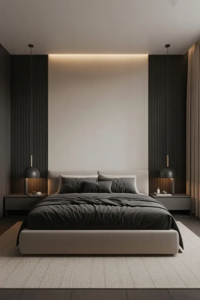
A large beige rug is the foundation layer that ties the palette together — it softens the black furniture’s edges, warms up hard floors, and defines the sleeping zone. In a black-and-beige room, the rug should be the largest beige surface after the bedding; it’s doing structural work, not just decorating.
Size it properly: at least 18–24 inches beyond the bed on three sides. A too-small rug in a high-contrast room looks like an afterthought and actually emphasizes the room’s divisions. Go for texture — a high-pile wool, a chunky jute, or a vintage-style patterned rug in beige tones. The rug is also where you can introduce subtle pattern without disturbing the palette’s calm.
8. Frame the Windows in Two Tones
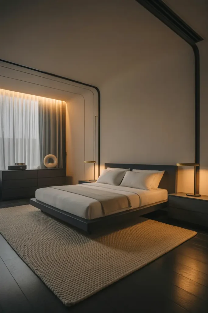
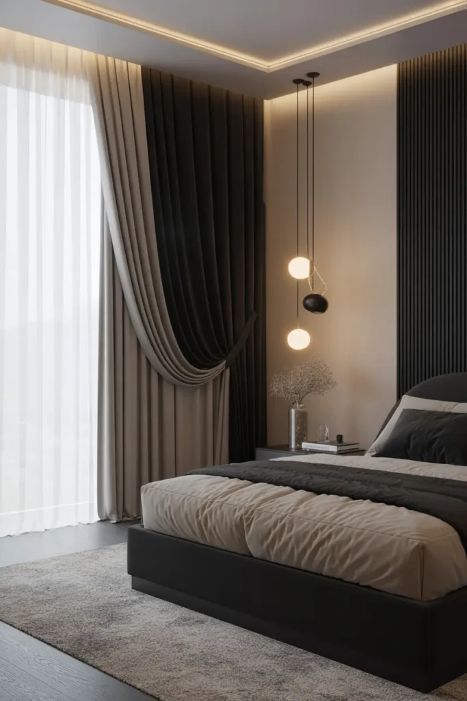
Curtains are a major color block in any bedroom, so use them deliberately: beige sheers for light and softness, with black or charcoal blackout drapes for drama and sleep. Layered together, they give you the full palette in one window treatment — and the practical benefit of perfect light control.
Hang them high and wide (4–6 inches below the ceiling, 6–12 inches beyond the frame) — the oversized scale is what makes curtains look expensive. The black drapes should be the outer layer, the beige sheers inside. During the day: sheers only, soft beige glow. At night: blackout drawn, cocoon achieved.
9. Gallery the Walls in Black and Cream
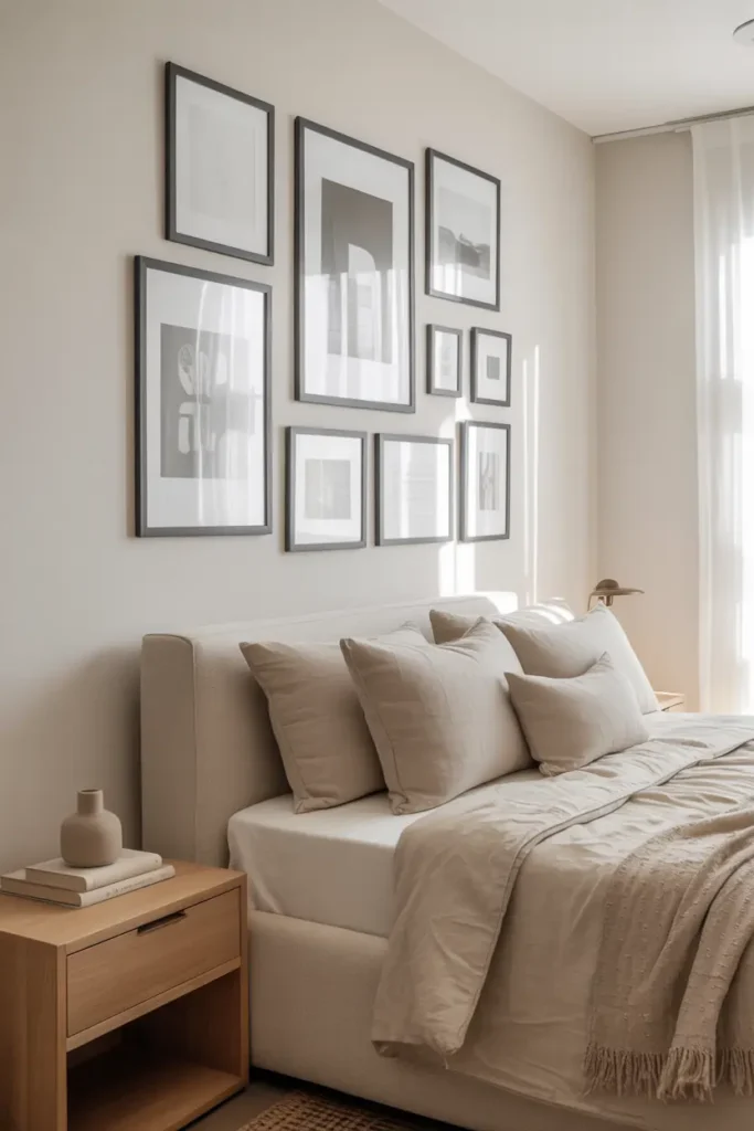
Black frames with neutral, muted artwork are the wall treatment this palette was made for. The black frames echo the furniture and fixtures; the soft art keeps the walls calm. It’s a gallery wall that practically designs itself — the palette does the curating.
Keep the art quiet: black-and-white photography, beige abstracts, pencil sketches, muted landscapes. The frames should be consistent (all thin black, or all thick black — pick one) and hung with consistent spacing. One large piece over the dresser often beats a scattered gallery in this palette; the contrast is strong enough that less composition does more.
10. Add One Upholstered Beige Piece
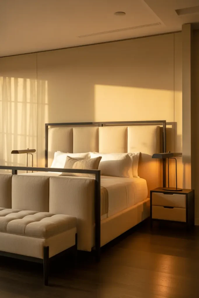
A beige upholstered bench at the foot of the bed, an accent chair in the corner, an ottoman — one soft, sinkable piece in beige balances all the hard black lines. Upholstery is where beige is at its most luxurious: velvet, bouclé, or washed linen in a warm beige tone.
Bouclé is the current darling for good reason — its nubby texture adds enormous visual interest in a solid color, and it wears beautifully. A bouclé bench or chair in oatmeal against black furniture is practically a design cliché now, but clichés become clichés because they work. Keep it clean: beige upholstery shows everything, so choose performance fabrics or commit to the maintenance.
11. Play Matte Against Soft
Here’s the detail that elevates the palette from nice to notable: finish contrast. Matte black (velvety, light-absorbing) against soft beige textures (nubby, touchable) creates a tactile tension that’s felt more than seen. It’s the difference between a room that looks good in photos and one that feels good in person.
Apply it deliberately: matte black nightstands against a bouclé headboard, a matte black tray on a linen duvet, matte frames on a plaster-look beige wall. Avoid glossy black here — shine fights the softness that makes beige work. The palette’s luxury lives in this contrast of hard-matte and soft-touch.
12. Light It Warm, Always
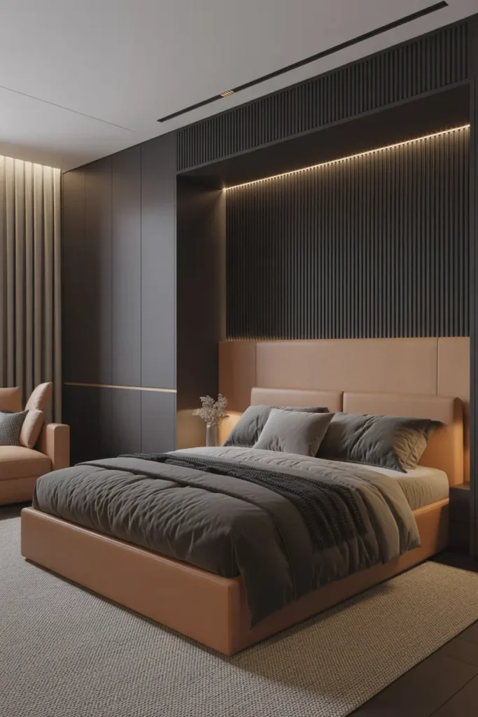
Warm light is non-negotiable in this palette — it’s what makes beige glow and black recede gracefully. Every bulb at 2700K, dimmers on everything, and light sources at multiple heights: bedside lamps, a floor lamp, maybe a picture light over the art. Cool white light turns beige gray and black harsh; warm light turns the whole room golden.
The evening test: with only the lamps on, the room should feel like candlelight — soft pools of warmth, gentle shadows, the black elements receding into elegant darkness. If any light source feels clinical, change the bulb, not the design. In black-and-beige, lighting isn’t decoration; it’s the atmosphere itself.
13. Scatter Small Black Accents
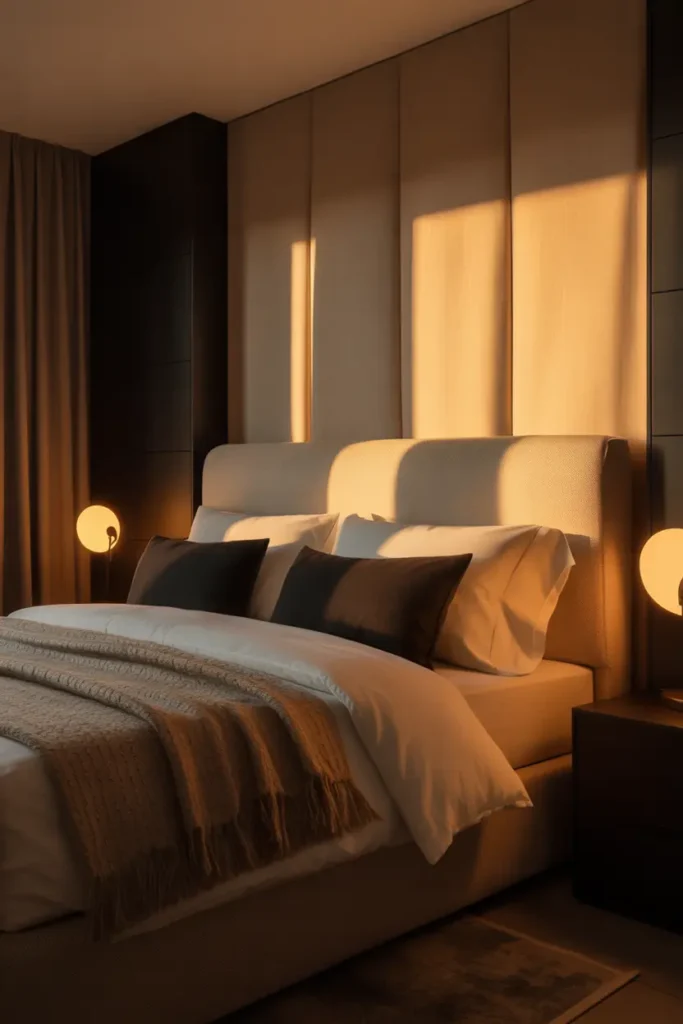
Once the big pieces are placed, small black accents tie the room together: a black tray on the dresser, black picture frames, a black vase, black drawer pulls, a black clock. These are the stitches that quilt the palette together — individually minor, collectively essential.
The rule of three applies at the detail level too: repeat black in small doses at least three times per sightline so it reads as intentional. A single black object in a beige room looks like a mistake; five coordinated black objects look like a scheme. Raid the decor aisle with a list, not a whim.
14. Keep the Layout Impeccable
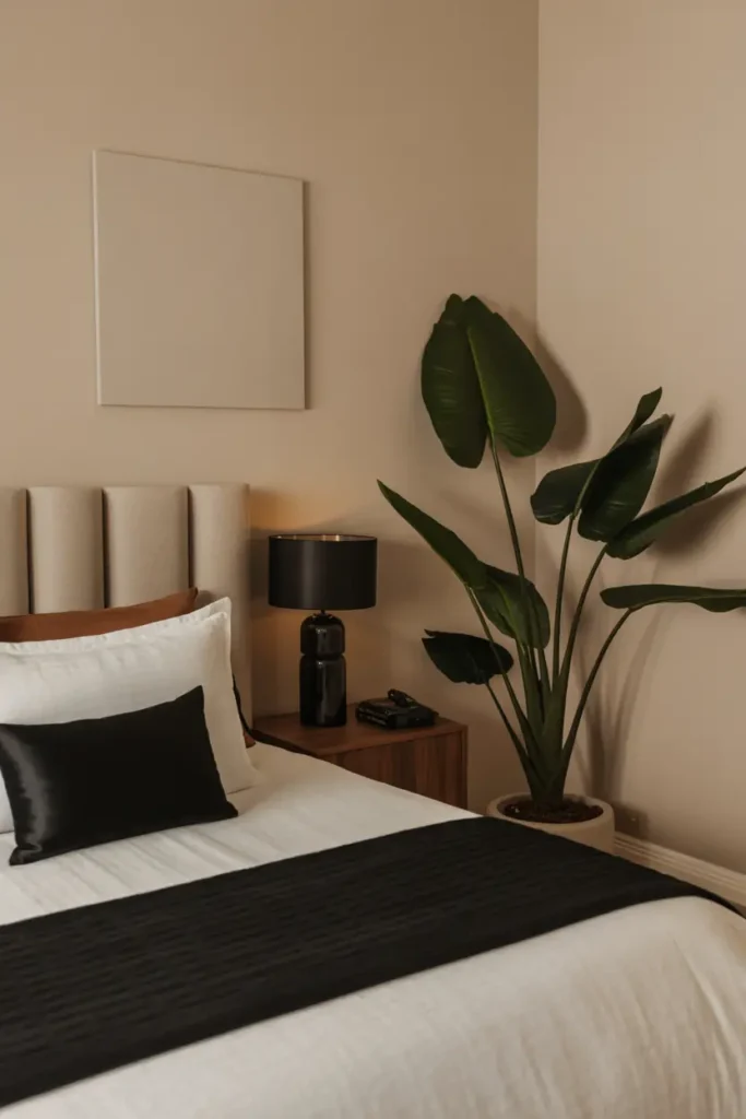
High-contrast palettes magnify disorder — in black-and-beige, a messy room doesn’t look lived-in, it looks chaotic. The layout needs to be clean: symmetrical where possible (matching nightstands, balanced art), clear pathways, and absolutely everything with a home. This is the palette where “a place for everything” isn’t just tidy advice, it’s a design requirement.
Invest in the invisible: drawer organizers, closet systems, under-bed storage. What guests see should be the curated surface; what makes it possible is the organization underneath. An expensive-looking bedroom is always, without exception, an organized bedroom.
15. Bring Nature In
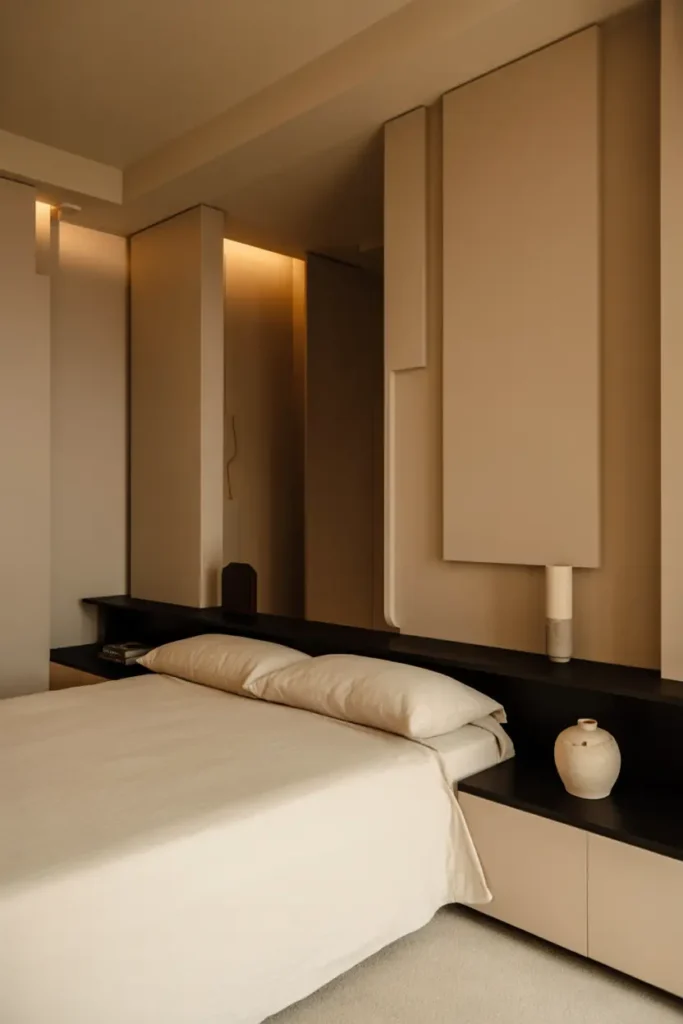
The final layer: something living and organic to keep the tailored palette from feeling sterile. A sculptural plant (olive tree, fiddle leaf, or even a simple snake plant), a wooden tray, woven baskets, a stone object — natural elements add the organic irregularity that makes designed rooms feel human.
Keep it minimal: one plant, one or two wooden or woven pieces. The naturals should whisper against the graphic palette, not compete with it. A single olive tree in a black pot in the corner is the iconic move — it hits black (pot), beige (trunk and light), and living green in one object. That’s the whole palette philosophy in a plant.
Related Decor Ideas
If you love these black and beige bedroom ideas, you can also explore:
- Cozy bedroom lighting ideas for better ambiance
- Small bedroom decor ideas for modern homes
- Minimalist bedroom designs for 2026
- Budget-friendly bedroom makeover tips
Conclusion
Black and beige endures because it’s honest design: contrast for definition, neutrals for calm, texture for richness, and light for atmosphere. No trends to chase, no colors to tire of, nothing that will look dated in five years. It’s the closest thing decorating has to a permanent answer.
Build it in layers — the black anchors first, then the beige softness, then the textures, then the light. Each layer makes the previous ones look more intentional. And when it’s done, you’ll have the thing every expensive hotel is selling: a room that feels calm, tailored, and quietly luxurious, at a fraction of their nightly rate.
Pro Tips
- Test your beige in your light. Beiges have undertones — pink, yellow, gray, green — and they shift dramatically between daylight and lamplight. Test large swatches at different times of day; the wrong undertone will fight your black instead of complementing it.
- Protect beige upholstery. Performance fabrics or washable slipcovers are worth it — beige shows everything. A $30 fabric protector spray applied yearly saves a $800 chair.
- Use black to hide flaws. Scuffed baseboards, dated trim, an ugly radiator — paint them black (or the wall behind them black) and they disappear into shadow. Black is the best concealer in decorating.
- Keep one warm metal. A single warm metallic — brushed brass or champagne — in small doses (lamp base, mirror edge, pulls) bridges black and beige beautifully. It adds the glint that two matte tones can’t provide alone.
FAQs
Will black make my bedroom feel too dark?
Only if black dominates. Keep black to 20–30% of the room (accent wall, furniture, fixtures) and let beige and warm light carry the rest. With proper layered lighting at 2700K, a black-and-beige bedroom feels cozy and cocooning, not dark — that’s precisely the appeal.
What’s the best beige to pair with black?
Warm beiges with yellow or pink undertones — they glow against black. Avoid gray-beige (“greige”) unless you want a cooler, more modern feel; it can read as muddy next to black in poor light. When in doubt, go slightly warmer than you think.
Can this palette work in a small bedroom?
Yes — it’s actually ideal. The high contrast creates definition that makes small rooms feel intentional rather than cramped. Keep the black to furniture and accents (not all four walls), maximize beige surfaces and mirror, and ensure good lighting. Small black-and-beige bedrooms often look more expensive than large ones.
How do I keep a beige bedroom clean with kids or pets?
Washable everything: slipcovers, washable rugs, performance fabrics, and paint in satin or eggshell (wipes clean). Keep throws over the most-used spots — they’re easier to launder than upholstery. Beige with kids is absolutely doable; it just requires washable layers instead of dry-clean-only ones.

HowDecor is a home decor blog sharing simple, practical decorating ideas for everyday spaces. We believe a beautiful home should feel comfortable, personal, and full of warmth — and that great style does not require a huge budget. Our goal is to inspire readers to create spaces that feel peaceful, welcoming, and truly their own — one room at a time.