The risk with a warm neutral living room is that it ends up looking like a furniture showroom — technically correct, emotionally empty. The difference between flat beige and a room that actually feels warm comes down to two things most guides skip: undertones and contrast. Get the undertones wrong and your “warm cream” walls turn greenish next to your sofa. Get the contrast wrong and every beige surface melts into one blurry oatmeal field.
So treat this as a calibration guide, not a shopping list. Every idea below is about making neutrals do actual work — through undertone matching, texture layering, and deliberate contrast — so the room feels collected and calm instead of washed out.
1. Creamy Neutrals That Feel Soft and Lived-In
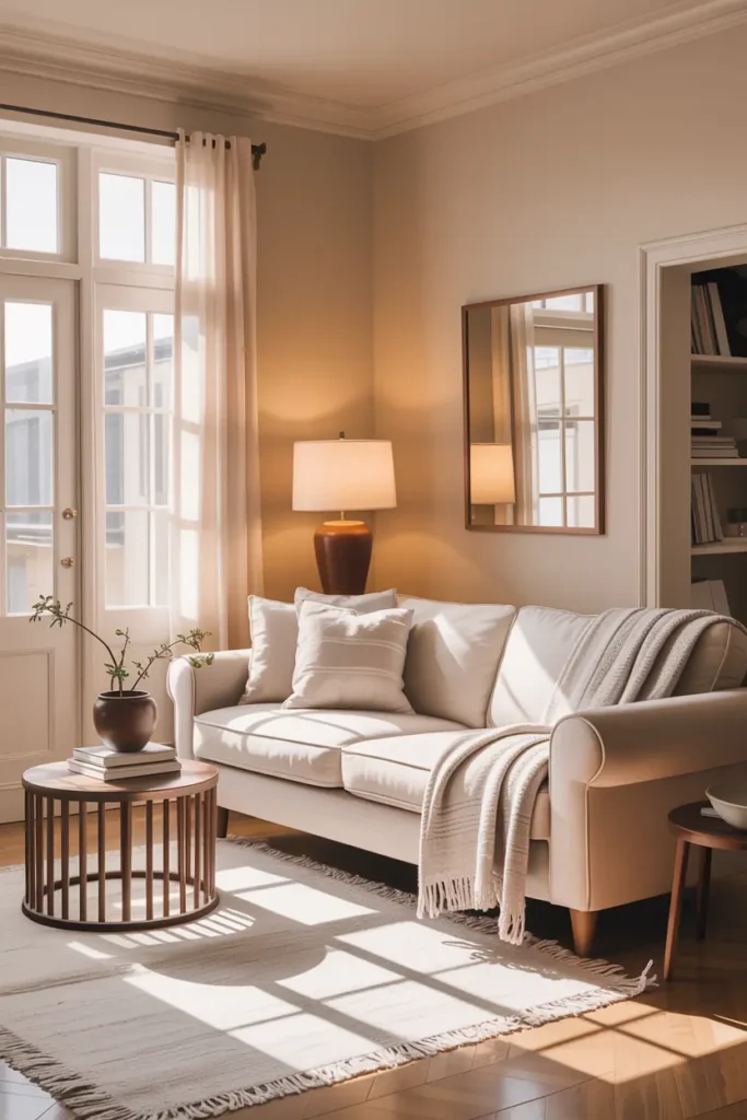
Not all creams are warm. Hold a paint swatch against a true white card in daylight: if the cream looks slightly pink or peach next to it, it has a warm red undertone; if it looks dingy or greenish, it’s a cool cream in disguise. For living rooms, warm whites with a Light Reflectance Value (LRV) between 70 and 85 bounce light without glare — think shades in the family of Benjamin Moore’s White Dove or Swiss Coffee. Paint the largest wall first as a test, and live with it for two days before committing to the whole room.
The mistake that ruins most neutral rooms is pairing a warm beige wall with a cool gray sofa — the undertones fight and both look dirty. Keep every large surface in the same undertone family. If your sofa leans warm greige, your walls, curtains, and rug should lean warm too. Small accents can cross the line; big surfaces can’t. When in doubt, take a cushion cover to the paint store and match under the store’s daylight bulbs, not the fluorescents.
2. Layered Textures Over Bold Colors
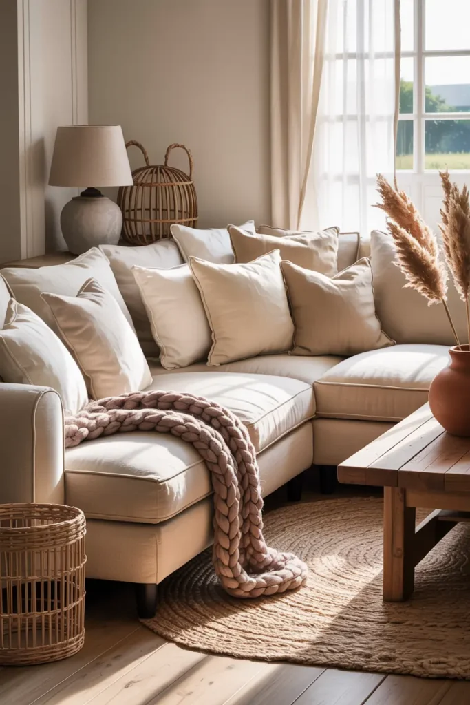
In a room with no strong color, texture becomes the entire visual interest — so you need more of it than you think. Aim for at least four distinct textures in the seating zone: something nubby (bouclé or chunky knit), something smooth (leather or velvet), something woven (linen or jute), and something soft (washed cotton or wool). Without this variety, neutral rooms read as flat no matter how expensive the pieces are.
Use the cushion formula designers rely on: for every three cushions on a sofa, make two solid and one patterned — and let the pattern be textural rather than colorful, like a tone-on-tone stripe or a subtle geometric weave. A wool throw draped over one arm adds a fifth texture and a lived-in feel for under $60. The goal is a room you want to touch, because in neutrals, touch is what the eye is actually reading.
3. Natural Wood That Warms the Space
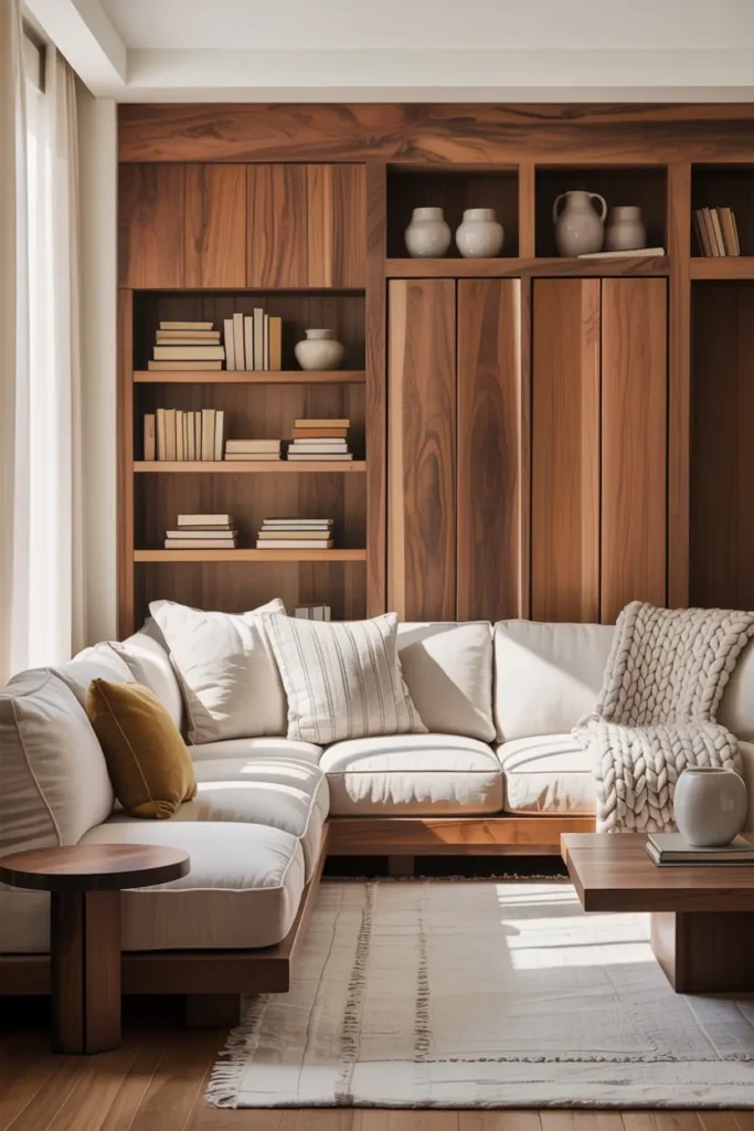
Wood is what keeps a neutral room from feeling like an upholstery catalog — but limit yourself to two wood tones maximum, one light and one medium-dark. Light white oak or ash on the coffee table paired with a walnut-toned side table gives you contrast without chaos; three or more wood species start looking like a furniture warehouse. The contrast between the wood and the surrounding cream is the point: medium wood against pale walls creates the depth that neutrals otherwise lack.
Finish matters as much as species. Matte or oil finishes look organic and hide fingerprints; high-gloss wood in a neutral room reflects light harshly and reads formal. If your existing furniture is the wrong tone, don’t replace it — a $15 tin of gel stain can shift honey oak toward walnut in an afternoon. And keep wood honest: one beautiful grain pattern beats three “wood-look” laminates every time.
4. Soft Curves Instead of Sharp Lines
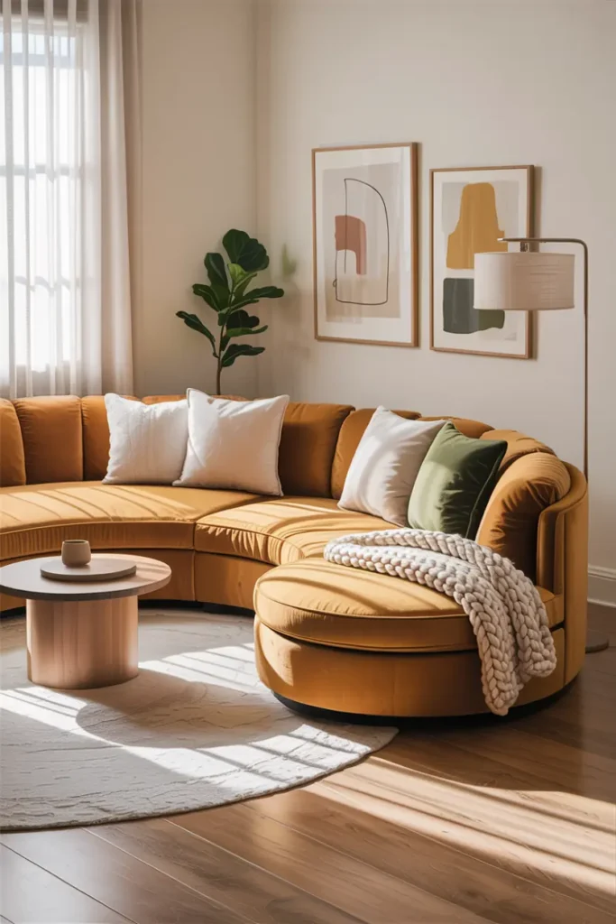
Curves do something measurable in neutral rooms: they create shadow gradients that add depth where color normally would. A curved-back sofa or a kidney-shaped coffee table catches light differently across its surface, giving the eye variation to rest on. You don’t need to replace everything — one strong curve per zone is enough. A round ottoman in front of a square sofa, or an arched floor lamp beside a rectangular bookcase, breaks the grid just enough.
Watch the scale, though. A small round side table next to an oversized sectional looks lost; curves need enough mass to register. As a rule, your curved piece should occupy roughly the same visual weight as the square piece it sits beside. And avoid the trap of curving everything — a room of all blobs feels theme-parky. One or two curves per sightline, with straight lines holding the structure, is the balance.
5. Warm Lighting That Changes the Mood
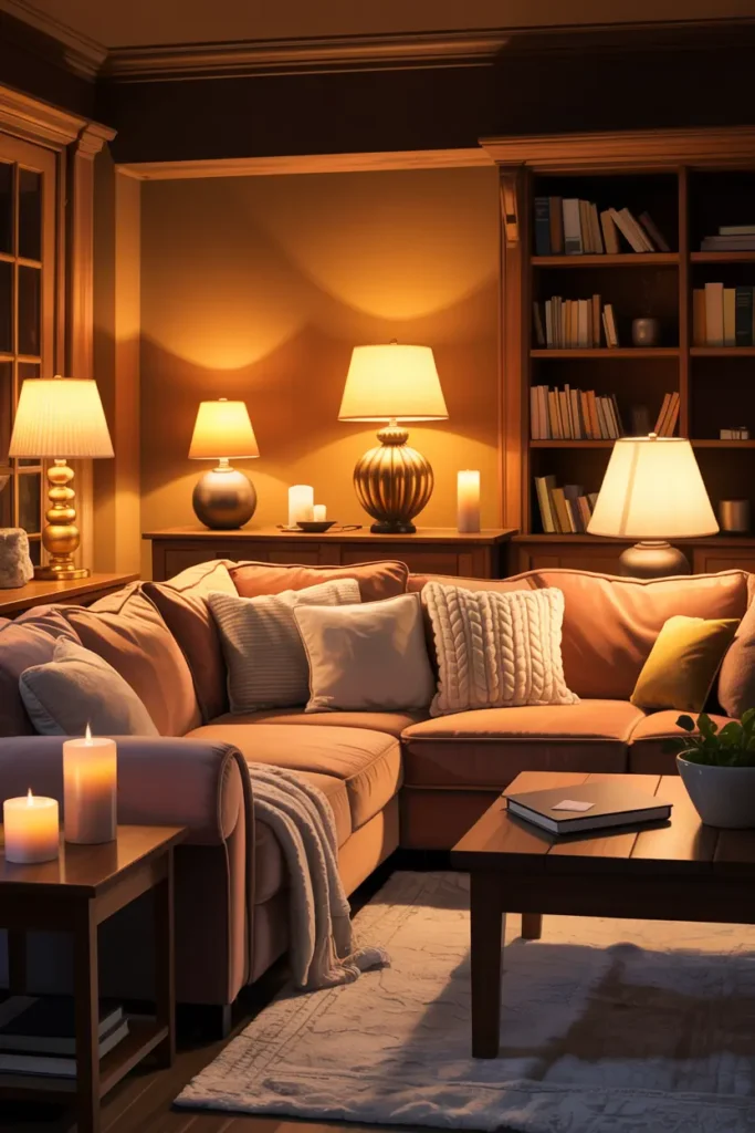
Neutral rooms live or die by lighting because there’s no color to carry the mood after dark. The non-negotiable setup is three light sources at three heights: a floor lamp for ambient wash (aim it at the wall, not the room, for a soft glow), a table lamp at seating level for task light, and one low accent — a candle cluster or a small picture light. Every bulb at 2700K, no exceptions; 3000K and above turns warm beige slightly clinical.
Put the two main lamps on dimmers — plug-in dimmers cost about $12 each and take thirty seconds to install. Linen or natural-fiber shades diffuse light warmly; white plastic shades create hotspots. And keep the overhead off in the evening whenever possible. A neutral room lit only from above looks flat and shadowless; the same room lit from the sides looks deep and expensive.
6. Minimal Decor with Meaning
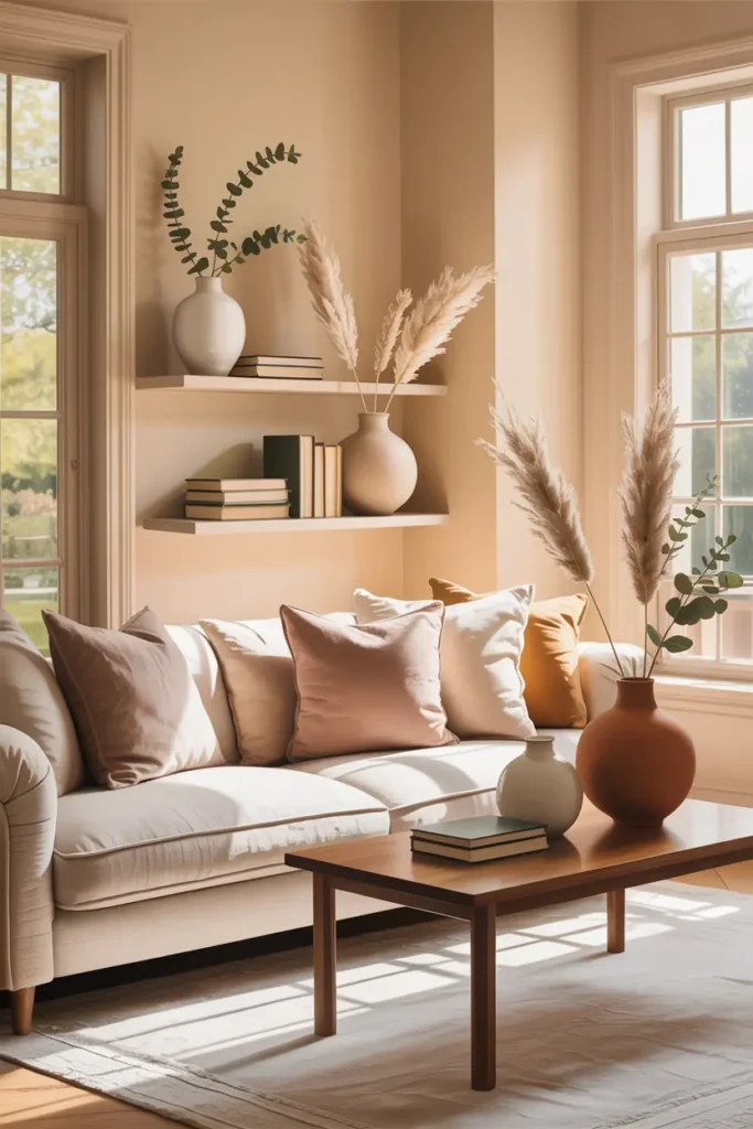
“Minimal” doesn’t mean empty — it means every object earns its square inch. The practical method is the rule of three: group decor in odd-numbered clusters of varying heights (a tall vase, a medium stack of books, a small object), then leave genuine negative space around the group. A styled shelf with breathing room looks curated; the same objects crammed edge-to-edge look like storage.
Choose one statement piece per room and let it be the only thing competing for attention — a large ceramic vase, an oversized art print, a sculptural bowl. Everything else should support it quietly. And edit seasonally: box up half your decor for three months, then swap. You’ll be amazed how “new” the room feels, and it costs nothing. If an object doesn’t get noticed after the swap, it doesn’t belong in the room.
7. Soft Rugs That Anchor the Room
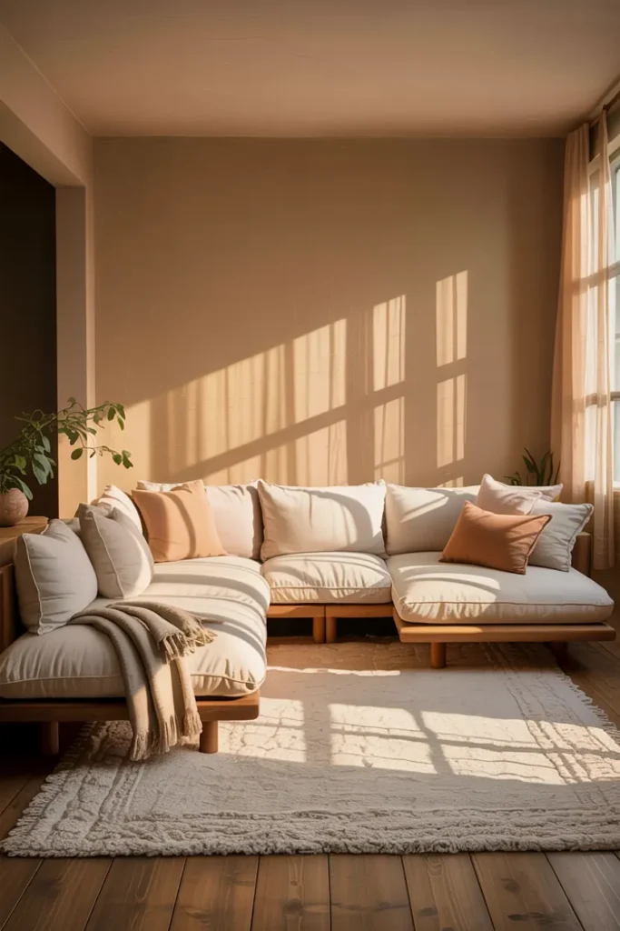
The rug is the foundation the whole seating arrangement sits on, so size it like one. In a standard living room, that means 8×10 feet minimum: all front legs of the sofa and chairs should rest on the rug, with 6 to 8 inches of rug extending beyond each side of the sofa. A too-small rug — the classic 5×7 floating in the middle — visually shrinks the room and makes furniture look like it’s drifting.
For warm neutrals, a low-pile wool or wool-blend rug in a tone slightly darker than your sofa creates grounding contrast; a rug lighter than everything else just disappears. Flatweave and subtle tonal patterns hide traffic wear far better than solid cream, which shows every footprint. Budget around $200 to $400 for a quality 8×10 — and always add a felt rug pad ($50 to $80), which prevents slipping, adds cushion, and doubles the rug’s lifespan.
8. Open Space That Lets the Room Breathe
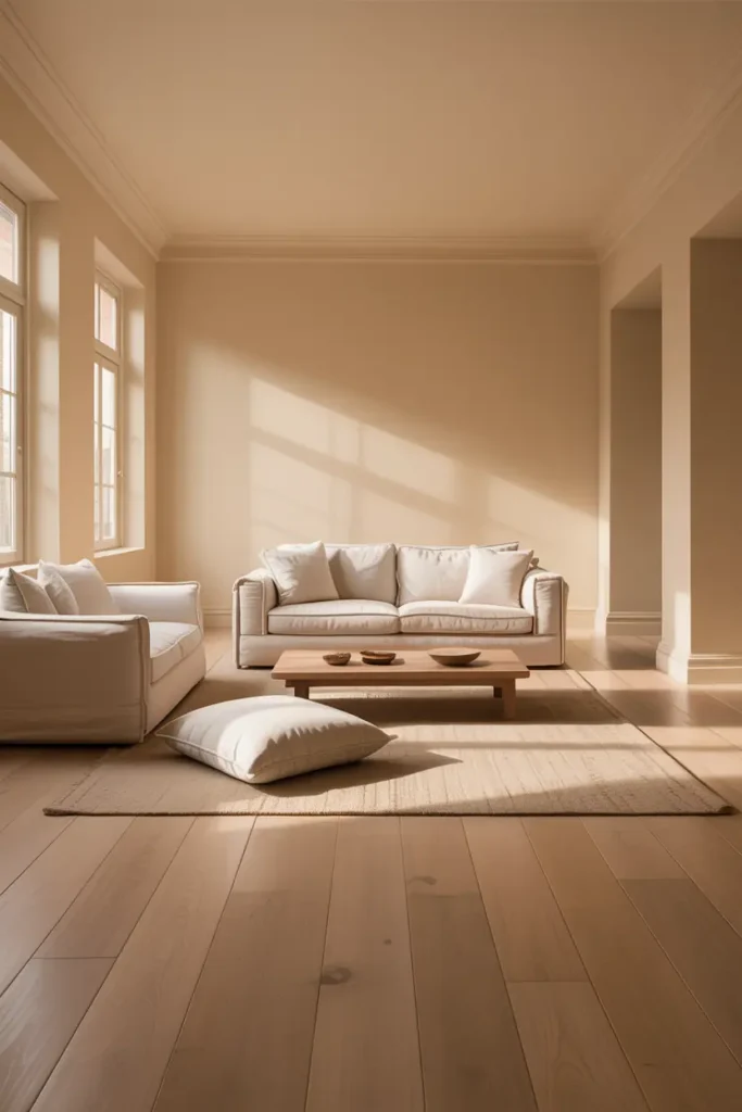
Negative space is a design element, not leftover room. Start with traffic lanes: keep 30 to 36 inches of clear walkway between major furniture pieces, and never block the natural path from door to window. Then float at least one piece — pull the sofa 3 to 6 inches off the wall. Furniture pushed flat against every wall is what makes rooms feel cramped, not the room’s actual size.
Do the “one thing out” test: remove one decor item or one small furniture piece from the room and live with it for a week. If you don’t miss it, it wasn’t contributing. Warm neutral rooms in particular benefit from restraint because every object is visible — there’s no bold color to distract from clutter. The calm you’re after is literally the absence of visual noise, and you create it by subtracting, not adding.
Final Thought
A warm neutral living room succeeds when it feels inevitable — like the textures, tones, and light couldn’t be any other way. That feeling comes from undertone discipline and deliberate contrast, not from buying more beige things. Get those two right and the room stays timeless no matter what trends cycle through.
Pro Tips
- Match undertones, not colors. Take a cushion cover to the paint store and compare swatches against it in daylight — matching the undertone family matters more than matching the exact shade.
- Count your textures. If you can name fewer than four distinct textures in your seating area, add one. Neutrals need tactile variety to avoid looking flat.
- Dim everything. Plug-in dimmers on your two main lamps are the cheapest upgrade in this entire guide — about $25 total — and they transform the room after dark.
- Photograph the room in black and white. Your phone’s monochrome filter reveals whether the room has enough tonal contrast. If everything merges into one gray blob, you need darker accents or deeper wood tones.
FAQs
How do I keep a neutral living room from looking boring?
Boredom in neutral rooms comes from lack of contrast, not lack of color. Add tonal variation — a rug two shades darker than the sofa, medium wood against cream walls, black or bronze in small doses — plus four or more textures. Contrast is what the eye reads as interest.
Warm white or beige for the walls?
Warm white (LRV 70-85) for rooms with good natural light — it stays fresh. Beige or greige for darker rooms, where white can turn gray and gloomy. Either way, match the undertone to your largest furniture piece first.
Can I mix warm neutrals with my existing gray sofa?
Honestly, it’s the hardest combination to pull off — warm and cool undertones fight each other. If replacing the sofa isn’t an option, bridge the gap with greige textiles (which contain both) and keep walls neutral-warm rather than yellow-cream.
What’s the one thing that makes the biggest difference?
Lighting. A neutral room with three warm light sources on dimmers looks expensive; the same room under a single cool ceiling light looks unfinished. Fix the lighting before buying a single new decor item.

HowDecor is a home decor blog sharing simple, practical decorating ideas for everyday spaces. We believe a beautiful home should feel comfortable, personal, and full of warmth — and that great style does not require a huge budget. Our goal is to inspire readers to create spaces that feel peaceful, welcoming, and truly their own — one room at a time.