Most people hear “pink bathroom” and picture two things: a 1950s Mamie Eisenhower time capsule, or a bottle of Pepto-Bismol. Both are failures of undertone, not of pink itself. The pinks that work in bathrooms — the ones you see in high-end hotel renovations — are never pure pink. They’re pink cut with brown, gray, or clay: plaster, mauve, terracotta-rose. Choose from that family and a pink bathroom reads as warm and sophisticated. Choose a blue-based bubblegum and it reads as a kids’ party.
So forget “pink” as a single idea. Below is how to calibrate the shade, what to pair it with so it stays grown-up, and where to spend versus where to hold back — because pink is unforgiving of cheap finishes in a way that white never is.
1. Soft Blush Pink for a Calm Start
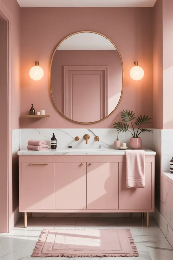
The safest entry point is a blush with a brown or gray undertone — paint colors in the “setting plaster” family rather than anything named after candy or flowers. Here’s the test that matters: paint your swatch and look at it in your actual bathroom light, not the store. Bathrooms are small, enclosed, and usually lit warmly, which intensifies pink. A shade that looks barely-there on the swatch card will read as a confident blush on four walls. Most people should go one shade lighter than their instinct says.
In a small bathroom, blush does genuine work: light pinks have high light reflectance, so they bounce your limited light around instead of absorbing it like a deep color would. Keep the ceiling bright white to lift the room, and paint the pink only to picture-rail height if you’re nervous — the white above keeps it airy while the pink does the warming. One gallon covers a typical powder room; you’re risking about $40 to find out if you love it.
2. Pink and Natural Wood Balance
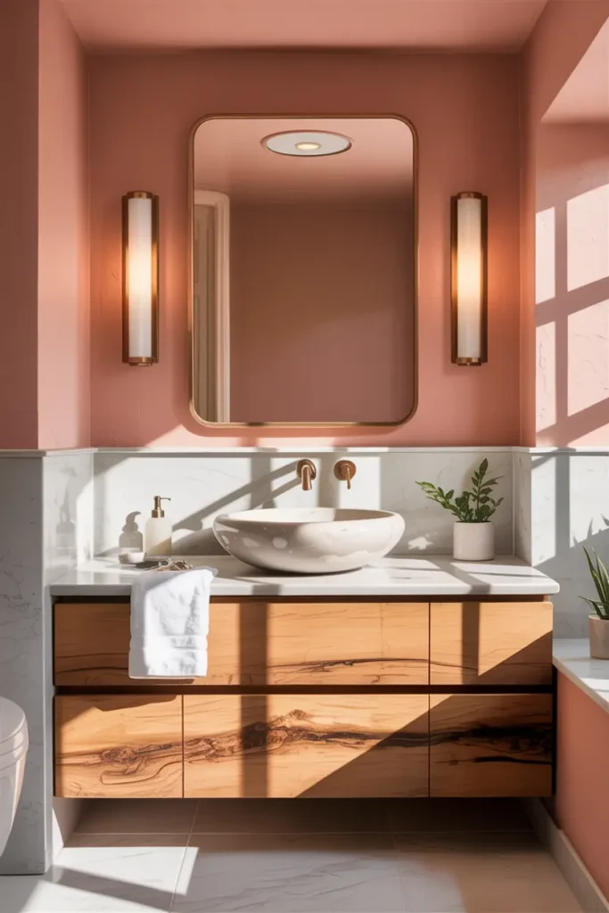
Pink without wood can drift toward the saccharine; wood is the ingredient that makes it read as designed rather than decorated. A floating oak or walnut vanity against blush walls is the classic pairing — the wood’s grain and warmth give the eye something organic to land on. But keep real wood away from direct splash zones: steam and standing water will warp an unsealed vanity within a couple of years.
The workaround for wet areas is wood-look porcelain tile, which has gotten convincingly good — the better ones even vary the grain print across tiles so it doesn’t repeat obviously. Use real wood for the vanity, open shelving, and mirror frames (all wipeable, all replaceable), and porcelain “wood” for floors or shower-adjacent walls. Seal any real wood in the bathroom with a marine-grade polyurethane, and leave a 1/8-inch silicone gap where wood meets tile so moisture can’t wick in.
3. Matte Pink Tiles for a Modern Feel
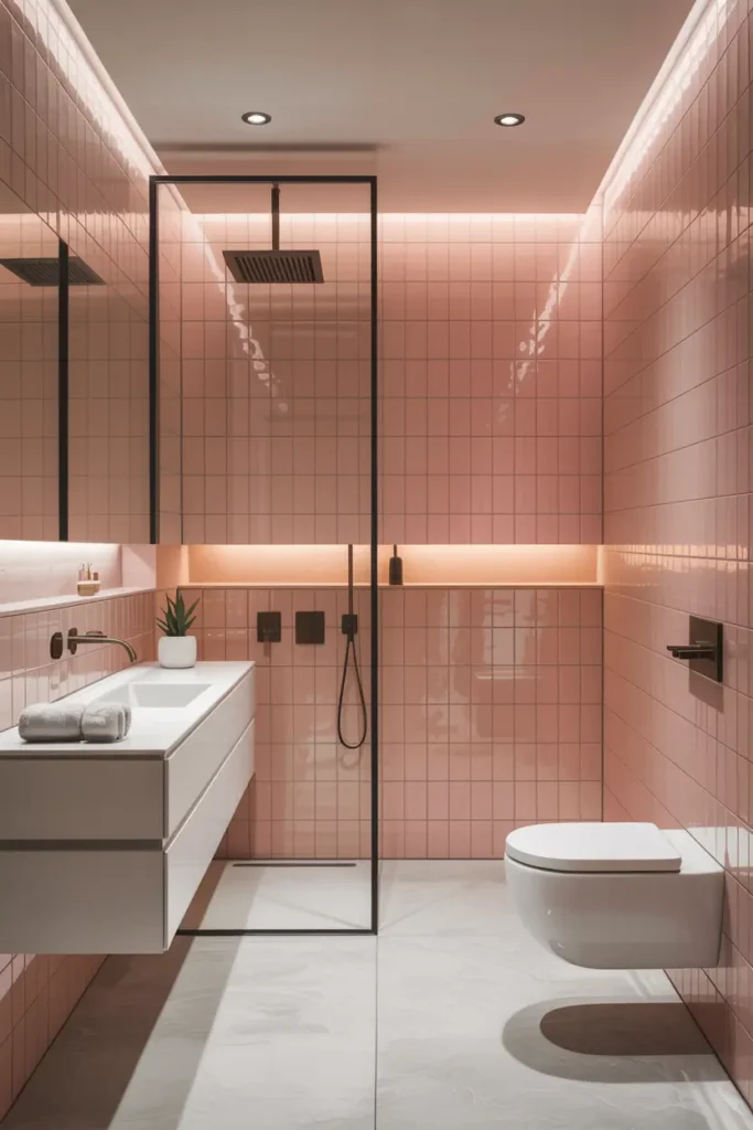
Matte pink tile — especially handmade-look zellige in a dusty rose — is doing the heavy lifting in current bathroom design, and for good reason. The uneven surface catches light in a way flat ceramic can’t, so the wall has movement even though the color is quiet. It also hides water spots and fingerprints far better than gloss, which matters in a bathroom you actually use. Expect to pay $8 to $15 per square foot for decent zellige-look tile; genuine handmade zellige runs higher and varies tile to tile, which is the point.
Grout color will make or break the installation. A stark white grout against pink tile creates a grid that fights the softness you’re after — choose a warm light gray or a grout tinted to sit half a shade darker than the tile. And order 15% overage instead of the standard 10%: handmade-look tiles have more variation and breakage, and dye lots shift, so you want spares from the same batch for future repairs.
4. Pink Accents Instead of Full Color
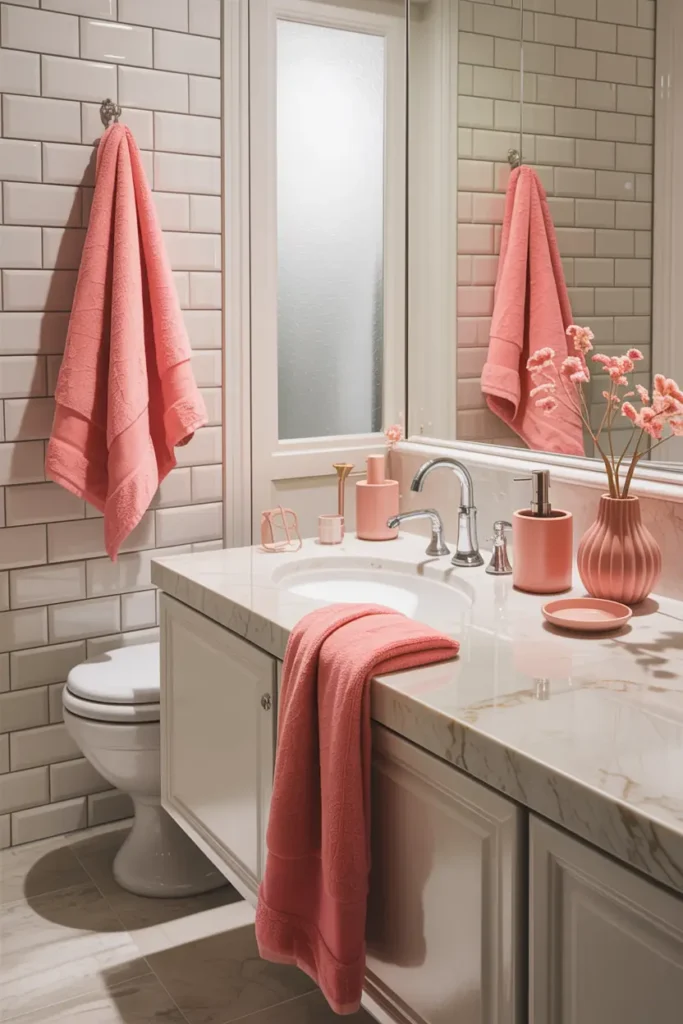
If ripping out tile feels like too much commitment, the accent route gets you 80% of the look for 10% of the cost and zero demolition. The hierarchy of impact goes: shower curtain, towels, bath mat, then small goods like the soap dispenser and a piece of art. A $30 shower curtain in a dusty rose changes the entire color temperature of a white bathroom — it’s the single highest-leverage swap in the room.
The trick is keeping the accents in the same undertone family as each other. A terracotta towel, a mauve soap dispenser, and a blush bath mat harmonize; throw in one hot-pink hand towel and the whole scheme looks accidental. Buy textiles in sets or from the same dye family, and keep the big surfaces (walls, floor, vanity) neutral so the next refresh is a $50 textile swap instead of another project.
5. Pink with Soft Gold Details
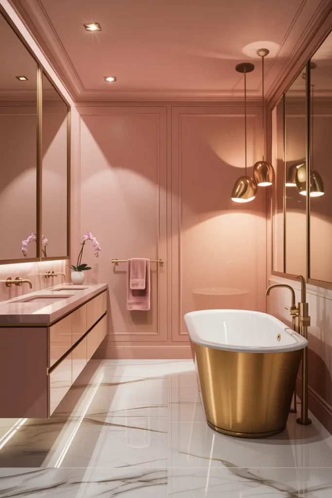
Brass and pink are a natural pair because both are warm — but the finish decides whether it reads luxurious or dated. Brushed or satin brass is the safe choice: it glows without mirroring, hides water spots, and doesn’t shout. Polished gold-look fixtures tend to read as costume jewelry in a bathroom, and cheap gold-finish plastic chips within a year, revealing chrome underneath. If the budget is tight, do fewer brass pieces in real metal rather than more pieces in fake finish.
Pick one metal and commit. Mixing chrome faucets with brass mirrors and black towel bars is the fastest way to make a considered bathroom look indecisive. Unlacquered brass is worth knowing about: it develops a living patina that deepens over months, which suits the organic feel of a pink-and-wood bathroom — but only choose it if you’re comfortable with the metal changing. If you want it to stay exactly as installed, lacquered is the low-maintenance pick.
6. Warm Lighting to Soften Pink Tones
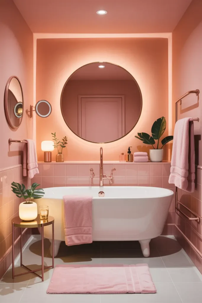
Pink is the most lighting-sensitive color you’ll put in a bathroom, and this is where most pink bathrooms fail. Cool white bulbs (4000K and up) drain the warmth straight out of blush tones and leave them looking flat or slightly gray — the dreaded “dull pink.” Everything in the room should be 2700K, and for the mirror area, look for a CRI (Color Rendering Index) of 90 or above so your skin looks like your skin, not like a photograph of it.
Placement matters as much as color temperature. A single overhead light casts shadows down your face — flattering to no one. Flank the mirror with sconces at roughly face height (about 60 to 65 inches off the floor), which gives even, shadow-free light for routines. Put the vanity lights on a dimmer; bright for morning efficiency, low and warm for the evening wind-down. That dimmer costs $15 and does more for the room’s mood than any fixture upgrade.
Final Thought
Pink works in a bathroom when it’s treated as a warm neutral with opinions — grounded by wood, disciplined about undertones, and lit like you mean it. Get those three right and it stops being a “pink bathroom” and just becomes a good bathroom that happens to be pink.
Pro Tips
- Test paint under your actual bulbs. Paint a large swatch, then view it at 7am and 10pm with your bathroom lights on. Pink shifts more between light conditions than almost any other color.
- One metal, one wood, one pink. Limit the bathroom to a single metal finish, a single wood tone, and pinks from one undertone family. Restraint is what makes pink look expensive.
- Grout half a shade darker than the tile. White grout creates a harsh grid on pink tile; a warm gray grout lets the tile’s color and texture do the talking.
- Start with the shower curtain. Not sure about pink? A $30 dusty-rose shower curtain is a fully reversible experiment that shows you how the color behaves in your light.
FAQs
Will a pink bathroom hurt my home’s resale value?
A fully tiled pink bathroom in a strong shade can narrow your buyer pool, but soft blush tones in the plaster-mauve family photograph as “warm neutral” and rarely hurt value. If resale worries you, keep pink to paint and textiles — both reversible in a weekend.
What’s the best pink undertone for a bathroom?
Pinks with brown or clay undertones (plaster, setting plaster, mauve) handle bathroom humidity and warm lighting best. Avoid blue-based pinks — they turn cold and flat under artificial light and clash with warm wood tones.
Matte or glossy pink tile?
Matte for a modern, calm feel — it hides water spots and reduces glare. Glossy works in small doses (like a shower niche) where you want light bounce. Just know gloss shows every fingerprint and water mark, so it needs more wiping.
Can I mix brass fixtures with chrome ones I already have?
You can, but do it deliberately: keep all the “wet” fixtures (faucet, shower) in one finish and all the “dry” accessories (mirror frame, towel hooks) in the other. Random mixing looks accidental; zoned mixing looks like a choice.

HowDecor is a home decor blog sharing simple, practical decorating ideas for everyday spaces. We believe a beautiful home should feel comfortable, personal, and full of warmth — and that great style does not require a huge budget. Our goal is to inspire readers to create spaces that feel peaceful, welcoming, and truly their own — one room at a time.