Blue and white is the oldest color partnership in interior design — Chinese porcelain, Greek island houses, Delft tile, New England coastal homes. It has survived five centuries of trends for a reason that turns out to be biological: blue light aside, blue as a color measurably lowers heart rate and blood pressure, which is exactly what you want a bedroom to do. But the combination has a failure mode, and you’ve seen it: the blue that’s slightly too bright, the white that’s slightly too stark, and suddenly the room feels like a corporate lobby instead of a retreat.
The difference is undertone and proportion. Get those right and blue-and-white is timeless. Get them wrong and it’s just… blue and white. Here’s how to get them right, section by section.
1. Classic Blue and White Palette
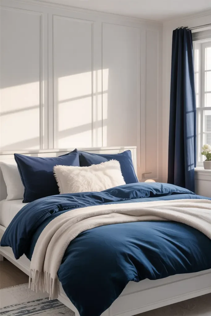
First, the undertone rule that governs everything below: blues come in two families — green-blues (teal, turquoise, sea-glass) and purple-blues (navy, indigo, periwinkle). Pick one family and stay in it. A teal throw on a navy bed looks like a mistake; two navy-family pieces at different depths look like a scheme. Hold swatches together in daylight: if one looks green next to the other, they’re from different families.
Second, the proportion rule: let white dominate. Aim for roughly 70% white, 20% mid-blue, 10% deep navy. White is doing the calming work — it keeps the room bright and restful — while blue provides the depth and interest. Flip the ratio and the room gets heavy and sleep-disrupting instead of serene. Navy, used sparingly, functions almost as a neutral: it’s the “black” of this palette, grounding everything without shouting.
2. Soft Blue Accent Wall
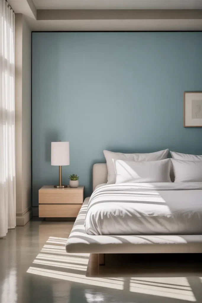
The accent wall goes behind the bed — always. It’s the wall you see least when you’re in the bed and most when you enter the room, which makes it the ideal place for color: maximum impact on arrival, zero interference with rest. For a bedroom, choose a muted blue with gray in it — a dusty chambray or a soft slate — rather than a saturated primary blue. Saturated blues advance visually and can feel agitating in a sleep space; muted blues recede and calm.
Paint it in eggshell, not flat: the slight sheen bounces lamplight softly and wipes clean. One gallon covers a typical bedroom accent wall with two coats. And here’s the pro move most people skip — paint the wall, then live with it for three evenings before deciding on bedding. The blue will look different against your actual lamps than it did in the store, and bedding is easier to adjust than paint.
3. White Bedding with Blue Layers
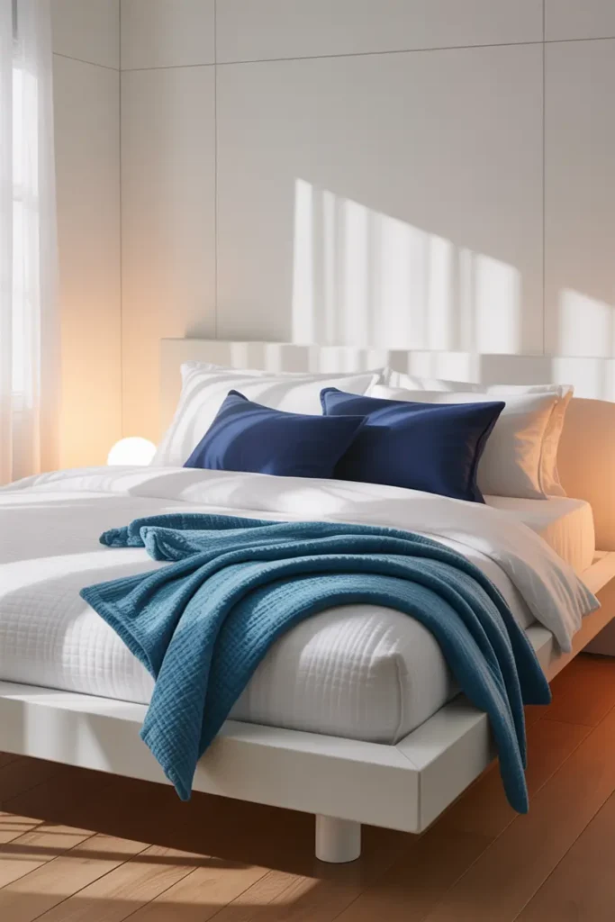
White bedding is the canvas; blue is the brushwork. Start with white sheets and a white or ivory duvet — crisp, clean, the hotel look — then add blue in exactly two layers: a mid-blue throw folded across the foot, and two blue pillows in front of the white sleeping pillows. Two blue touches, different depths (say, a chambray throw and navy shams). That’s the complete formula. A third blue layer is where “layered” tips into “busy.”
This setup is also your seasonal lever. In summer, swap the throw for a lighter blue linen; in winter, bring in the navy wool. The white base never changes, so each seasonal refresh costs one textile, not a redecoration. And keep the blues washable — indigo-dyed cotton throws fade beautifully over time, developing the soft, lived-in character that makes this palette feel collected rather than staged.
4. Blue Upholstered Headboard
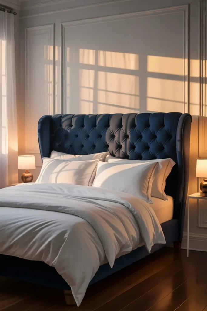
A navy upholstered headboard is the fastest way to give a white bedroom architecture. It creates a strong vertical anchor behind the bed, adds a huge dose of your deepest blue in one move, and gives you something comfortable to lean against. Velvet reads most luxurious; a performance linen or woven texture reads more relaxed. Either way, choose a fabric rated for at least 30,000 double rubs (the Wyzenbeek rating) — a headboard gets leaned on daily, and cheap fabric pills within a year.
Height matters: 48 to 54 inches from the floor puts the headboard in proper proportion to a standard bed, tall enough to read as intentional but not so tall it overwhelms a room with 8-foot ceilings. If a new headboard isn’t in the budget, a slipcover in navy over your existing headboard gets you 90% of the look for under $60. Mount it to the wall rather than the bed frame if you can — it stays put, and the bed can be moved for cleaning without a wobble.
5. Coastal Blue and White Style
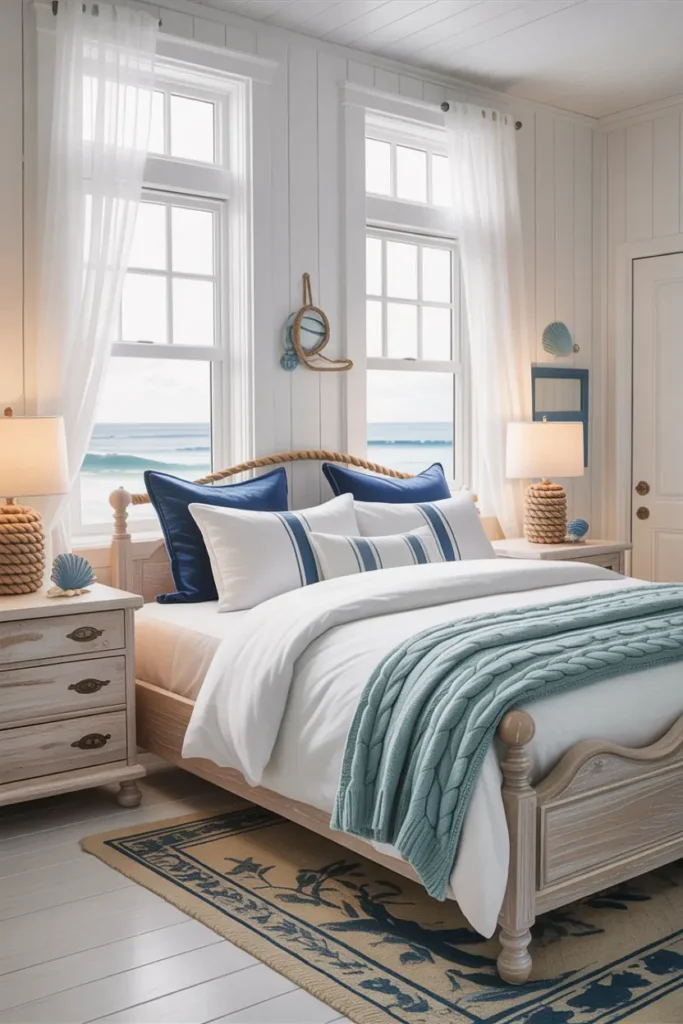
Let’s draw the line clearly: coastal is a feeling, not a theme. The feeling is air, light, and natural texture. The theme — anchors, ropes, “beach house” signs — is what makes coastal bedrooms feel like gift shops. Stay on the right side by banning literal nautical motifs entirely and building the coastal feel from materials instead: weathered or whitewashed wood, natural linen, jute or sisal, and glass that catches light.
The palette for grown-up coastal is pale blue, white, and sand — never turquoise, which reads tropical rather than coastal, and never more than a hint of the sand tone. A jute rug, linen curtains in a pale blue-white stripe, and one piece of weathered wood furniture deliver the entire concept. If you can smell the salt air without seeing a single seashell, you’ve done it right.
6. Blue Patterned Textiles
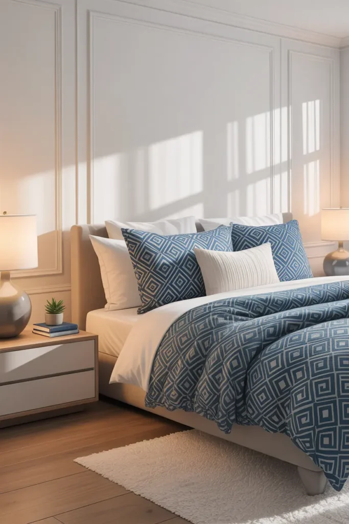
Patterns are where blue-and-white rooms get their personality, but they follow a strict scale rule: mix one large-scale pattern with one small-scale pattern, never two of the same scale. A broad blue stripe on the duvet plus a small geometric on the pillows works; two medium florals fight each other. And keep the patterns to textiles only — patterned walls plus patterned bedding is pattern overload in a room meant for rest.
Classic combinations that never fail: ticking stripe with a small dot, block-print floral with a thin stripe, ikat (large scale) with solid navy. Keep the background of every pattern white or ivory so they all share a common ground — that’s what makes different patterns feel related instead of random. Two patterns maximum per room. The white space between them is doing as much work as the patterns themselves.
7. White Furniture with Blue Accents
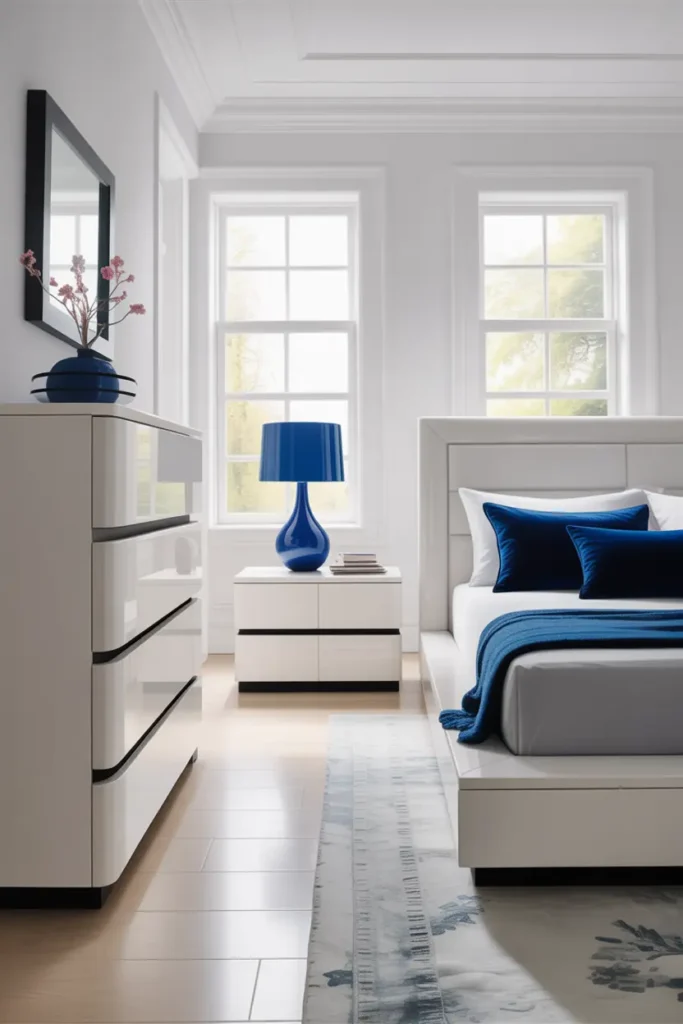
White furniture is the practical backbone of this palette: it reflects light, makes small rooms feel larger, and — counterintuitively — shows less dust than dark wood. The maintenance reality is scuffs, not dust: white painted furniture marks where dark furniture doesn’t. The fix is choosing the right paint from the start — a satin or semi-gloss acrylic enamel, which wipes clean and resists marking far better than flat wall paint ever will.
With white furniture holding the room, blue becomes the accent color in small, movable doses: a blue ceramic lamp base, a stack of blue-spined books, one piece of blue-and-white art. This is the most flexible version of the palette — when you want a change, you swap objects, not furniture. And it photographs beautifully, because the white furniture bounces light into every corner while the blue accents give the camera something to hold onto.
8. Soft Blue Curtains and White Walls
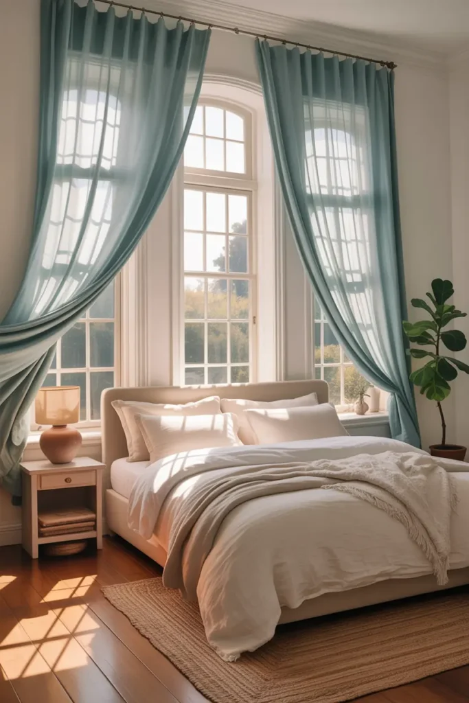
Blue curtains do double duty: they’re a large soft surface of your accent color, and they filter the daylight coming through them. A pale blue linen curtain turns harsh afternoon sun into a soft blue-tinted glow — the room literally bathes in the palette. Choose a light-filtering linen or cotton voile rather than blackout for the main panels; you want the light transformed, not blocked. (If you need darkness for sleep, add a separate blackout roller blind behind the decorative panels.)
Hang them to frame the view, not cover it: rod 4 to 6 inches above the frame, 8 to 12 inches wider on each side, panels kissing the floor. In a blue-and-white room, the curtains are often the largest single piece of blue in the space, so get the color right — hold the fabric up to your blue textiles in daylight before committing. A curtain that’s half a shade off from everything else will bother you every single day.
Final Note
Blue and white endures because it’s honest: white for light and rest, blue for depth and calm, in proportions that let each do its job. Respect the undertone family, keep white dominant, and let the blue arrive in confident, well-placed doses. Five centuries of designers can’t all be wrong.
Pro Tips
- Pick one blue family and commit. Green-blues and purple-blues don’t mix. Hold every blue in the room together in daylight — if one looks green next to the others, it’s the wrong family.
- Let white do 70% of the work. The calm comes from the white; the interest comes from the blue. Flip that ratio and the room gets heavy instead of serene.
- Test the accent wall for three evenings. Blue shifts dramatically under lamplight. Live with the painted wall before choosing bedding — fabric is easier to adjust than paint.
- Coastal feeling, zero anchors. Build “coastal” from linen, jute, weathered wood, and glass — never from themed decor. If there’s a seashell in the room, you’ve gone too far.
FAQs
What shade of blue is best for sleep?
Muted, gray-toned blues — dusty blue, slate, soft chambray. Research consistently links blue with calm, but saturated bright blues can be stimulating rather than restful. When in doubt, go one shade more muted than your instinct says.
Can I mix navy and light blue in the same room?
Yes — that’s exactly how the palette works best, as long as both blues are from the same undertone family. Use light blue for large soft areas and navy in small, grounding doses (headboard, throw pillows, one textile).
Will blue walls make my small bedroom feel smaller?
One muted blue accent wall behind the bed won’t — it actually adds depth. Four walls of saturated blue will. Keep three walls white and the room keeps its brightness while gaining the blue’s calming depth.
How do I keep white bedding actually white with blue layers?
Wash whites separately in warm water with oxygen bleach, and wash new blue textiles alone two or three times first — indigo and navy dyes bleed. Once the blue stops releasing dye in the rinse water, it’s safe to wash with the whites.

HowDecor is a home decor blog sharing simple, practical decorating ideas for everyday spaces. We believe a beautiful home should feel comfortable, personal, and full of warmth — and that great style does not require a huge budget. Our goal is to inspire readers to create spaces that feel peaceful, welcoming, and truly their own — one room at a time.