Here’s what “stylish” actually means in a living room: it’s not a price point or a trend — it’s visual hierarchy. Walk into any room that impresses you and you’ll find the same thing: one clear focal point, a calm backdrop that lets it shine, and nothing competing for attention. Walk into a room that feels “off” and you’ll find the opposite: five things shouting at once, or nothing to look at at all. Stylish is just the word we use when the hierarchy works.
The five ideas below build that hierarchy from the ground up. Each one answers a single question — what’s the backdrop, what’s the star, where does the light come from — and together they produce the “designed” feeling that has nothing to do with budget.
1. Neutral Color Balance
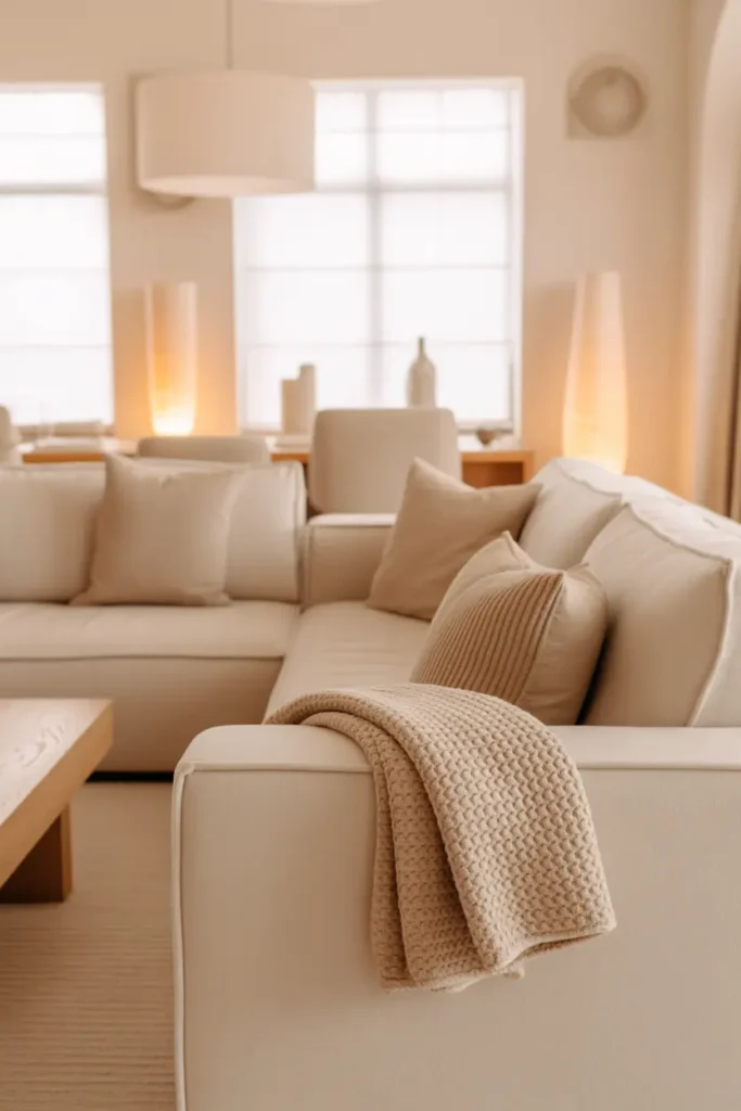
Neutrals are the backdrop, and the backdrop has one job: disappear. That means choosing a neutral with the right undertone for your light — warm greige or creamy beige for most living rooms — and then committing to it across the big surfaces: walls, sofa, rug, curtains. When the large planes agree with each other, the room reads as calm and expensive; when they argue (cool gray walls against a warm beige sofa), everything looks slightly wrong and nobody can say why.
Use the 60-30-10 framework to keep it structured: roughly 60% dominant neutral (walls and largest furniture), 30% secondary neutral a shade deeper (rug, curtains), 10% accent — and the accent is the only place color is allowed to speak. That 10% is powerful precisely because it’s scarce: a terracotta throw, a pair of olive cushions, one piece of art with a confident color. Scarcity is what makes an accent feel stylish instead of random.
2. Statement Sofa Styling
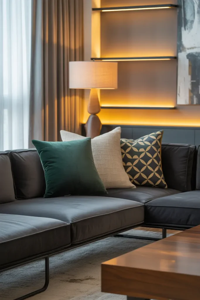
The sofa is the room’s star — it’s the largest object and the one everything else orients around — so it gets styled like one. The designer formula: start with the sofa’s own color as the base, then add cushions in descending size from the arms inward — 22-inch at the back corners, 20-inch in front of those, one 14×22 lumbar in the center. Odd numbers, mixed textures, all within your neutral family plus the one accent color. Five cushions total for a standard three-seater; more than that and sitting down becomes a chore.
The throw is where people go wrong: draped carelessly, it looks like laundry; folded in thirds lengthwise and laid across one arm or the back corner, it looks intentional. That single fold is the difference. And skip the karate-chop dent in the cushions — it was a showroom trend from 2015 that reads as dated now. Plump, smooth, and symmetrical is the current language of luxury, and it takes thirty seconds longer.
3. Mirror for Elegant Space
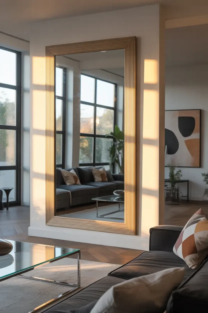
A mirror earns its place in a stylish living room by doing something no other object can: borrowing a view. Hung or leaned across from the window, it captures daylight and greenery and puts them on a second wall — the room gains a view it didn’t have. Hung where it reflects a blank wall or the TV, it doubles the dullest thing in the room. Placement isn’t a detail here; it’s the entire point.
Scale it like art, not like an accessory: a mirror over a console should be roughly two-thirds the console’s width, and a leaning floor mirror should stand at least 60 inches tall to read as furniture rather than decoration. Frame it deliberately — thin black for modern, natural wood for warmth, brass for a touch of polish. An unframed mirror in a stylish room looks unfinished, like a sample waiting for its frame. The frame is what promotes it from trick to design.
4. Minimal Wall Art
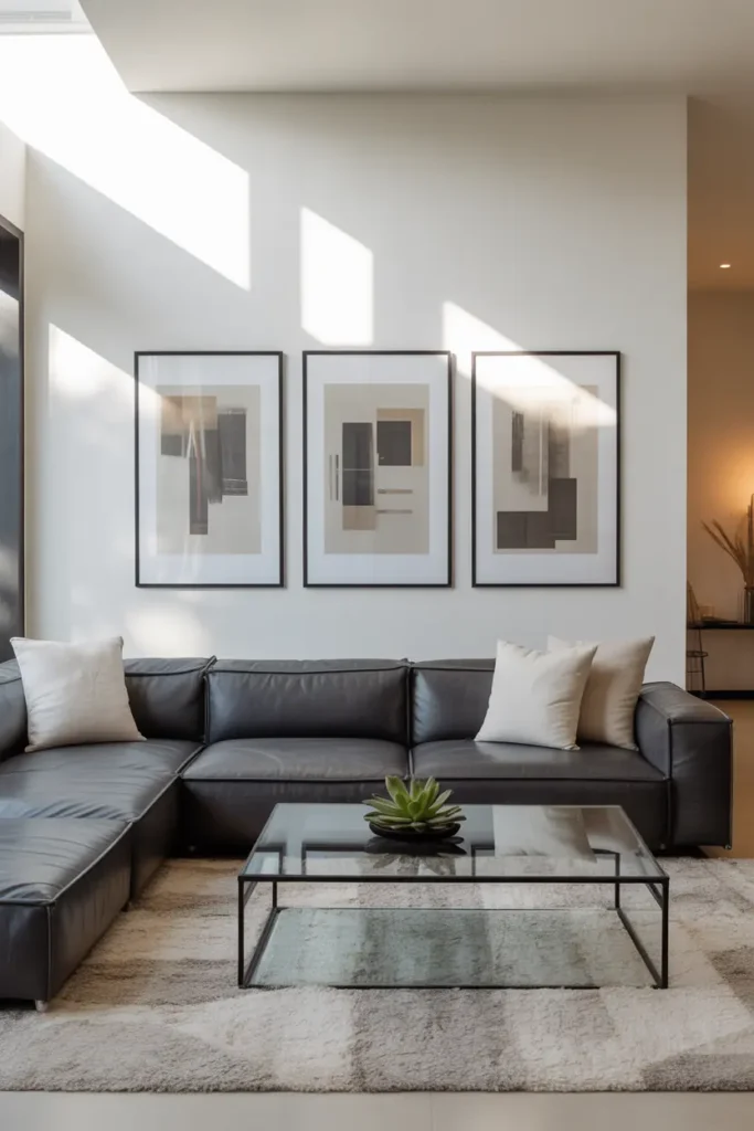
One wall, one statement — that’s the hierarchy at work. Choose the wall your eye lands on from the main seating position (usually above the sofa or the console), and give it a single piece sized at two-thirds the furniture’s width, centered 6 to 10 inches above it. Abstract, landscape, or large-scale photography in tones that echo the room’s neutrals will always work; the art should feel like it belongs to the palette, not like it wandered in from another house.
Resist the gallery wall unless you have a genuinely large expanse — in most living rooms, multiple small frames fragment the wall and dilute the focal point you’re building. If you already own several small pieces you love, unify them ruthlessly: identical frames, identical mats, hung in a tight grid with 2-inch gaps. Uniformity turns a collection into a single visual event, which is what the hierarchy demands. Scattered and mismatched turns it into noise.
5. Soft Lighting Magic

Lighting is the stylist’s secret because it changes how everything else looks — the same sofa reads as flat under a cool ceiling light and rich under warm lamplight. Build the classic triangle: one floor lamp in a corner (arched or tripod, aimed to wash the wall), one table lamp at seating height, and the overhead either off or dimmed to a whisper. All bulbs at 2700K. This isn’t ambiance as decoration; it’s the light the room’s colors were chosen for.
The magic hour test: at dusk, turn off the overhead and turn on the two lamps. If the room suddenly looks like it belongs in a magazine, your decor was fine all along — it was the light. Put both lamps on dimmers (plug-in versions cost about $12) so you can tune the mood from “evening with friends” to “late night, one lamp.” Stylish rooms aren’t brightly lit; they’re deliberately lit. There’s a difference, and it’s about $25 worth of dimmers.
Final Note
Style is hierarchy: a calm neutral backdrop, one clear star (the sofa), one borrowed view (the mirror), one confident piece of art, and light that flatters it all. None of these ideas requires new furniture. All of them require deciding what the room is about — and then letting everything else support that decision quietly.
Pro Tips
- Decide the focal point first. Every other decision — where the sofa faces, where the art goes, where the light falls — follows from it. A room without a focal point can’t look stylish, only furnished.
- Audition with your phone camera. Photograph the room from the doorway and from the sofa. The camera flattens the space and reveals hierarchy problems — competing focal points, dead corners — that your eyes edit out in person.
- One accent color, used three times. The throw, one cushion, and one small object in the same accent hue create a thread that ties the room together. Three appearances is the minimum for it to read as intentional.
- Dim the overhead, always. If your living room has one ceiling light doing all the work, that’s the first thing to fix — before any decor purchase. Lamps on dimmers, overhead off or barely on.
FAQs
What makes a living room look “stylish” vs. just “nice”?
Visual hierarchy. Stylish rooms have one clear focal point, a calm supporting backdrop, and deliberate lighting — everything serves the composition. “Nice” rooms have pleasant things arranged without a clear point of view. The difference is decision, not money.
How many colors should a stylish living room have?
Two neutrals plus one accent is the sweet spot — roughly 60% dominant neutral, 30% secondary neutral, 10% accent. More colors can work, but each additional color needs a clear role or it just becomes noise.
Where should the mirror go if there’s no good window to reflect?
Reflect the room’s best feature instead: the styled bookshelf, the art wall, or the seating area itself. As a last resort, a mirror behind a console with a lamp in front of it creates its own vignette — the lamp’s glow doubled in the glass is genuinely beautiful.
Can I mix modern and traditional in one living room?
Yes — the 80/20 rule keeps it coherent: 80% one style (say, modern clean lines), 20% the other (a traditional rug, a vintage lamp). The minority pieces read as character; a 50/50 split reads as indecision. Keep the palette unified and the mix will feel curated.

HowDecor is a home decor blog sharing simple, practical decorating ideas for everyday spaces. We believe a beautiful home should feel comfortable, personal, and full of warmth — and that great style does not require a huge budget. Our goal is to inspire readers to create spaces that feel peaceful, welcoming, and truly their own — one room at a time.