I’ve lost count of the kitchens where the owner chose a colour from a phone screen and regretted it by Christmas. Here’s what fifteen years of colour consultations taught me: paint chips lie, phone screens lie, and the only thing that tells the truth is a painted sample board taped to your actual cabinet, viewed in your actual light, at three times of day.
The 21 colours below aren’t trends — they’re the ones I specify repeatedly because they behave. They work across house styles, budgets, and, crucially, across different levels of natural light. For each, I’ll tell you where to put it, what it hides, and what it demands.
1. Navy Blue for Depth and Sophistication
Navy is the dark colour with training wheels. It reads as neutral from across the room — guests will call your kitchen “classic” rather than “blue” — yet it gives cabinets the depth that flat white never can. Use it on lower cabinets or an island, never on all four walls of a small kitchen, or the room will feel like the inside of a coat.
It works particularly well in kitchens with decent natural light since the darker tone absorbs light rather than reflecting it. In a well-lit space, this creates a rich, layered quality that brighter colours simply cannot replicate. Navy also pairs effortlessly with brass, chrome, and matte black hardware, giving you plenty of flexibility in the finer details. One rule: check the undertone. A navy with green undertones goes murky under warm bulbs; one with purple undertones turns inky. Paint a full door before you commit.
2. Sage Green for Calm and Character
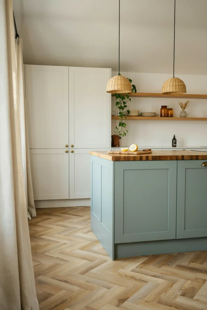
Sage is the colour of the last five years, and unlike most fashionable colours, it has a genuine reason: it’s the exact midpoint between grey and green, so it calms a room without cooling it. In a kitchen it reads as both natural and designed — the rare colour that suits a cottage and a new-build equally.
Designers tend to use sage green on lower cabinets or on a kitchen island, keeping the upper cabinets in white or cream to maintain lightness. Paired with natural wood, aged brass, and simple ceramic accessories, it creates a kitchen that feels calm, considered, and quietly beautiful. Warning: sage shifts dramatically with light. North-facing rooms pull it grey; south-facing rooms pull it minty. Sample it on the wall it will live on.
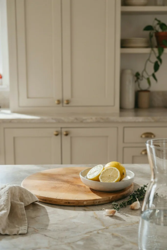
3. Warm White to Avoid a Clinical Feel
Not all whites are equal, and designers know this better than anyone. A warm white — one with a drop of yellow or red in the mix — is the difference between a kitchen that feels like a home and one that feels like a laboratory. If your kitchen gets cool northern light, warm white isn’t a preference, it’s a correction.
The choice between warm white and cool white is one of the most impactful decisions in the whole kitchen, and it’s free — same tin price, wildly different room. Test with the “hand test”: hold your hand against the sample. If your skin looks healthy, the white is right for your light. If your hand looks grey, the white is too cool for the room.
4. Forest Green for a Bold Statement
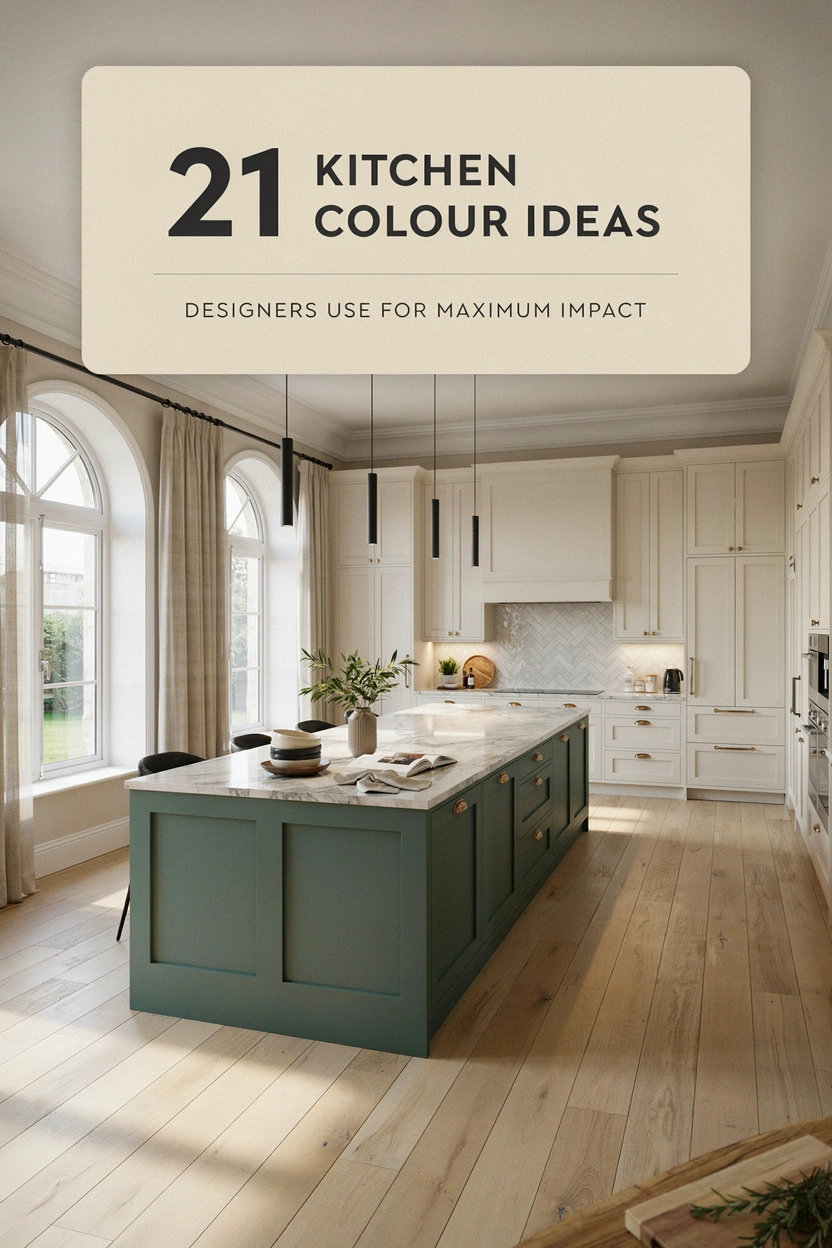
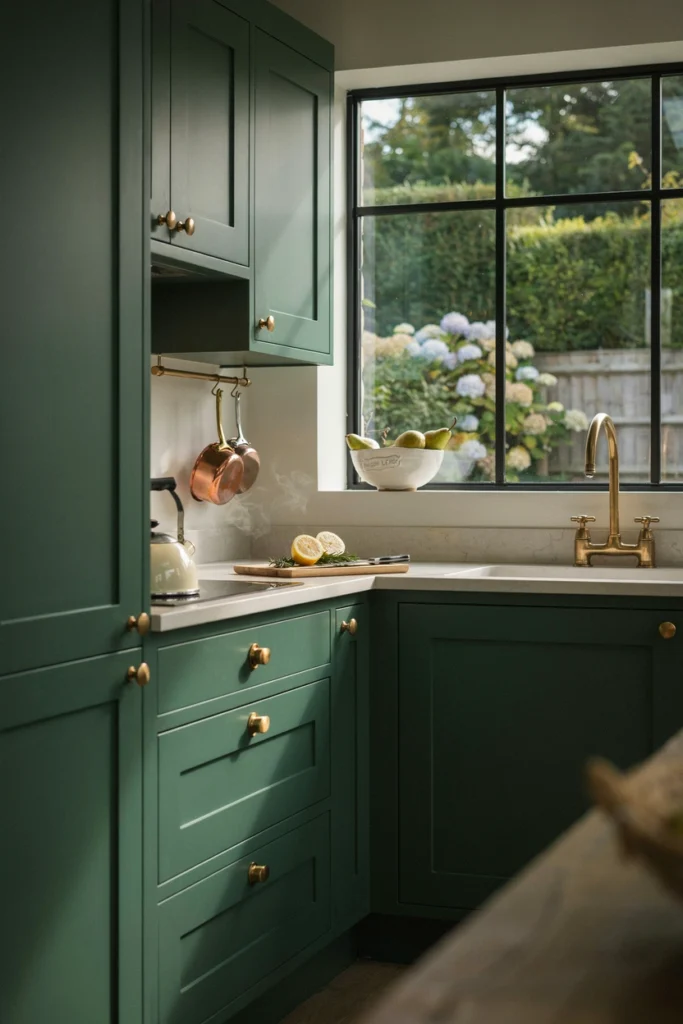
Forest green is sage’s extrovert sibling — same natural root, twice the confidence. It works best as a full commitment: all the cabinetry, floor to ceiling, in a room with enough light and square footage to carry it. Done timidly (one accent wall, one island), it just looks like you ran out of paint.
Pair it with unlacquered brass and warm white worktops; the brass will patina over two years into something no new fitting can imitate. Avoid pairing forest green with grey flooring — the two fight, and the floor always wins by making the green look muddy. Warm oak or pale stone floors are the safe partners.
5. Dusty Pink for Unexpected Warmth
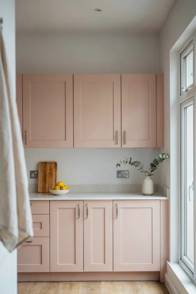
Pink in a kitchen sounds like a dare, but dusty pink — the colour of plaster, not bubblegum — is essentially a warm neutral. It does for a kitchen what blush does for a face: adds life without announcing itself. It works beautifully on lower cabinets with white uppers, or on a pantry wall in an otherwise neutral room.
The secret is keeping everything else restrained. Dusty pink plus brass plus white marble is a combination that has survived a decade of trends. Dusty pink plus black plus concrete is a combination that fights itself. Give the pink calm companions and it will reward you for years.
6. Charcoal Grey for Modern Edge
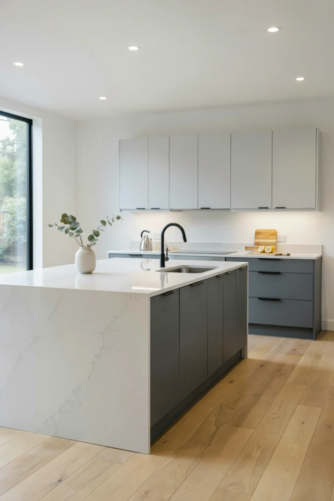
Charcoal is the colour for people who find black too severe and grey too timid. It has the drama of dark cabinetry with a softness that black lacks, and it hides fingerprints, dust, and cooking splatter better than any pale colour ever will — a genuine practical advantage nobody mentions in the brochures.
Use it with warm metals (brass, copper, bronze) rather than chrome; cool metals against charcoal read as corporate, warm metals read as considered. And give it light: charcoal in a dark kitchen needs under-cabinet LEDs and a pale worktop, or it will close the room in like a lid.
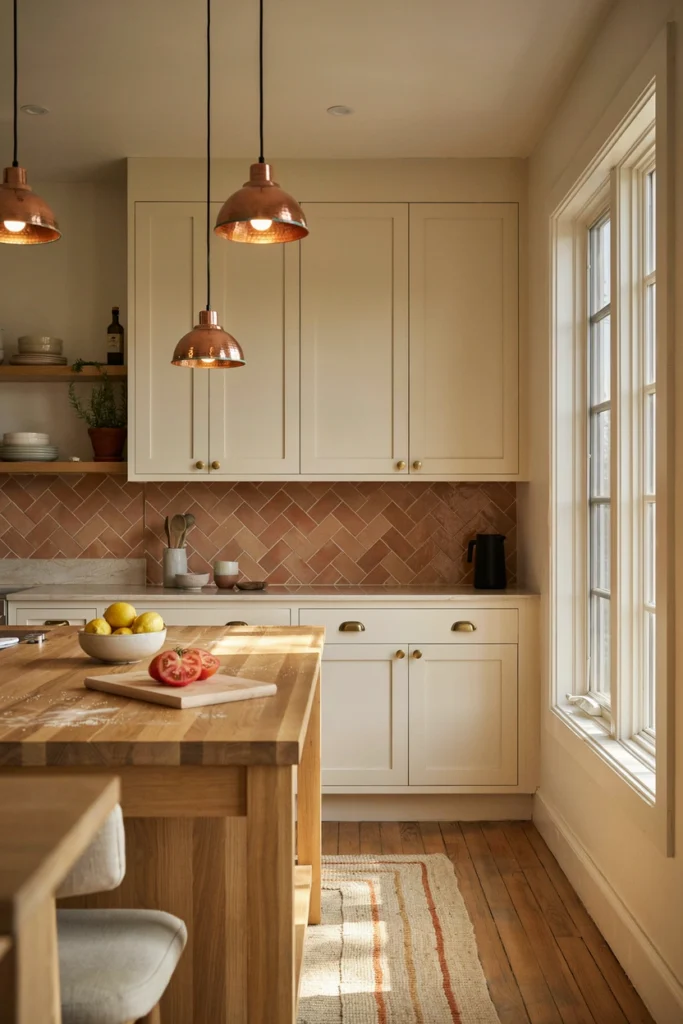
7. Terracotta for Warmth and Texture
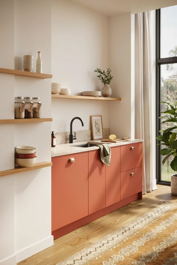
Terracotta brings the Mediterranean into a British or American kitchen without a single themed accessory. It’s earthy, warm, and forgiving — the colour equivalent of a handmade bowl. It works best in kitchens with natural materials around it: oak, stone, linen, clay.
A little goes a long way. A terracotta island, a terracotta splashback, or terracotta floor tiles each work; all three together is a restaurant in 1987. If you’re nervous, start with the smallest surface — the splashback is 3 square metres of commitment, not 30.
8. Cobalt Blue for High-Impact Drama
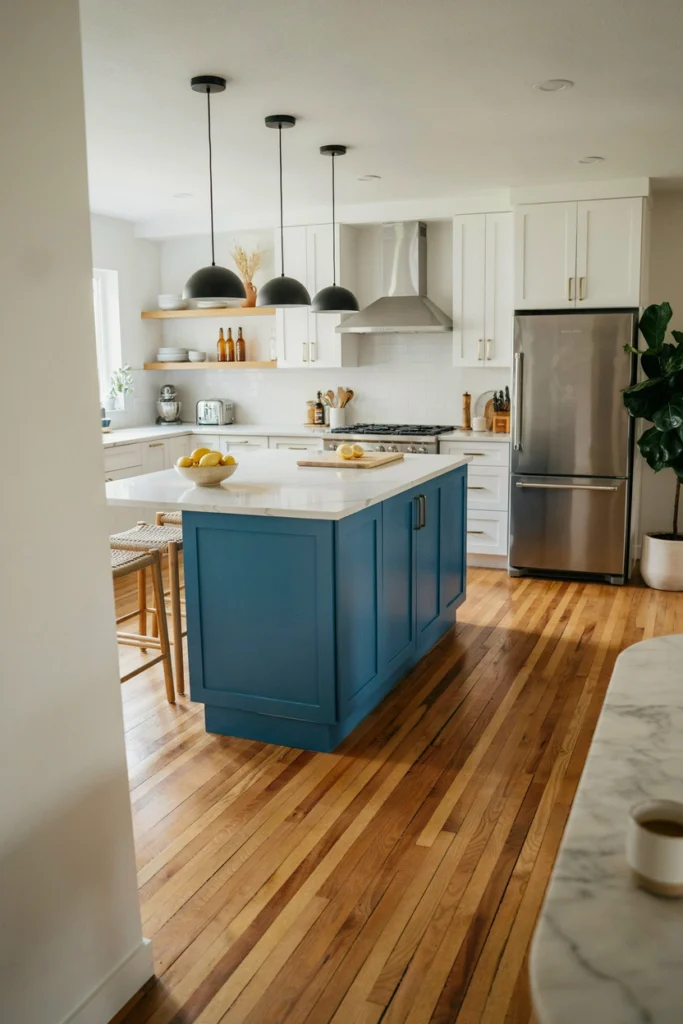
Cobalt is not a colour for the cautious — it’s electric, saturated, and it will dominate every photo of your kitchen forever. That’s exactly why some people love it. In a large, light-filled kitchen, a cobalt island is a piece of furniture as much as a colour choice.
Rules for surviving cobalt: keep it to one element (the island, never the island plus the walls), surround it with white and pale oak to give the eye somewhere to rest, and accept that you will be repainting it in seven years when your taste calms down. That’s fine — an island repaint is a weekend and a tin of paint.
9. Pale Yellow for Light and Positivity
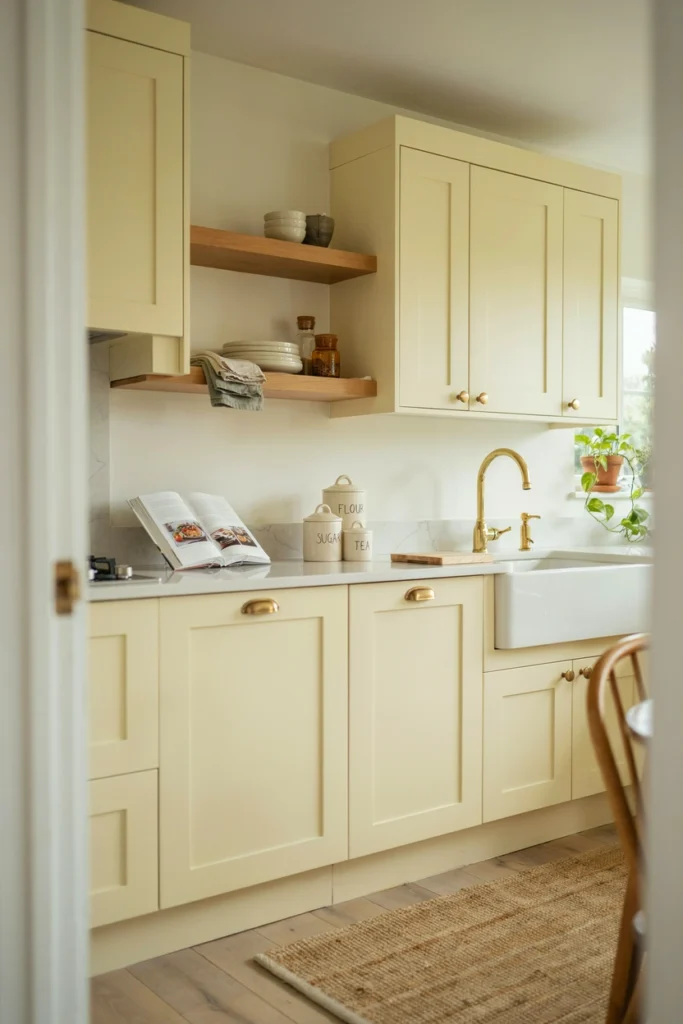
Pale yellow is the most underrated kitchen colour in existence, mostly because people picture nursery yellow. The yellows that work — think butter, buttermilk, pale ochre — are barely yellow at all. They’re warm whites with optimism, and they make north-facing kitchens feel sunlit on the greyest February morning.
It pairs naturally with white cabinetry trim, oak worktops, and cream tiles. Avoid pairing pale yellow with grey — the combination turns institutional fast. And keep it off the ceiling; yellow ceilings lower the perceived height of a room by making the eye stop at the colour change.
10. Black for Boldness Done Right
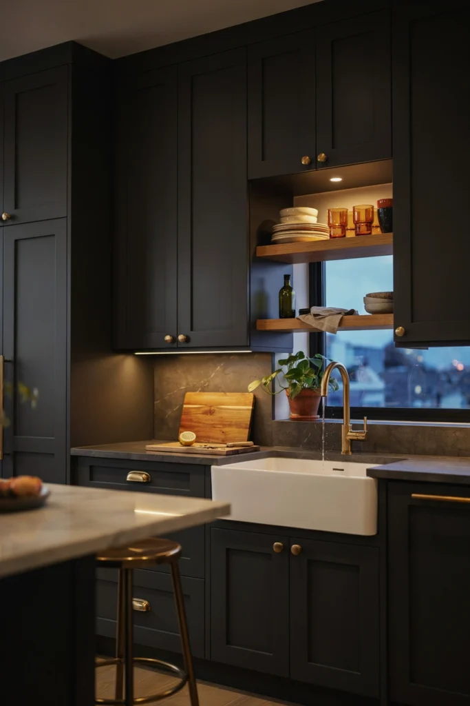
Black kitchens photograph like dreams and live like a commitment. The ones that work share three traits: generous natural light, a pale worktop to lift the room, and impeccable cabinetry — because black shows every gap, ripple, and misalignment that white forgives.
If you want the look without the risk, do black lowers and white uppers. You get the drama at worktop level where the eye naturally falls, and the lightness above where the room needs it. Matte black hides marks; gloss black shows them. Choose accordingly and honestly.
11. Two-Tone Blue and White
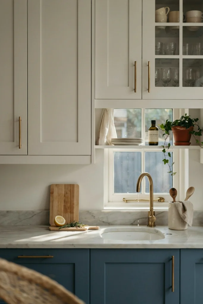
Blue below, white above is the two-tone formula with the longest track record. It works because it mirrors how we naturally read a room: darker, heavier elements at the bottom (like furniture), lighter elements at the top (like sky). The brain finds it restful without knowing why.
Keep the dividing line at the worktop — blue base units, white wall units — and run the same white on the ceiling for continuity. The most common mistake is introducing a third colour “for interest.” The interest is already there in the contrast; a third colour just creates noise.
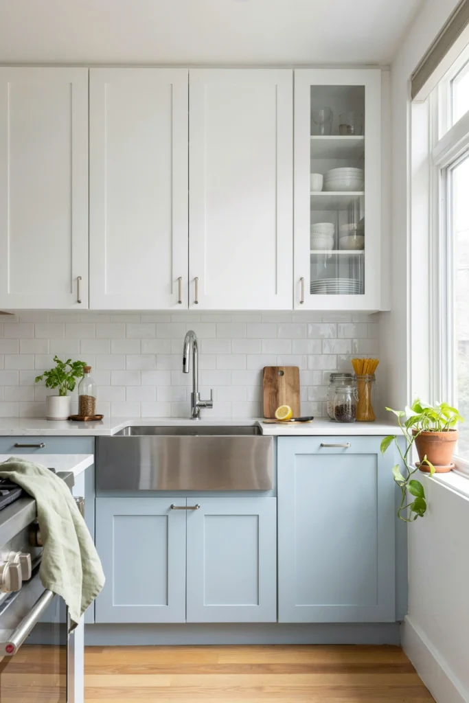
12. Warm Taupe for Understated Elegance
Taupe is what you choose when grey feels cold and beige feels dated. It’s the quiet luxury colour — it doesn’t photograph dramatically, but it makes everyone in the room look good and everything in the kitchen feel expensive. Estate agents love it because buyers can’t object to it.
It needs texture to avoid flatness: pair warm taupe cabinets with a honed stone worktop, brushed brass handles, and oak flooring. Flat taupe on flat surfaces in flat light is the one combination that can look dull — give it something to play against and it glows.
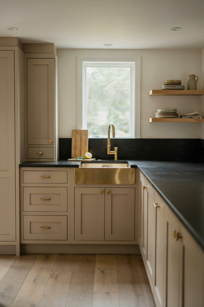
13. Olive Green for an Earthy, Grounded Feel
Olive sits between sage and forest — deeper than sage, softer than forest — and it’s the green that works best in rooms with warm, golden light. It has an earthiness that makes a kitchen feel connected to the garden outside, especially with timber and stone in the mix.
Olive’s weakness is artificial light: under cool LEDs it can turn khaki and military. If your kitchen relies on artificial light after 4pm in winter, sample the colour under your actual bulbs at night before committing. Under 2700K warm light, olive is magnificent.
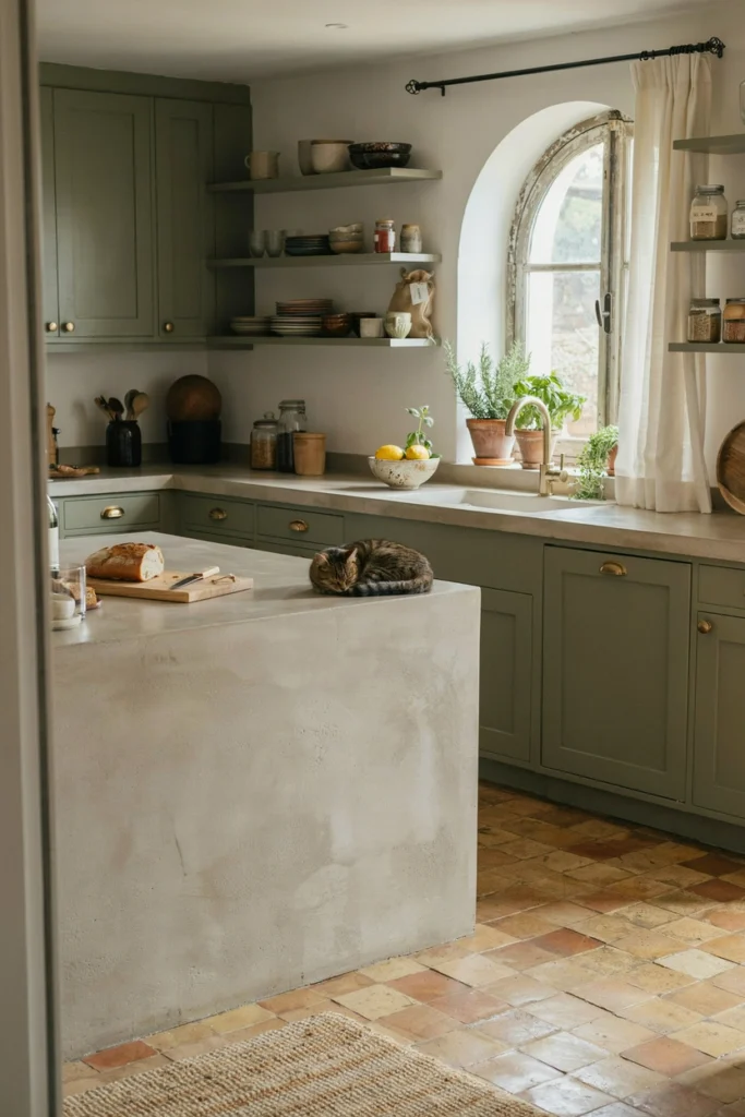
14. Pale Blue-Grey for a Coastal or Calm Feel
Pale blue-grey is the colour of distance — sea mist, far hills — and it gives a kitchen an immediate sense of calm. It’s the right choice for busy households where the kitchen needs to be the peaceful room, not the energetic one.
Keep it pale. The moment blue-grey goes mid-tone it starts demanding attention and natural light to support it. At the pale end it behaves like a neutral: it works with white, oak, chrome, and even soft pink accessories without a single clash.
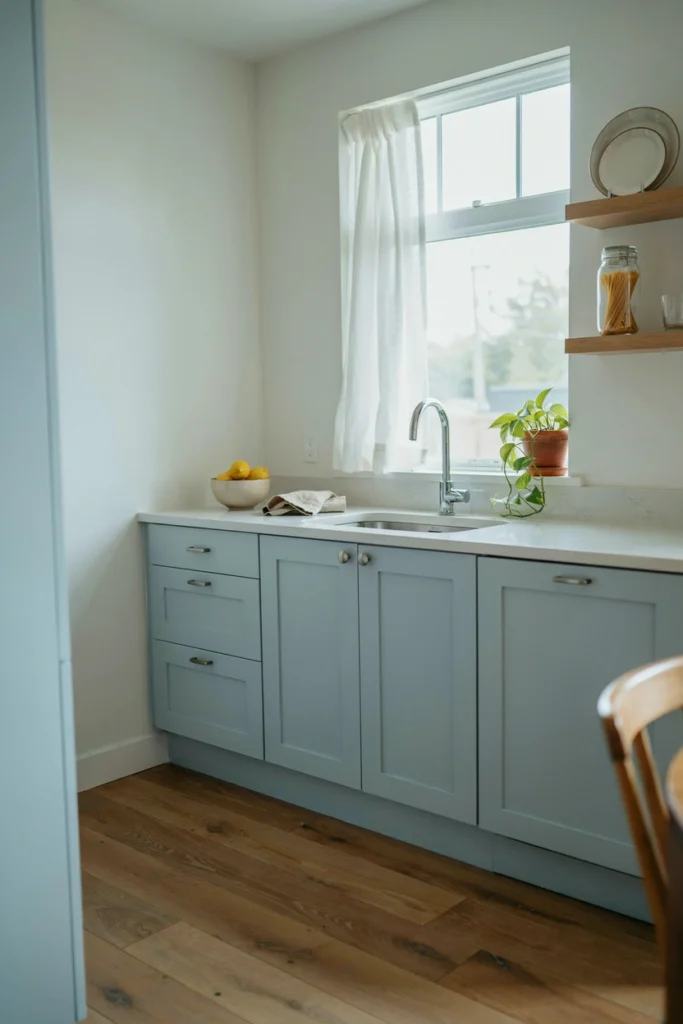
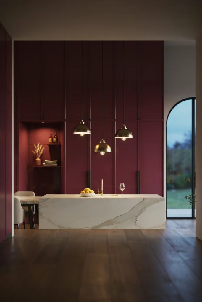
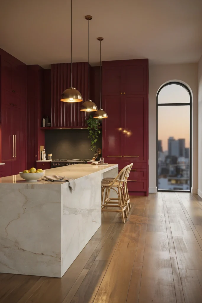
15. Rich Burgundy for Maximum Drama
Burgundy is the colour equivalent of ordering the tasting menu — a statement of confidence. On kitchen cabinetry it’s extraordinary: deep, wine-dark, and completely unexpected. It works best in dining kitchens where the room is as much about evening atmosphere as daytime function.
This is a colour that needs its supporting cast chosen carefully: warm white walls, brass or aged bronze hardware, and dark wood or stone floors. Burgundy with chrome and white gloss is a nightclub; burgundy with brass and oak is a library. Same colour, different universe.
16. Concrete Grey for an Industrial Edge
Concrete grey — flat, honest, mid-tone — gives a kitchen an architectural quality that no “pretty” colour can. It’s the colour of warehouses converted by people with good taste, and it works brilliantly with black steel, pale oak, and white worktops.
The risk is coldness. Concrete grey has no warmth of its own, so you must add it: timber open shelves, a warm white ceiling, pendant lights with visible warm filaments. Without warm counterpoints, concrete grey kitchens feel like they’re waiting for someone to move in.
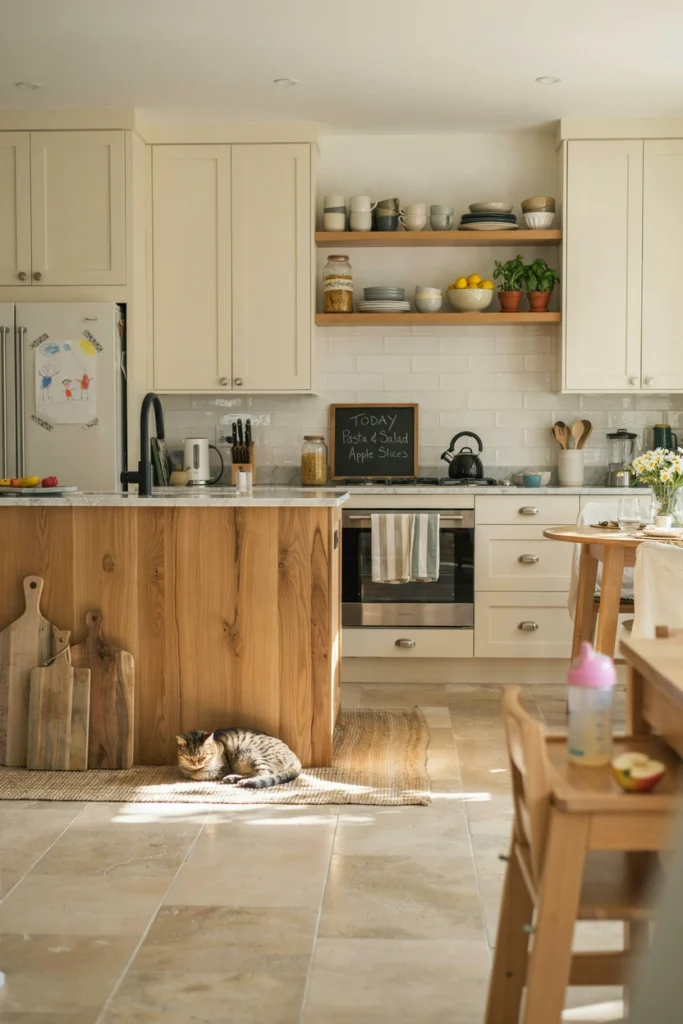
17. Cream and Natural Wood Together
Cream plus natural wood is the combination that never had a trend cycle because it never needed one. It’s the kitchen equivalent of a linen shirt — always appropriate, never trying. Cream softens the room, wood warms it, and together they need almost nothing else.
The detail that matters is the wood tone: keep it consistent. Mixing pale oak shelves with dark walnut stools with mid-tone pine flooring is three woods too many. Pick one wood, repeat it three times, and let the cream do the rest.
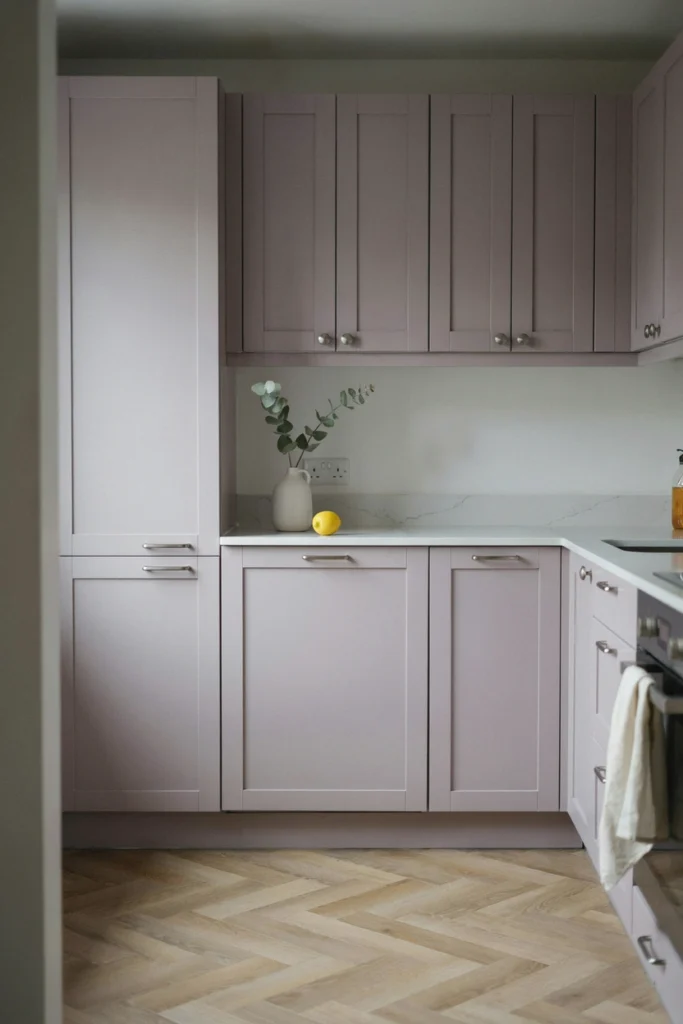
18. Soft Lilac for Something Genuinely Different
Lilac in a kitchen is rare enough to be memorable and soft enough to live with. It works in the same way dusty pink does — as a warm neutral with personality — but it suits cooler light better, making it a clever choice for north-facing rooms where pink can turn peachy.
Use it where you’ll see it in daylight: a pantry wall, the inside of glass-fronted cabinets, or lower cabinets in a kitchen with big windows. Pair with white and pale oak; avoid grey, which drags lilac into sadness. This is a colour for people who want their kitchen to feel like theirs and nobody else’s.
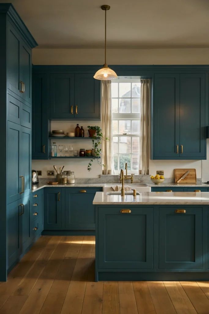
19. Dark Teal for a Jewel-Toned Impact
Dark teal is the jewel-box colour — saturated, deep, and faintly exotic. It has the drama of navy with more personality, and it does extraordinary things under warm lighting, where it glows like the inside of a peacock feather.
It demands good lighting design: dark teal in a dim kitchen is just dark. Plan for under-cabinet strips and warm pendants before you paint, not after. And pair it with marble or pale quartz — the veining gives the dark colour something to converse with.
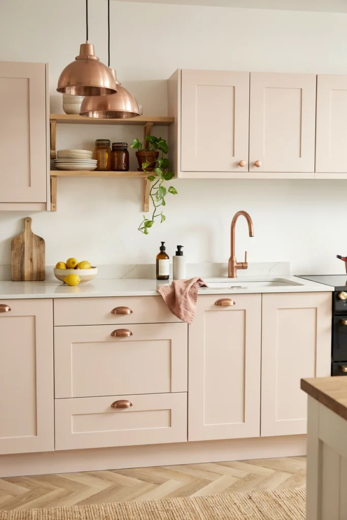
20. Blush and Copper for a Warm Feminine Palette
Blush pink cabinetry with copper hardware is the warmest combination on this list — romantic without being girly, soft without being weak. The copper is essential: it picks up the pink’s warmth and reflects it around the room like a gentle glow.
Copper needs maintenance honesty: unlacquered copper will darken and patina, lacquered copper stays bright. Decide which you want before you buy, because half-patinated handles look neglected rather than aged. And keep the palette tight — blush, copper, white, oak. Four elements, no more.
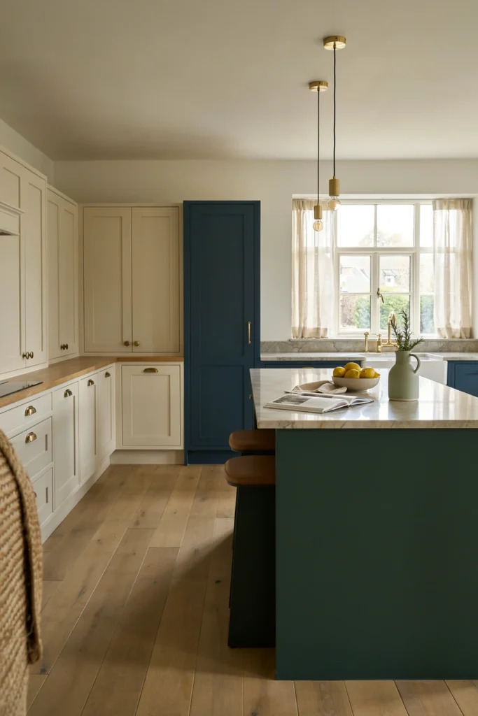
21. Mixed Colour Kitchen for a Collected, Bespoke Feel
The bravest kitchens on this list mix colours the way a good dresser mixes patterns: with confidence and a unifying thread. A navy island, sage pantry wall, and warm white perimeter can work — if the thread (say, unlacquered brass throughout, or one consistent worktop) holds them together.
The rule for mixing: all colours must share the same depth. Three saturated colours work together; three pastels work together; one pastel plus two saturated colours looks like a mistake. And write the palette down before you start — mixed-colour kitchens fail when the third colour is chosen in the paint aisle on a whim.
Conclusion
Every colour on this list has survived real kitchens, real light, and real life — that’s the only test that matters. The designers who specify them aren’t chasing trends; they’re solving the same problem you have: a room that needs to work at 7am and still look good at 9pm.
Pick your colour, then do the unglamorous work: sample boards, three times of day, your actual light. An hour of sampling saves years of regret. The right colour, correctly tested, is the cheapest renovation you’ll ever do.
Pro Tips
- Learn LRV before you shop. Light Reflectance Value (0–100) tells you how much light a colour bounces. Below 20 is dramatic and needs strong light; 60+ is safe almost anywhere. It’s printed on most paint chips — use it.
- Sample on a movable board, not the wall. Paint an A3 board, then carry it around the kitchen for three days. Colours change completely between the window wall and the dark corner.
- Match undertones, not colours. A “neutral” grey with blue undertones will fight a cream with yellow undertones forever. Hold samples together in your light and look for the shared temperature.
- Finish matters as much as colour. The same navy in eggshell vs. matt reads as two different colours. Kitchens need wipeable finishes — eggshell or satin on cabinets, never flat matt.
FAQs
What is the most timeless kitchen cabinet colour?
White, followed by soft greige and warm wood tones — they’ve led sales for decades because they suit every house style and every buyer’s taste. If resale matters, these are the safest choices. Bolder colours like navy and forest green have also shown remarkable staying power over the last decade.
Should kitchen cabinets be lighter or darker than the walls?
There’s no universal rule, but the most reliable formula is cabinets slightly deeper than walls, which grounds the room without shrinking it. In small or dark kitchens, keep cabinets light and let the walls carry any deeper colour instead. Always test the combination in your own light before committing.
How do I choose a kitchen colour for a north-facing room?
North-facing rooms get cool, blue-tinged light, so choose colours with warm undertones — warm whites, buttery yellows, sage with a yellow base, or warm greiges. Avoid cool greys and brilliant whites, which turn flat and chilly. Sample on the actual wall and check at midday, when northern light is at its coolest.
Do dark kitchen cabinets make a room look smaller?
They can, but light matters more than colour. A dark kitchen with generous natural light and good artificial lighting feels dramatic, not small; a dark kitchen with poor light feels like a cave. If your kitchen is small and dark, use deep colours on lower cabinets or the island only, and keep uppers and walls light.

HowDecor is a home decor blog sharing simple, practical decorating ideas for everyday spaces. We believe a beautiful home should feel comfortable, personal, and full of warmth — and that great style does not require a huge budget. Our goal is to inspire readers to create spaces that feel peaceful, welcoming, and truly their own — one room at a time.