Most living rooms fail on plan, not on taste. People buy pieces they love and then wonder why the room feels wrong — usually the proportions are off, the circulation is pinched, or the light is fighting the layout. This guide treats your living room like a small architecture project: fifteen decisions, taken in sequence, each one setting up the next. Same style territory as any contemporary room, but approached with a drafter’s discipline.
Start with a rough floor plan — even a phone-sketch with measurements. Every idea below references dimensions, because in interior design, numbers are what separate intention from accident.
1. Start with a Calm Neutral Foundation
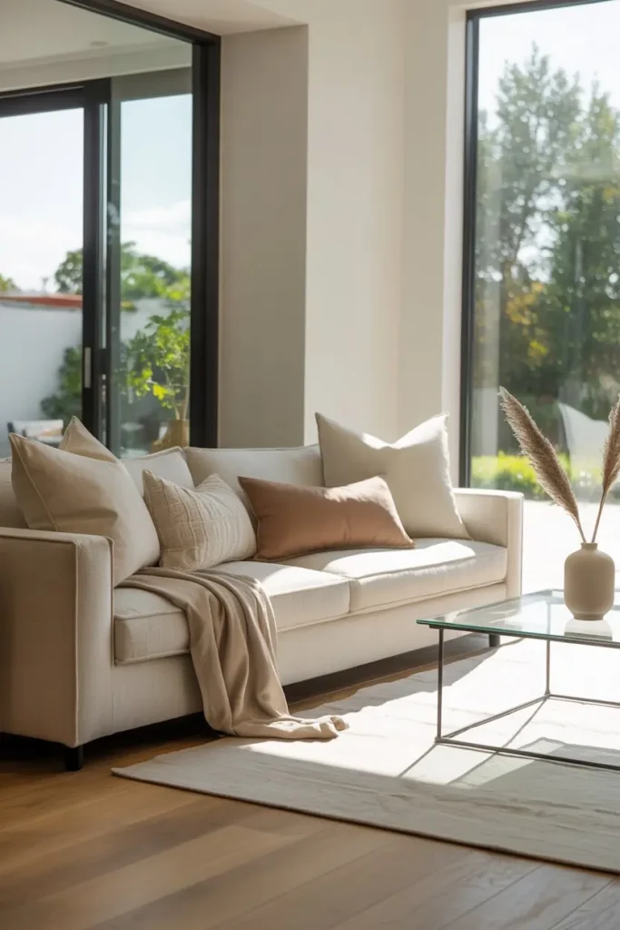
Before a single object enters the room, fix the envelope: walls, floor, ceiling. A contemporary envelope is quiet — warm white or pale greige walls, flooring that does not shout. If you are working with existing finishes you cannot change, this step becomes camouflage: large neutral textiles that visually reset the surfaces.
Measure your wall expanses and note the light: north-facing rooms need warmer neutrals (they get cool, flat light), south-facing rooms can handle cooler ones. This one decision — undertone matched to orientation — does more for the room’s feel than any furniture purchase that follows.
2. Add Personality Through Accent Colors
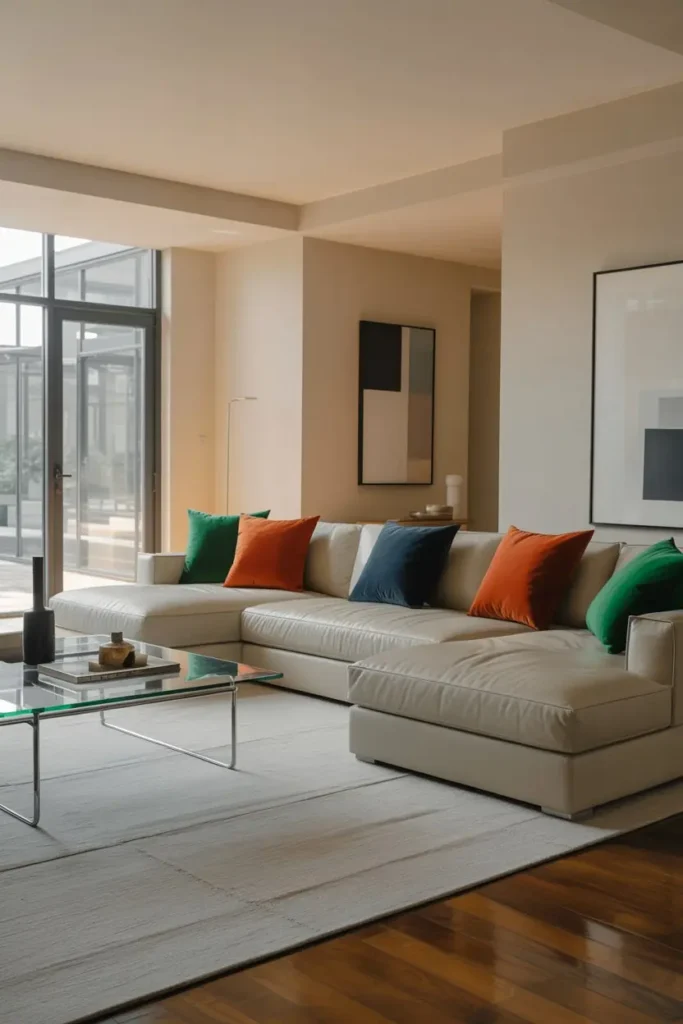
With the envelope calm, you earn one strong color move. In plan terms, think of it as a 10% allocation: cushions, one throw, one art piece, all in the same saturated hue — saffron, deep teal, oxblood, forest. The repetition across three touchpoints is what makes it read as a scheme rather than a whim.
Test at full scale before committing: drape the actual fabric on the sofa and live with it for three days, viewed in morning and evening light. Colors shift dramatically under different light temperatures, and a swatch lies. What survives three days of real light is safe to buy in quantity.
3. Choose Comfortable Yet Sculptural Furniture
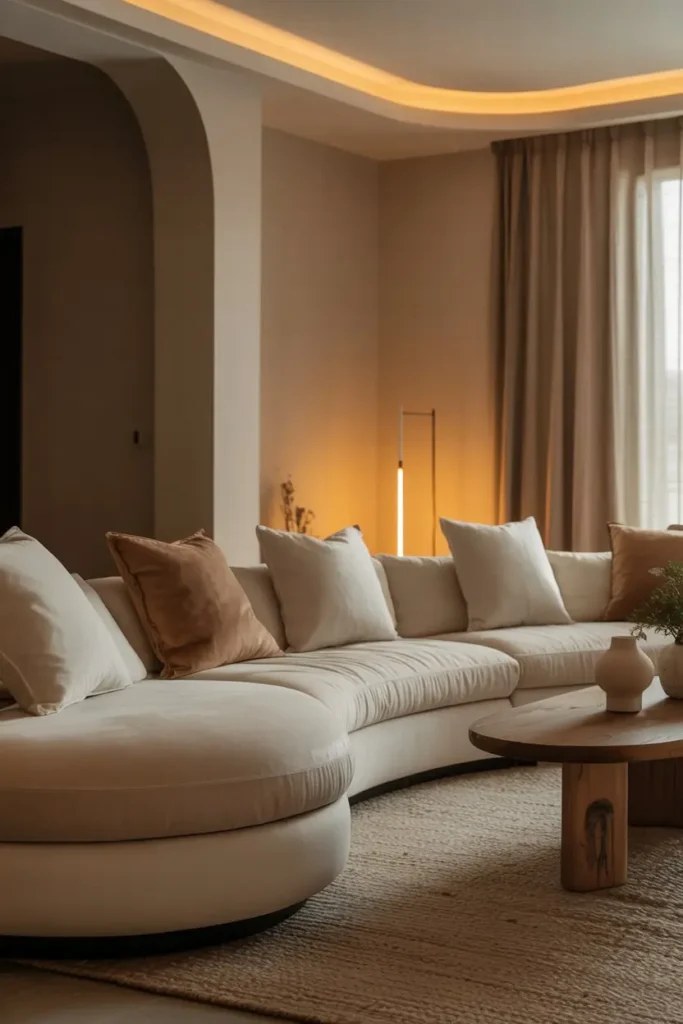
The sofa is the room’s largest mass — treat it like architecture. Contemporary profiles favor low backs (28–32 inches), deep seats (22–24 inches for lounging), and clean lines without fussy detailing. Sit-test ruthlessly: seat height 17–18 inches suits most adults; lower looks sleek but punishes knees.
Sculptural does not mean uncomfortable. A curved back, a cantilevered arm, an interesting leg profile — choose one distinctive gesture per piece. Two statement silhouettes in one room compete; one anchors. Everything else in the seating group should be quiet enough to let the anchor speak.
4. Layer Different Textures
In a restrained palette, texture is the primary source of visual complexity. Specify it deliberately: five distinct tactile families minimum across the seating zone — e.g., boucle, washed linen, natural jute, honed stone, brushed metal. Run your hand over every candidate in the store; if you cannot feel the difference, the eye will not see it either.
Distribute textures so no two adjacent surfaces match: linen sofa against a jute rug, boucle cushion against smooth leather, rough ceramic on polished wood. Adjacency contrast is the mechanism — texture only registers against a different texture.
5. Use Statement Lighting as Art
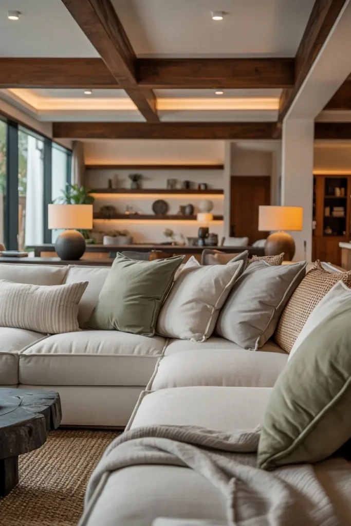
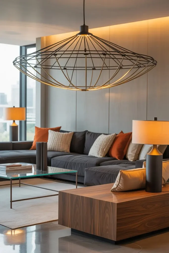
Lighting deserves the same design effort as furniture. Plan three layers on paper before buying: ambient (the general wash), task (reading, working), accent (the drama — picture lights, LED coves, a sculptural pendant). Mark their positions on your floor plan; lighting placed by habit clusters in the wrong spots.
The statement piece — arc lamp, pendant cluster, oversized paper lantern — should sit at a natural focal point: over the coffee table, beside the reading chair, in the dark corner that needs a reason to exist. Hang pendants 30–36 inches above the surface below; higher and they float disconnected, lower and they block sightlines.
6. Keep Wall Decor Simple but Impactful
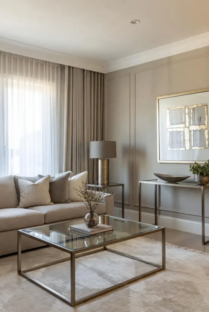
Walls are the room’s largest uninterrupted planes — curate them like gallery space. One substantial piece per major wall beats a scatter of small frames every time. For a standard 8-foot wall above a sofa, target art 48–60 inches wide: roughly two-thirds the furniture width.
Hang precisely: center at 57–60 inches from the floor, which is average human eye level. In rooms with tall ceilings, resist the urge to hang higher to “fill” the wall — art relates to the furniture beneath it, not to the ceiling. One level, one strong piece, generous margins.

7. Bring Nature Indoors
Every rectilinear room needs an organic counterpoint, and nothing does it like living plants. From a plan perspective, plants solve the “dead corner” problem — that awkward zone too small for furniture. A 4–6 foot tree (olive, fiddle-leaf, dracaena) in a simple pot claims the corner with one object.
Match plant to light honestly: measure with a free light-meter app if you are unsure. Low-light corners (under 200 foot-candles) get snake plants and ZZ; bright spots get figs and birds of paradise. A dead expensive plant is worse decor than no plant — buy for your actual conditions, not your aspirations.

8. Mix Materials for Visual Interest
Material contrast is contemporary design’s signature move. Write a short material palette — three to four materials, no more — and hold every purchase to it: say, white oak, blackened steel, travertine, and boucle. When everything in the room descends from the same four materials, mixing looks inevitable rather than accidental.
Engineer the contrasts: place matte against polished (honed stone beside lacquered wood), warm against cool (oak beside steel), soft against hard (boucle beside glass). Each pairing should occur at least twice in the room — repetition is what converts contrast from noise into rhythm.
9. Maintain an Open and Breathable Layout
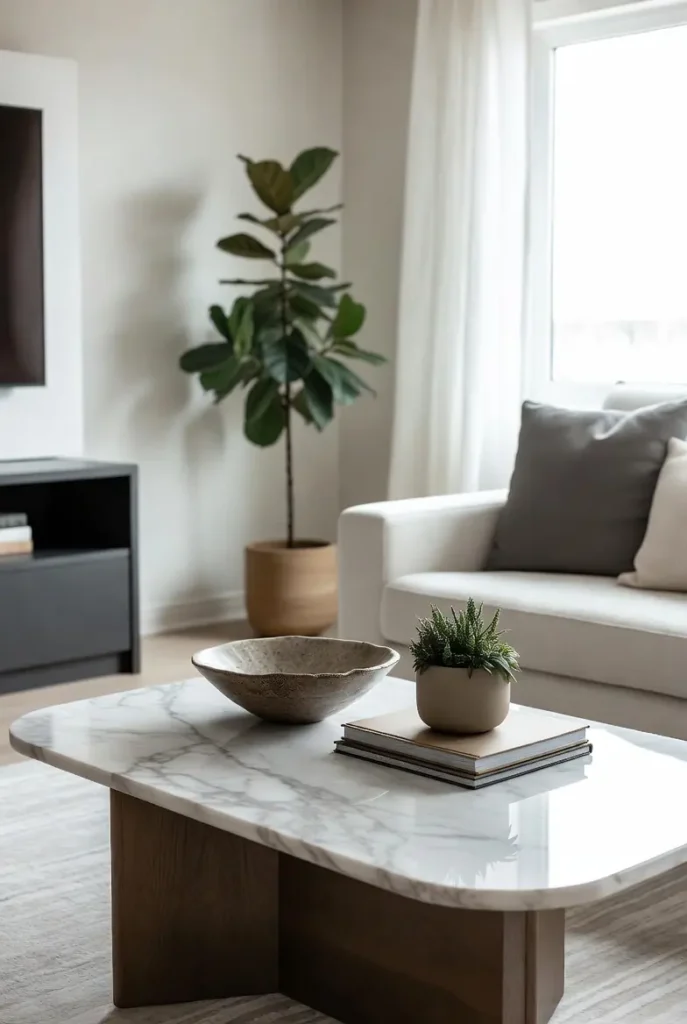
Draw your circulation first, furniture second. You need a primary path of 30–36 inches from entry through the room, and 18 inches between coffee table and seating for legs and movement. Tape these zones on the floor before finalizing any layout — rooms feel cramped when circulation is an afterthought.
Float the main seating group to define the conversation zone, even in small rooms; a 6-inch gap behind the sofa reads as depth, not waste. Keep the view from the entrance open to a window or focal point. If you must cross the conversation zone to reach another room, reroute — traffic through the middle destroys any layout.
10. Add Cozy Layers for Comfort
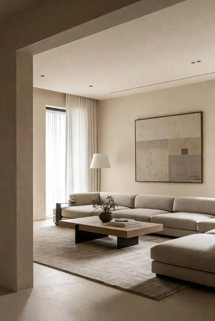
Contemporary does not mean austere — it means the comfort is designed rather than accumulated. Specify coziness the way you specify anything else: a throw with real weight (not decorative tissue), cushions with feather or quality fill (not flat polyester), a rug with enough pile to feel underfoot.
Layer in the order the body meets the room: rug underfoot, seat depth and back angle, throw within arm’s reach, light at reading height. Comfort that is planned reads as luxury; comfort that is piled reads as clutter. Every cozy element should have a home when not in use — a basket for throws, a lidded ottoman for spare cushions.
11. Create a Textured Accent Wall
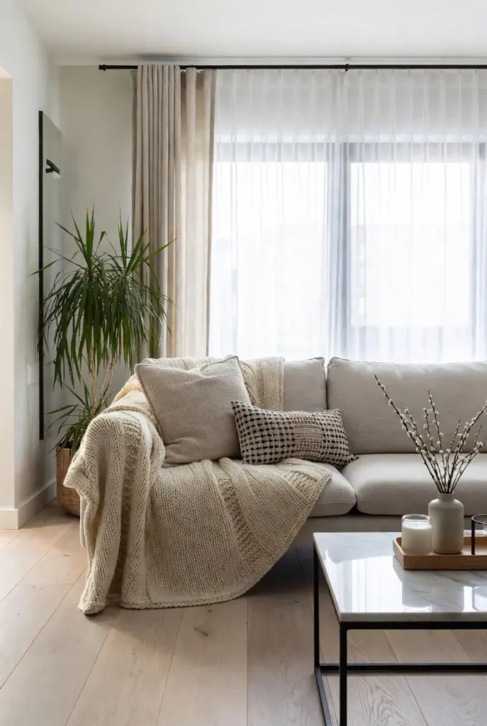
One wall may carry more visual weight — through texture, not color. Limewash, microcement, wood slats, or grasscloth wallpaper add depth that flat paint cannot, while staying within the neutral envelope. The accent wall should be the room’s natural focal wall: behind the sofa or the media unit, never a random side wall.
Sample at full scale and observe for 48 hours in changing light — textured finishes transform between morning and evening, and that transformation is the point. Keep the other three walls quiet; a textured accent wall with busy companions becomes noise. One strong move, supported by silence.

12. Use Smart Storage Solutions
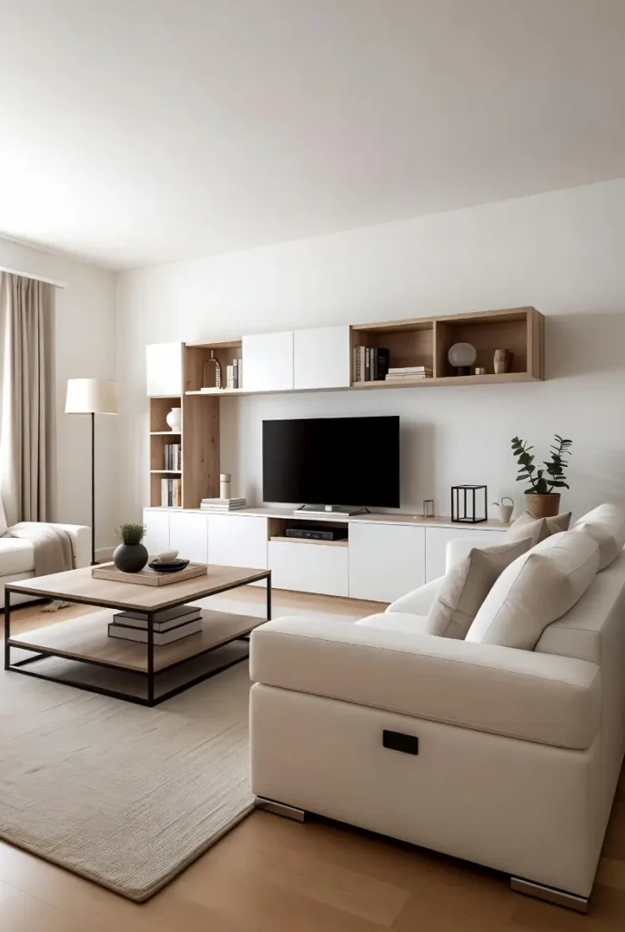
Visible clutter is the enemy of the contemporary look, so storage must be designed, not improvised. Audit what actually needs storing in this room — media, throws, games, charging gear — and specify closed storage for all of it: a media console with doors, lidded baskets, one drawer that is allowed to be the “junk drawer” so surfaces stay clean.
Follow the 80/20 rule: 80% of storage closed, 20% open display for the objects you have curated. Open shelving full of random items is just clutter with better lighting. And measure your media components before buying the console — the number one storage failure is a beautiful unit that does not fit the soundbar.
13. Include a Statement Accent Chair
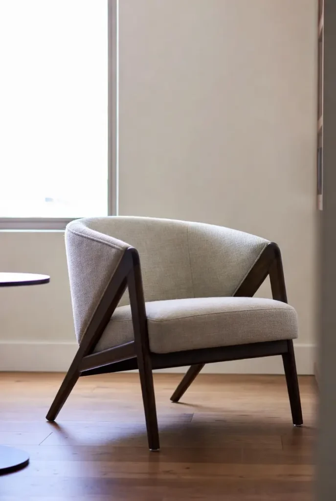
The accent chair is the room’s exclamation point — the one piece allowed to be purely expressive. A sculptural swivel chair, a vintage find reupholstered in your accent color, a rattan peacock for texture: choose the chair that makes you smile, then give it the best position in the room (angled toward the conversation, near the light).
One chair, one statement. Two competing accent chairs divide the room’s attention and usually its comfort — sit-test before committing, because the prettiest chair that nobody sits in is a failed purchase. Allow 24 inches of clearance around it for the swivel or the sitter’s legs.
14. Personalize the Space
After all the discipline, the room needs its signature — yours. Select three to five objects with genuine personal meaning: the books you actually reread, the ceramic from the trip, the framed print that stopped you in a gallery. These are not decorations; they are evidence that a specific human lives here.
Curate their placement with the same rigor as everything else: grouped with intention, given negative space, lit if they deserve it. In a disciplined room, personal objects carry enormous weight — five meaningful things in a calm contemporary space say more than fifty accessories in a busy one. This is the layer no designer can specify for you, which is exactly why it matters most.

Final Thoughts
Fifteen decisions, one room. The method behind them is simple: plan before purchasing, measure before committing, and let each layer — envelope, light, furniture, texture, storage, personality — do its job without crowding the others. Contemporary design rewards this kind of discipline more than any other style, because its beauty is structural. Get the plan right, and the room almost decorates itself.
Pro Tips
- Draw it first: a measured floor plan — even rough — prevents 90% of expensive mistakes. Tape the layout on the floor and live with it for a weekend.
- Buy the rug early: rugs are harder to match than sofas. Choose the rug in the first round of purchases, not the last.
- Light in layers on paper: mark ambient, task, and accent positions on your plan before buying a single fixture. Clustered lighting is the most common amateur tell.
- Edit on a schedule: every six months, remove one thing from the room. Contemporary rooms stay sharp through subtraction.
FAQs
How is this different from a standard contemporary living room guide?
This one works like a project plan: measurements, sequencing, and decision logic, not just inspiration. If you want the room to actually get built — not just pinned — the numbers matter.
What should I buy first for a contemporary living room?
In order: rug (hardest to match), sofa (largest mass), lighting plan (most transformative), then everything else. Art and accessories come last — they respond to the room, not the other way around.
How much does a contemporary living room redesign cost?
A focused refresh (rug, lighting, textiles, paint) can land under $2,000; a full furniture replacement runs $5,000–$15,000 depending on quality. The plan-first method saves money by preventing wrong purchases, which are the real budget killer.
Can I mix contemporary with pieces I already own?
Yes — audit each existing piece against your material palette and proportions. Keep what fits the plan, reupholster or refinish what almost fits, and release what fights it. Sentiment is valid, but it belongs in the personal layer, not in every layer.

HowDecor is a home decor blog sharing simple, practical decorating ideas for everyday spaces. We believe a beautiful home should feel comfortable, personal, and full of warmth — and that great style does not require a huge budget. Our goal is to inspire readers to create spaces that feel peaceful, welcoming, and truly their own — one room at a time.