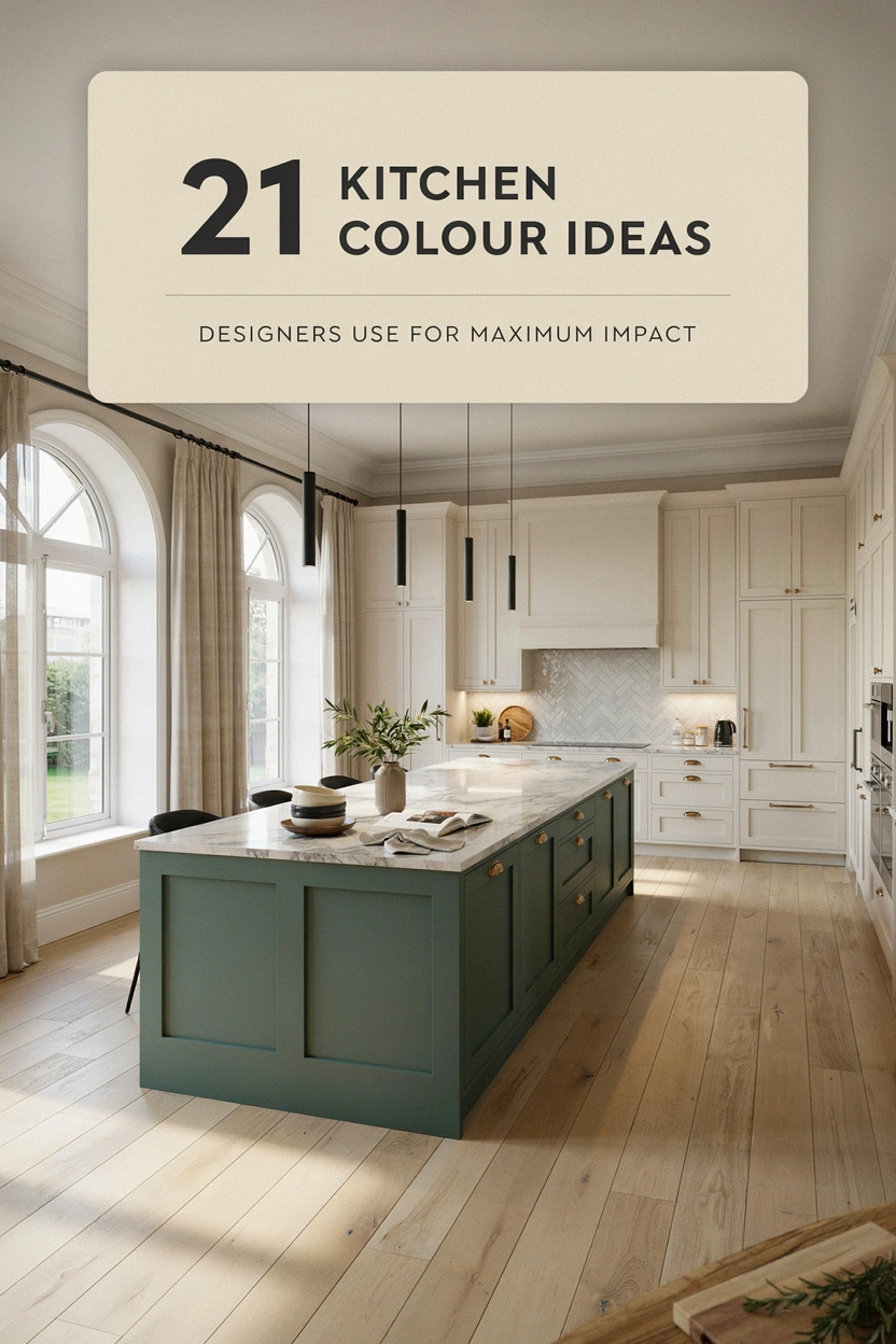
Colour is arguably the single most powerful tool in kitchen design. It can make a small kitchen feel generous, a dark room feel brighter, and an ordinary layout feel like something a professional spent months planning. The difference between a kitchen that people walk into and immediately notice versus one that simply functions comes down, more often than not, to colour choices.
These 21 ideas come from the kind of decisions designers make repeatedly because they work consistently, across different home styles, different budgets, and different levels of natural light.
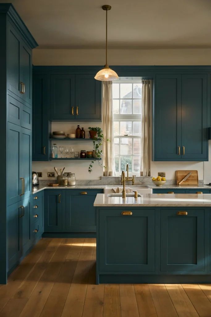
1. Navy Blue for Depth and Sophistication
Navy blue is one of the most consistently successful kitchen colours in professional design. It adds depth and a quiet confidence to a space without feeling aggressive or difficult to live with. Against white walls or light stone countertops, navy cabinets look genuinely luxurious, and the combination photographs beautifully.
It works particularly well in kitchens with decent natural light since the darker tone absorbs light rather than reflecting it. In a well-lit space, this creates a rich, layered quality that brighter colours simply cannot replicate. Navy also pairs effortlessly with brass, chrome, and matte black hardware, giving you plenty of flexibility in the finer details.
2. Sage Green for Calm and Character
Sage green has become one of the defining kitchen colours of recent years, and the reason is straightforward. It sits in that comfortable middle ground between neutral and colourful, bringing enough warmth and personality to feel interesting while remaining easy to live with long term. It doesn’t compete with the food, the people, or the other materials in the room.
Designers tend to use sage green on lower cabinets or on a kitchen island, keeping the upper cabinets in white or cream to maintain lightness. Paired with natural wood, aged brass, and simple ceramic accessories, it creates a kitchen that feels calm, considered, and quietly beautiful.
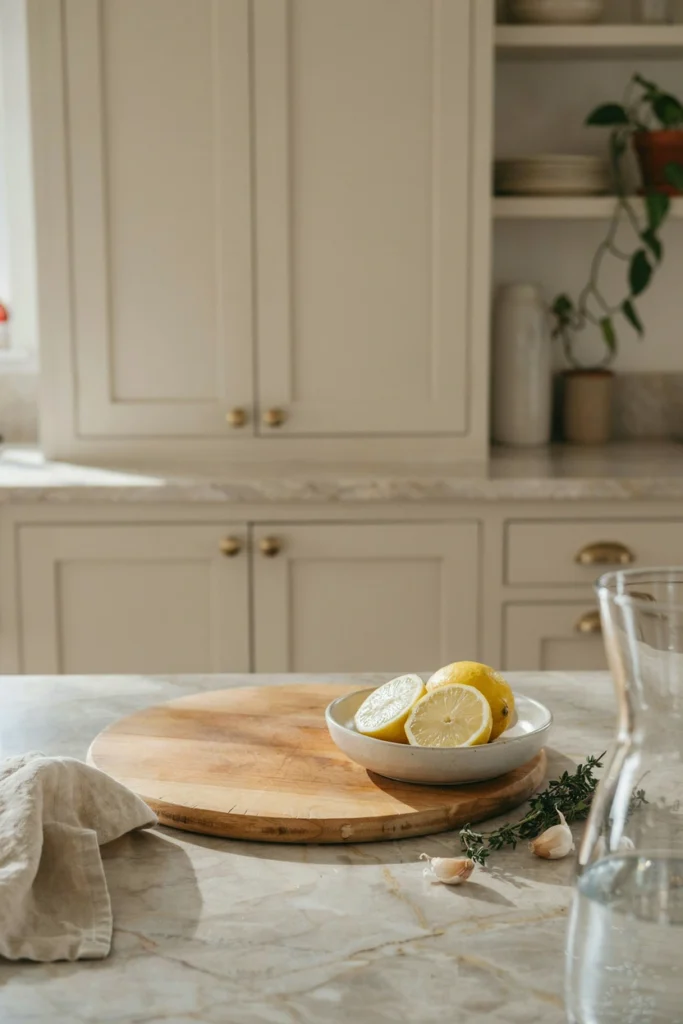
3. Warm White to Avoid a Clinical Feel
Not all whites are equal, and designers know this better than anyone. A stark, cool white kitchen can feel unwelcoming and harsh, particularly in rooms that don’t receive much natural light. Warm whites, those with a slight yellow, pink, or beige undertone, create an entirely different atmosphere. They reflect warmth rather than light, making the kitchen feel inviting even on grey days.
The choice between warm white and cool white is one of the most impactful decisions you can make in a kitchen, and it costs nothing extra. Getting it right means the whole room feels cohesive and comfortable rather than clinical and flat.
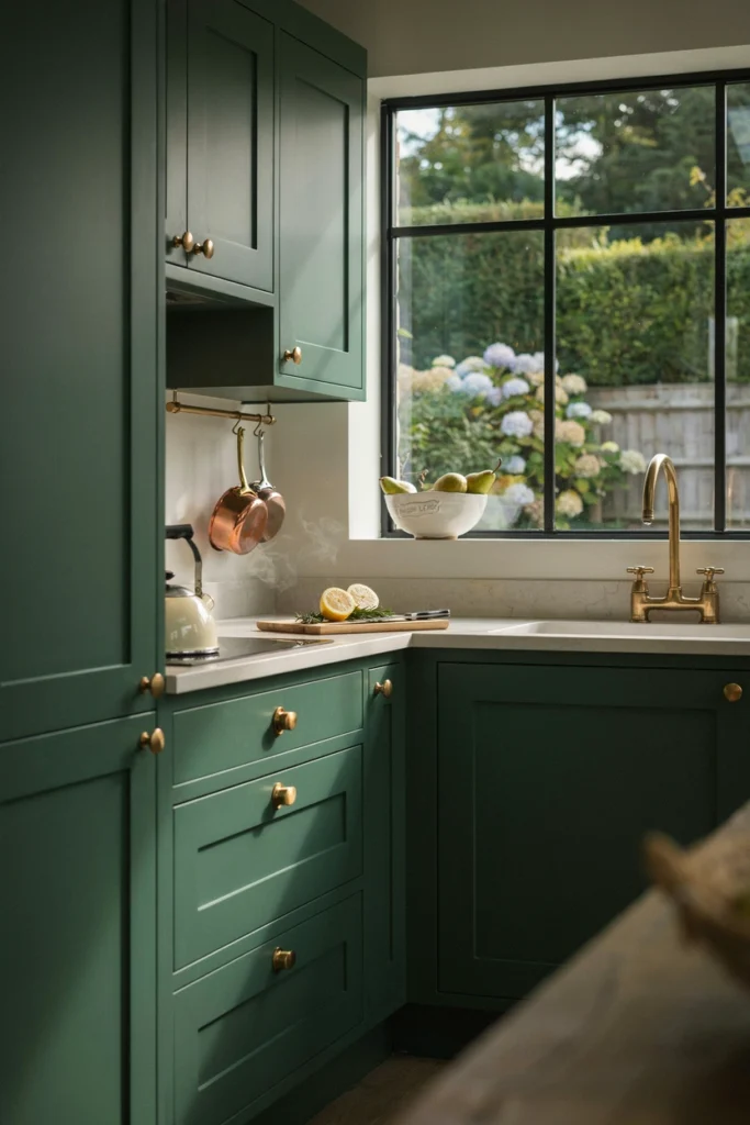
4. Forest Green for a Bold Statement
Where sage green is subtle and restful, forest green is confident and commanding. Designers use it when a kitchen needs to make a real statement, usually in open-plan spaces or rooms with generous natural light where the depth of the colour can be fully appreciated. It works particularly well in homes with character, period features, or high ceilings.
Forest green pairs beautifully with natural brass, unlacquered bronze, and warm wood tones. Keep the countertop and walls relatively light to let the green do the talking, and the result is a kitchen with a genuinely distinctive personality.
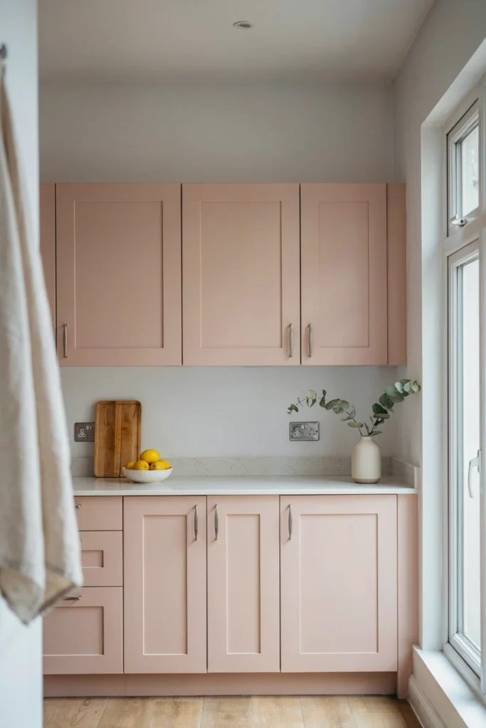
5. Dusty Pink for Unexpected Warmth
Pink in a kitchen sounds bold, but dusty or muted pink is one of those colours that designers reach for when they want warmth without the weight of a darker tone. It works because it reads almost as a warm neutral in certain lights, adding a blush of colour that feels gentle rather than dramatic.
It suits smaller kitchens particularly well because it reflects warmth without closing the space in. Paired with pale grey, warm white, or natural wood, dusty pink creates a kitchen that feels feminine without being fussy, and individual without being difficult to live with.
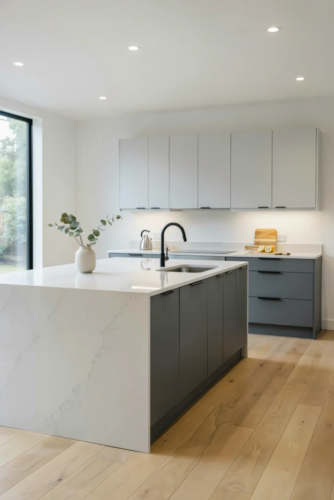
6. Charcoal Grey for Modern Edge
Charcoal grey gives a kitchen a sharp, contemporary edge that navy and black can sometimes overcomplicate. It’s a sophisticated choice that works across a surprisingly wide range of styles, from sleek handleless modern kitchens to more traditional painted shaker designs. The key is getting the right shade since some greys can pull blue or green in certain lights.
Designers often use charcoal on the lower cabinets or island while keeping the uppers lighter, which grounds the space and adds visual weight at the bottom of the room where it naturally belongs. Against white walls and pale worktops, it looks clean and purposeful.
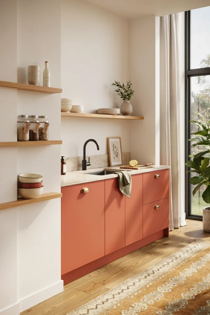
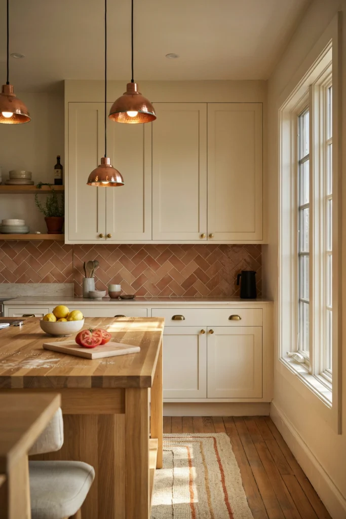
7. Terracotta for Warmth and Texture
Terracotta is having a sustained moment in interior design, and it translates particularly well into the kitchen. It brings warmth, earthiness, and a connection to natural materials that cooler colours can’t provide. In a kitchen, it works beautifully as a wall colour behind open shelving, as a tile choice for the backsplash, or on a standalone island.
It pairs naturally with cream cabinets, warm wood, and aged brass or copper hardware. The overall effect is a kitchen that feels grounded, warm, and genuinely inviting, the kind of space where cooking feels like a pleasure rather than a chore.
8. Cobalt Blue for High-Impact Drama
For designers working on a kitchen that needs to be truly memorable, cobalt blue delivers impact that few other colours can match. It’s vivid, confident, and energising, and when used well it turns a kitchen into a genuine focal point of the home. The trick is containment. Cobalt works best when it’s used on one element, the island, the lower cabinets, or a run of shelving, with the surrounding space kept calm and neutral.
This is not a retiring colour choice, and it suits homeowners who genuinely enjoy bold design. Paired with white, natural wood, and polished chrome or stainless steel, cobalt blue creates a kitchen that feels both lively and surprisingly elegant.
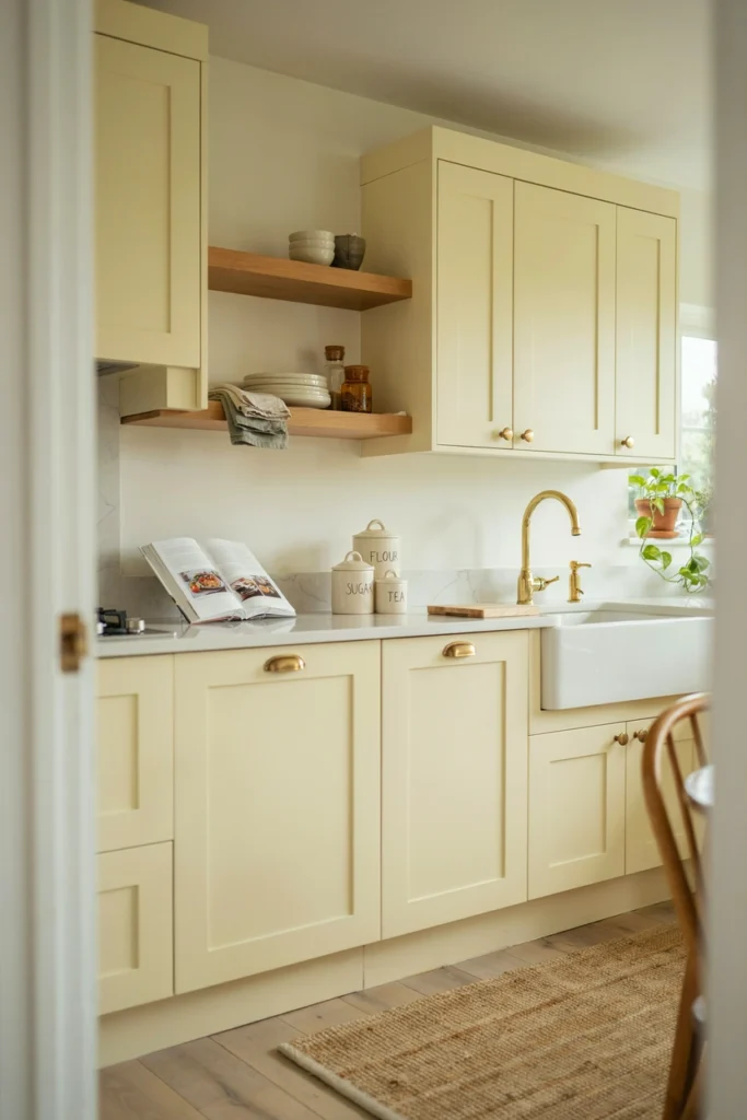
9. Pale Yellow for Light and Positivity
Yellow is a colour that many people shy away from in the kitchen, but pale or buttermilk yellow is one of the warmest and most welcoming tones you can use. It reflects light beautifully and creates a naturally sunny atmosphere even in north-facing rooms that receive little direct sunlight. It’s a colour that genuinely lifts the mood of a kitchen without demanding attention.
Designers tend to use it on walls or as a cabinet colour in smaller or darker kitchens where the priority is maximising the sense of warmth and light. Keep the surrounding palette simple, white, cream, and natural wood, and pale yellow becomes a quietly joyful foundation for the whole room.
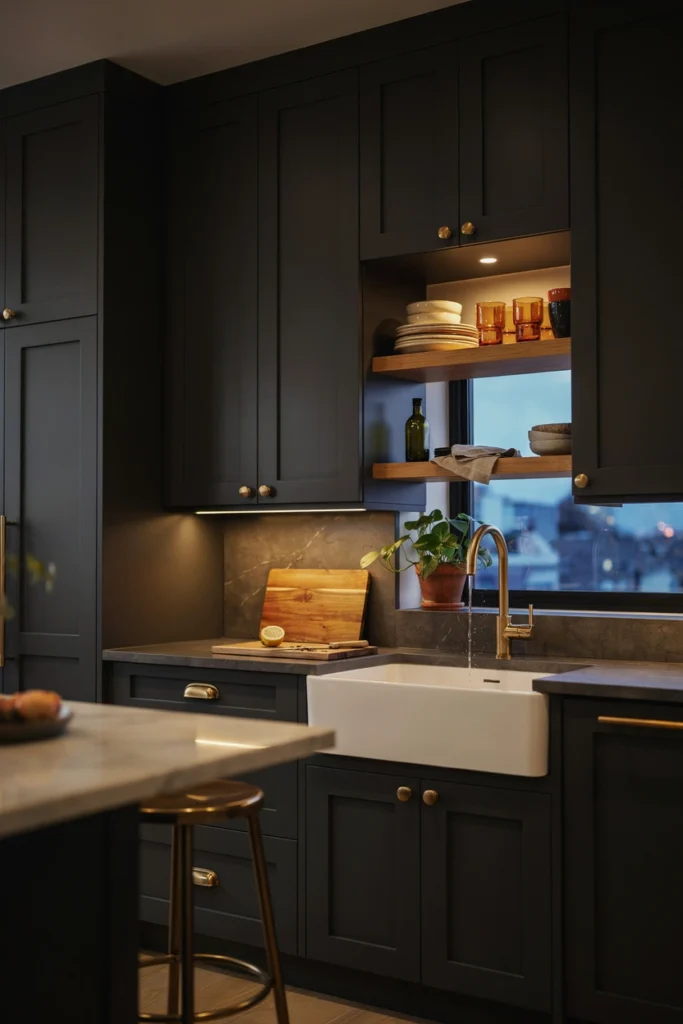
10. Black for Boldness Done Right
An all-black or predominantly black kitchen is one of the most striking choices in contemporary design, and when it’s executed well the result is genuinely breathtaking. Black absorbs light and creates drama, and in a kitchen with good lighting, it produces a moody, atmospheric quality that no other colour replicates.
The practical considerations are real. Black surfaces show dust and watermarks, and the kitchen needs to be well-lit to avoid feeling cave-like. But for the right homeowner in the right space, a black kitchen is one of the most impactful colour decisions available. Pair it with warm wood, polished brass, and soft lighting for a result that feels luxurious rather than oppressive.
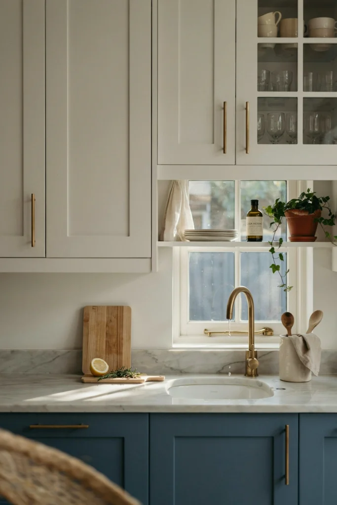
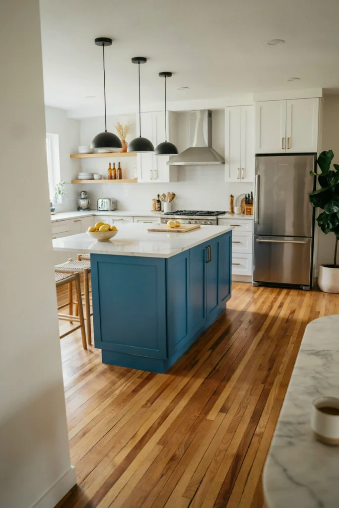
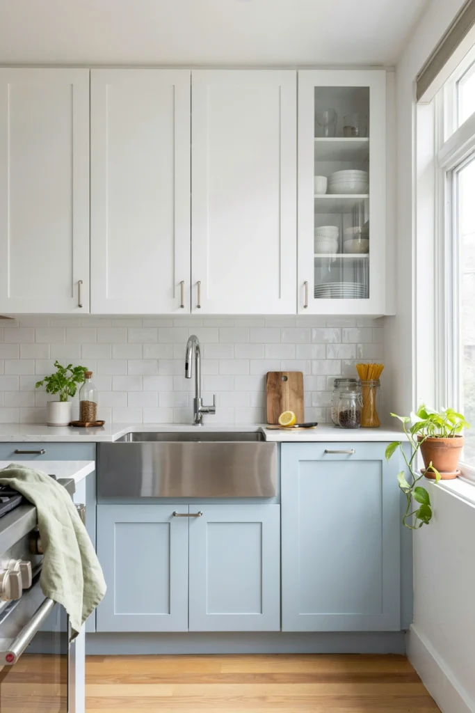
11. Two-Tone Blue and White
Using two complementary tones together, particularly blue and white, is a classic designer move that adds visual interest without introducing chaos. Blue lowers with white uppers is the most common version, but pale blue walls with white cabinets works equally well. The combination feels fresh, clean, and timeless in a way that single-colour kitchens sometimes don’t.
It’s also one of the most practical approaches for anyone unsure about committing to a full-colour kitchen. The white upper cabinets keep the room feeling light and open while the blue lowers introduce colour at a level where it can be appreciated and enjoyed every day.
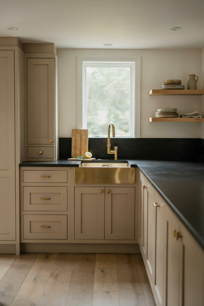
12. Warm Taupe for Understated Elegance
Taupe occupies a sophisticated middle ground between beige and grey, and in a kitchen it reads as quietly luxurious rather than safe or uninspired. Designers use it when a client wants warmth and subtlety without committing to a true colour. It works across both modern and traditional kitchen styles and pairs well with almost any countertop material from white quartz to dark granite.
The advantage of taupe is that it ages very gracefully. It doesn’t follow trends closely enough to feel dated after a few years, and it tends to look slightly richer and more interesting as the kitchen around it develops its own character.
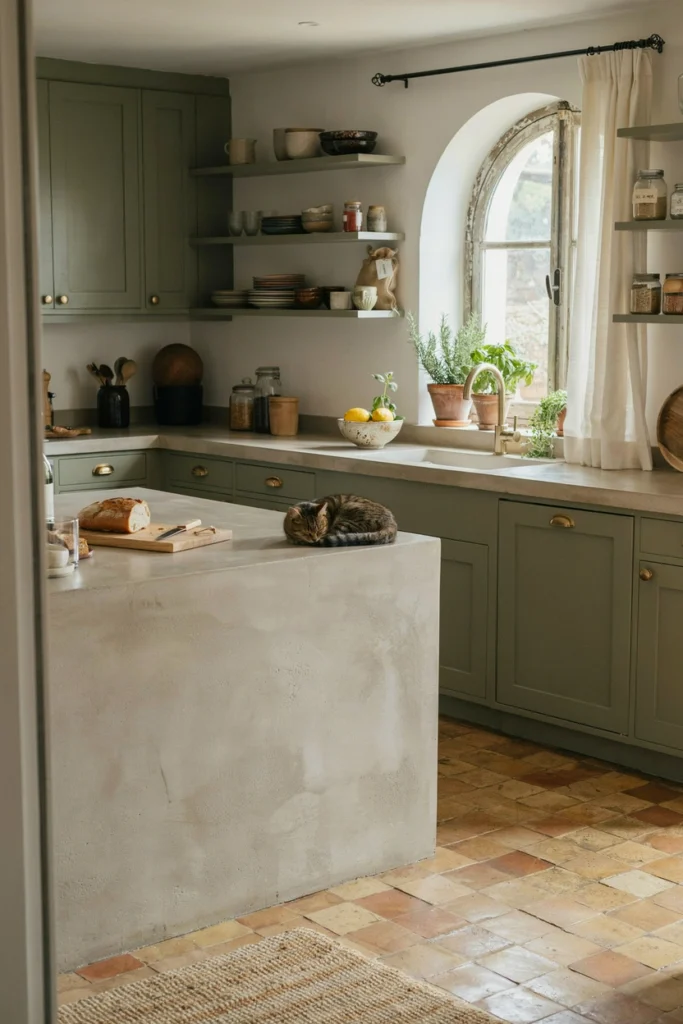
13. Olive Green for an Earthy, Grounded Feel
Olive green sits in a slightly warmer, earthier territory than sage or forest green, and it brings a genuinely organic quality to a kitchen. It works particularly well in homes with natural materials throughout, where the green connects the kitchen to wooden floors, stone surfaces, and garden views.
Designers often pair olive green with raw plaster walls, concrete countertops, or terracotta tiles for a kitchen that feels rooted in natural materials and genuinely unhurried. It’s not a colour for everyone, but for those who connect with it, an olive green kitchen feels like a deeply comfortable space to inhabit.
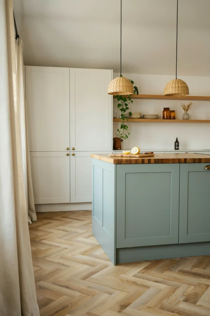
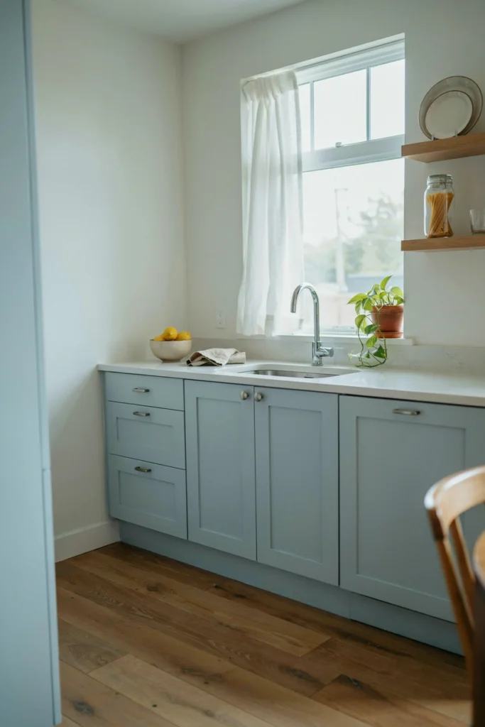
14. Pale Blue-Grey for a Coastal or Calm Feel
Pale blue-grey is one of those colours that feels simultaneously airy and grounded. It has the coolness of blue and the solidity of grey, creating a kitchen that feels calm, considered, and slightly coastal without resorting to nautical clichés. It works in almost any kitchen size and suits both modern and traditional styles.
This colour reads differently across the day as the light changes, which is part of its appeal. In morning light it can feel almost white. By evening with warm artificial light, it settles into a deeper, softer tone. That versatility is exactly what makes it a designer favourite.
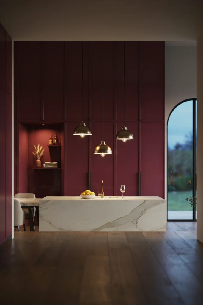
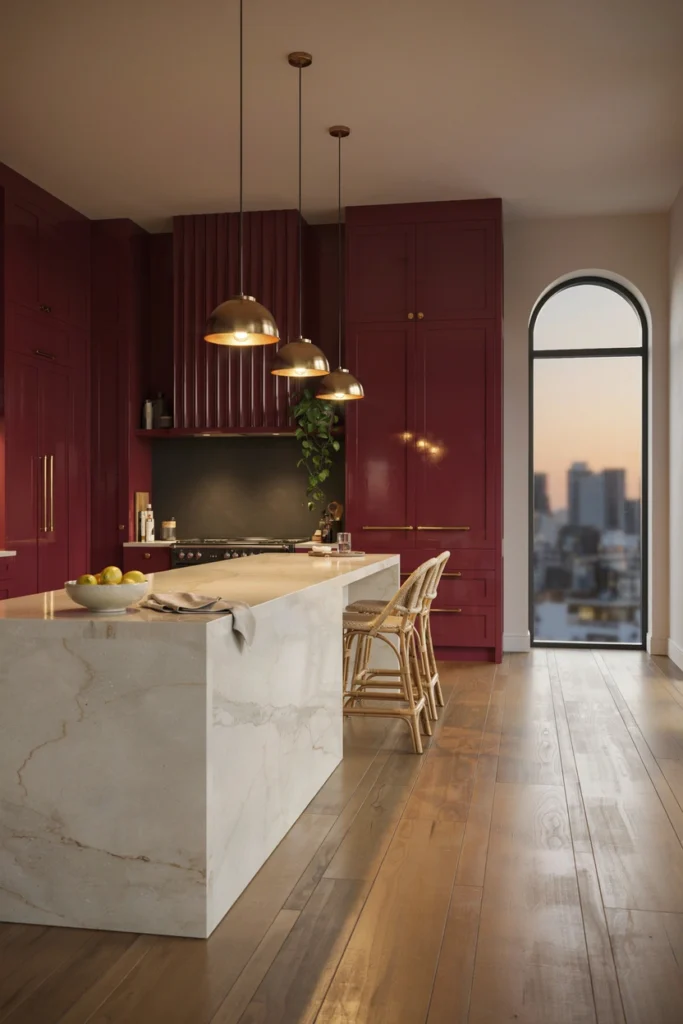
15. Rich Burgundy for Maximum Drama
Burgundy or deep wine red is an unconventional choice for a kitchen, but designers use it precisely because it does something no other colour quite manages. It creates a sense of enclosure and intimacy that makes the kitchen feel more like a dining room or a den, a space designed for lingering rather than rushing through.
It works best in larger kitchens with high ceilings where the drama can be properly appreciated. Keep the countertops light and the hardware gold or brass to warm the tone, and the result is a kitchen that feels genuinely theatrical in the best possible sense.
16. Concrete Grey for an Industrial Edge
Concrete grey, whether applied as a paint colour, a tile choice, or an actual concrete surface, brings an industrial quality to a kitchen that feels modern and genuinely distinctive. It’s a cooler, harder-edged grey than charcoal and works best in contemporary spaces where the raw, utilitarian aesthetic is intentional rather than accidental.
Softening a concrete grey kitchen with warm wood, leather bar stools, or some well-chosen plants prevents it from feeling too cold or too warehouse-like. The goal is a kitchen that references industrial design while still feeling like a comfortable, welcoming place to cook.
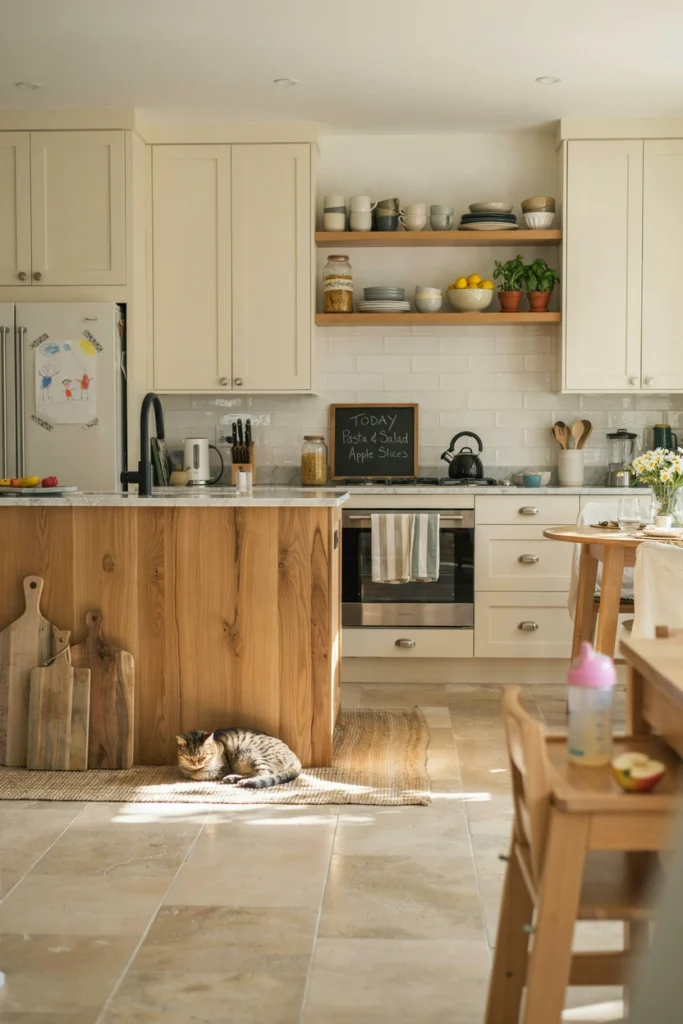
17. Cream and Natural Wood Together
Cream cabinets with natural wood elements is one of the most enduring colour and material combinations in kitchen design. It feels warm, natural, and timeless without being old-fashioned, and it suits an enormous range of home styles from country cottages to modern apartments. The cream softens the space while the wood adds organic warmth and texture.
This combination is also one of the most forgiving in terms of maintenance. Cream hides minor marks better than pure white, and wood develops a natural patina that only improves its appearance over time. For families with young children or pets, this is a genuinely practical as well as beautiful choice.
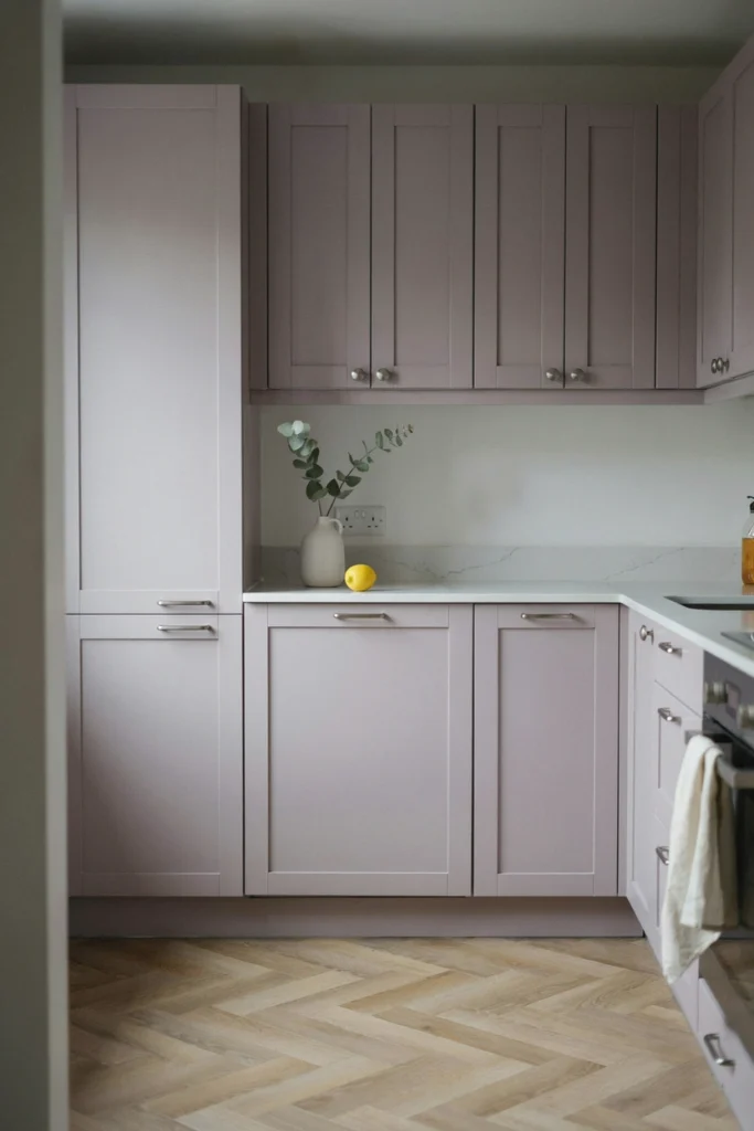
18. Soft Lilac for Something Genuinely Different
Lilac or pale lavender in a kitchen is a genuinely unexpected choice, but in the right space it creates something beautiful and memorable. Designers use it when they want a kitchen that feels entirely individual without being aggressive or difficult to live with. Soft lilac reads as almost neutral in strong natural light while revealing its colour in softer conditions.
It pairs naturally with white, pale wood, and simple silver or chrome hardware. The overall effect is delicate and slightly romantic, which suits certain homes and certain personalities perfectly. It’s not a mainstream choice, but that’s precisely its appeal.
19. Dark Teal for a Jewel-Toned Impact
Dark teal sits somewhere between deep green and rich blue, and it has a jewel-like quality that makes it one of the most visually compelling colour choices in kitchen design. It feels luxurious without being pretentious and distinctive without being difficult. Designers reach for it when they want depth and personality in equal measure.
It works beautifully with brass hardware, warm wood accents, and light stone countertops. In a kitchen with good natural light, dark teal genuinely glows, and it creates a space that feels both comfortable and quietly spectacular.
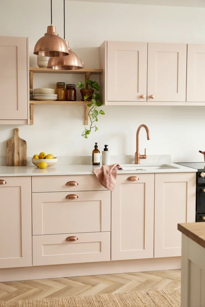
20. Blush and Copper for a Warm Feminine Palette
Blush pink cabinets with copper hardware and fittings create one of the warmest and most cohesive colour palettes available in kitchen design. The two tones share the same warm undertone, which means they work together naturally without any effort. The result feels considered and personal rather than assembled from separate choices.
This palette suits smaller kitchens particularly well since both blush and copper are light-reflective tones that contribute to a sense of warmth and openness. It’s a combination that feels genuinely current while being grounded in timeless warm tones that won’t date quickly.
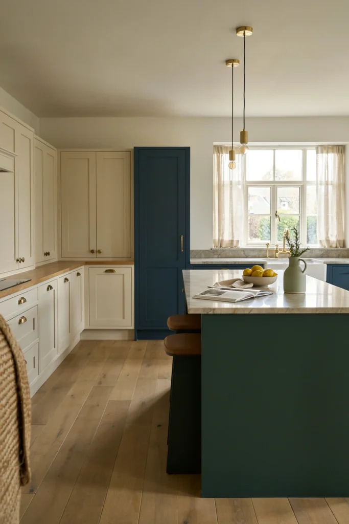
21. Mixed Colour Kitchen for a Collected, Bespoke Feel
The most confident and individual kitchens often use more than one colour deliberately, treating different zones of the kitchen as separate design moments. A different colour on the island, the larder cupboard, or a run of cabinets on one wall creates a kitchen that feels custom-built and carefully considered rather than ordered from a catalogue.
Designers use this approach to give clients a kitchen that genuinely reflects their personality. The key is finding a logic to the colour choices, whether that’s tone, material, or placement, so the combination feels purposeful rather than random. Done well, a mixed colour kitchen is one of the most satisfying and personal spaces in any home.
Conclusion
Colour in the kitchen is never just decorative. It shapes how the room feels to be in, how it relates to the rest of the home, and how much you enjoy spending time there every day. The designers who use colour most effectively aren’t necessarily the ones who take the biggest risks. They’re the ones who understand how tone, light, and material work together to create a specific feeling in a specific space.
Whether you’re drawn to the deep confidence of navy, the earthy calm of sage green, or the quiet warmth of cream and wood, the right colour for your kitchen is the one that makes the room feel genuinely yours. Start with how you want the space to feel, and let that guide the colour decision rather than the other way around.